GitHub App – Help me see a cleaner user experience (Little issue with overlapping popups)

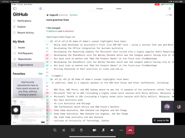
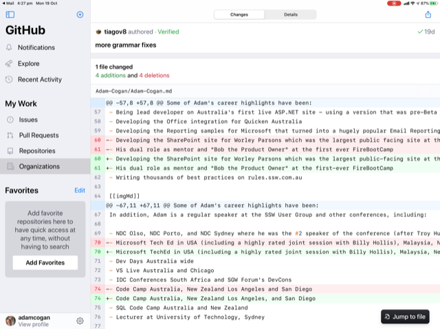
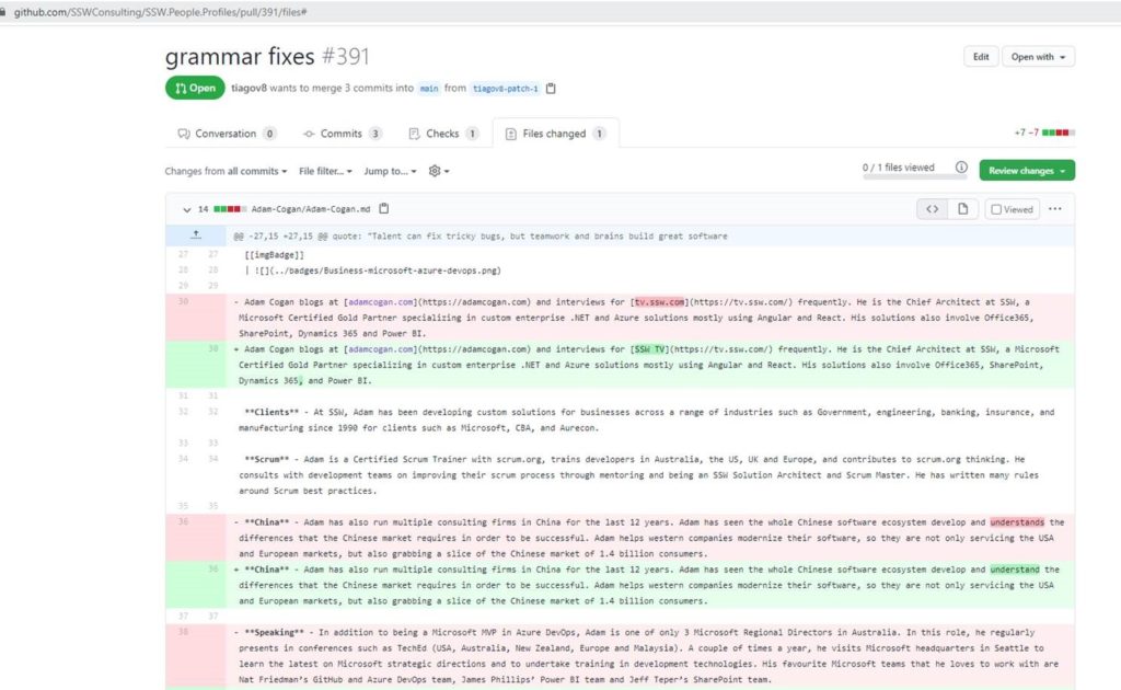
I discovered a possible UX issue when modifying a GitHub Pull Request using the iPad App.

There are multiple popups that appear, which is noisy and unintentional.

Figure: Bad Example – The GitHub iPad app shows multiple overlaying “Got It” boxes when reviewing changes

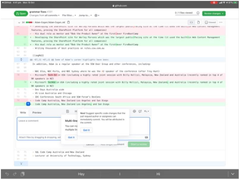
I wonder if this is the intended UX… I am aware one benefit of this UX is that the user knows which popup to read first.

GitHub App – Help me see the changes as easily as the webpage

I  found an issue when using the GitHub App on the iPad when reviewing a Pull Request.

It’s not clear to see the changes and for small grammatical changes the web view is required.

Figure: Bad Example – Using the GitHub iPad App in dark mode you cannot see the lines highlighted (Only numbers)
Figure: Bad Example – Using the GitHub iPad App in light mode you cannot see changes within the highlighted lines
Figure: Good Example – The Web view clearly shows the highlighted changes (See the darker red and darker green)