Help me understand “refresh history” better

This problem comes up every couple of weeks so I thought of 4 things that would help Power BI users.

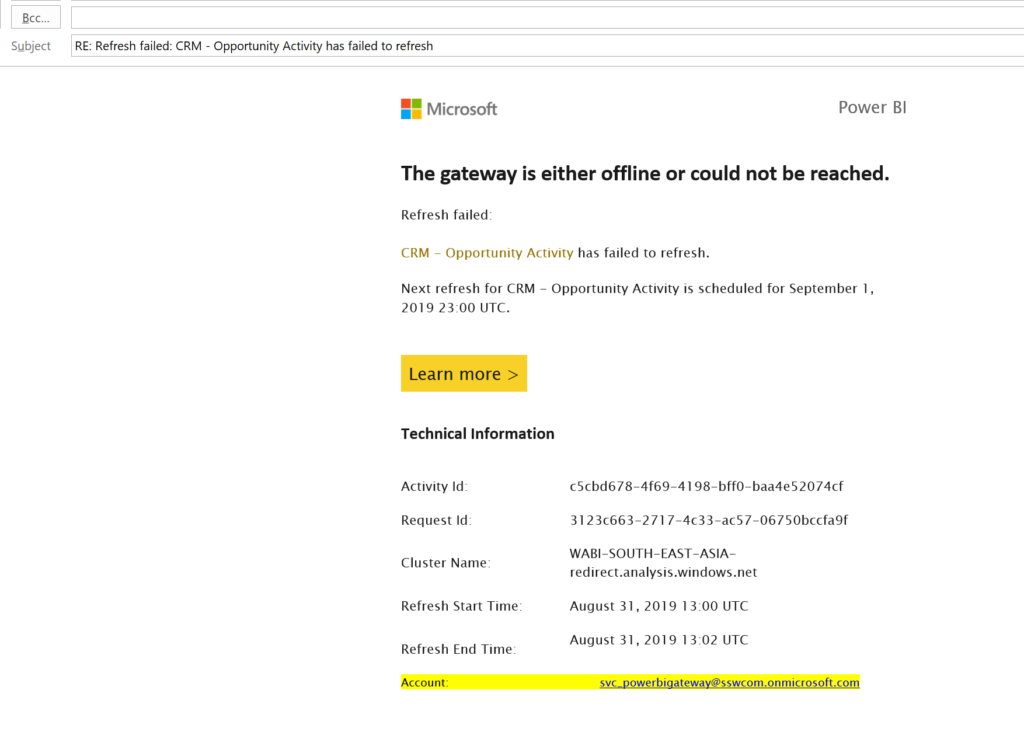
See email of failed refresh below. I get this email periodically telling me of an error. Thank you.

When I look into the error… sometimes it has magically resolved itself and it was a waste of time me looking into it. 
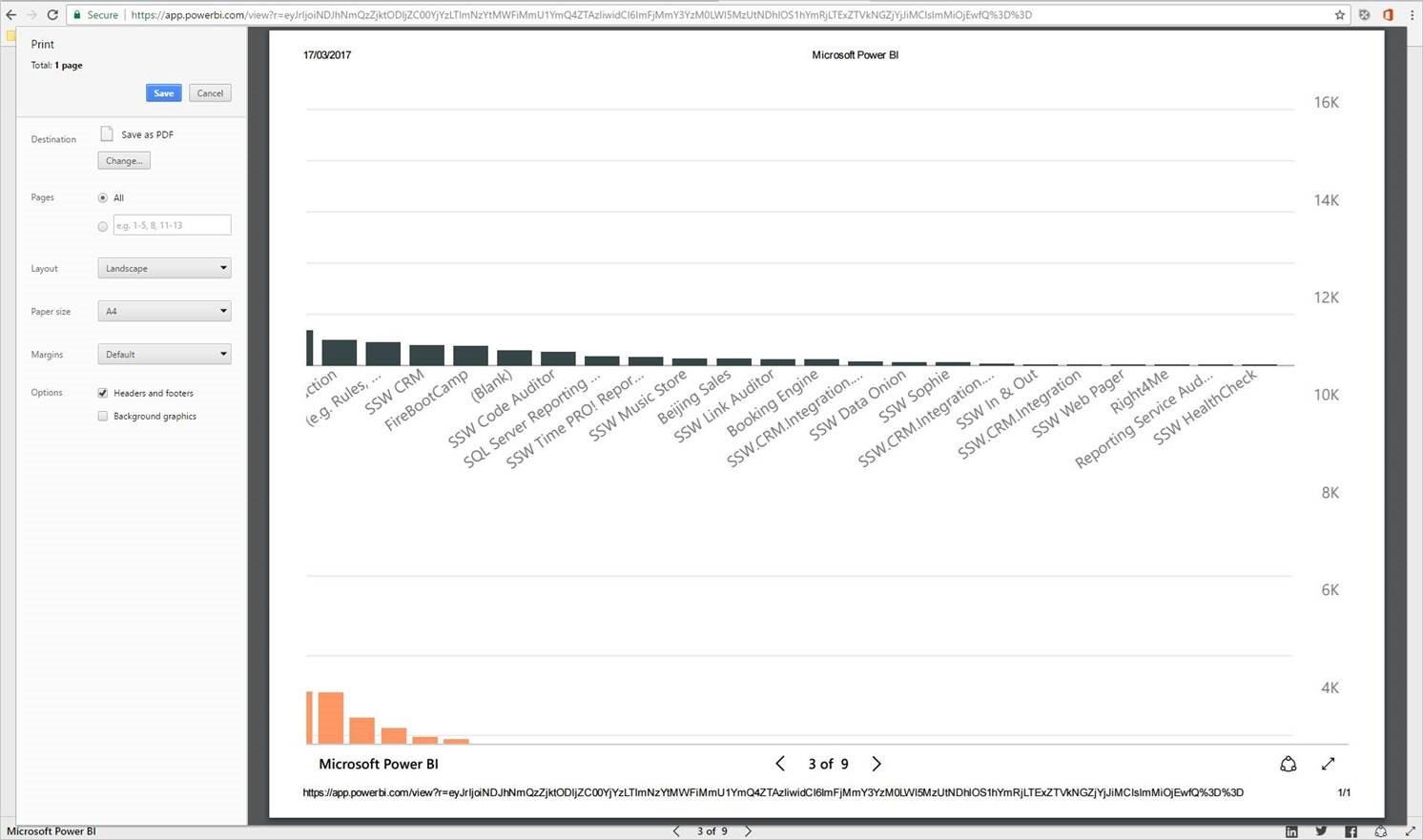
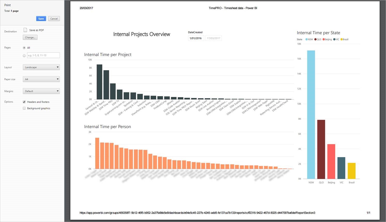
Here is an example…

Figure: Booked in Days Report – Refresh History – shows the failed timeout and subsequent successful refreshes

Suggestion #1 – Emails

We currently get an email on refresh failure. We need one on the next success too (only after the last one failed). Please.
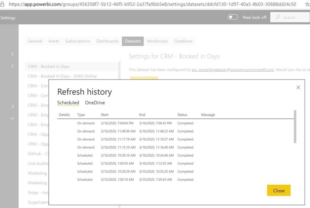
Suggestion #2 – UX

Please add a Duration column in the Refresh History table next to the End Time.
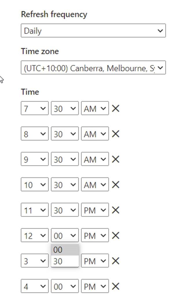
Suggestion #3 – UX

Please provide more flexibility with refresh timings by allowing users to pick the time rather than just 30-minute intervals (change from combo to textbox).

Figure: Refresh settings don’t allow flexibility

Suggestion #4 – Please provide more info

The details link unfortunately does not provide much detail apart from saying it was a timeout issue.

Figure: Yellow highlight shows the error but not much detail ☹

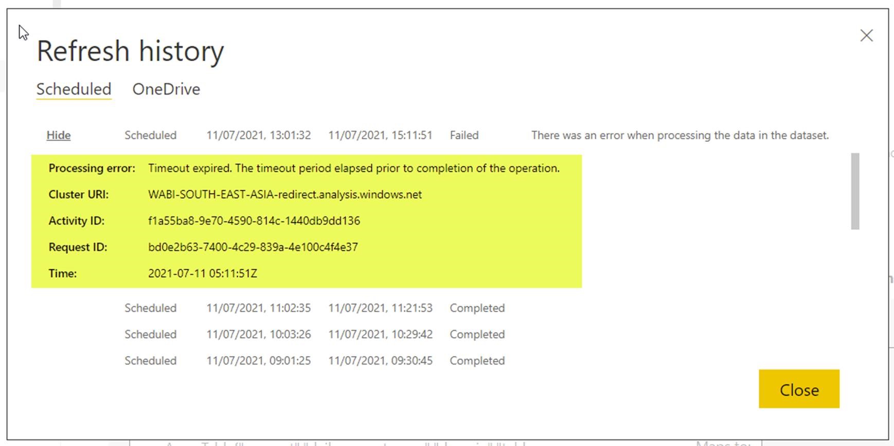
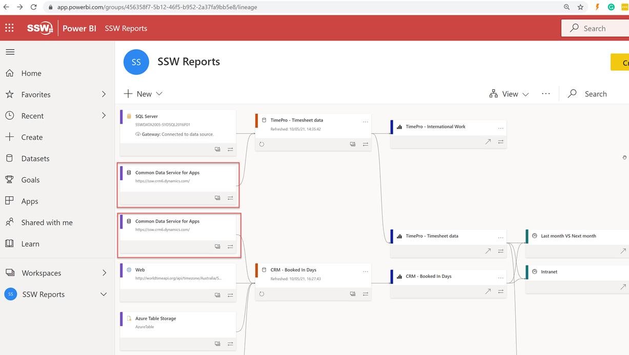
This report uses an SSW gateway and my best guess is that this was due to some issue connecting to the Gateway.

If that is the reason it would be helpful to provide that info.

Help me get more clarity from Workspace | Lineage View

I love the new view in Power BI called Lineage. It allows visualising which data sources are used by which reports. 

One small thing I was confused by was the Data Source boxes.

1. As per my 2 red boxes, there is duplication…which I assume is there to make it simpler to read with less overlapping lines:

Am I right that there are 2 boxes instead of 1, to make it easier to read? 

I think that there should be an option to ‘show only 1 box with many arrows’.

Answer from Microsoft:

In your case, it looks like you are connecting the same data source to more than one dataset. We show it twice because although it is the same source, we allow you to setup different credentials against the source for each dataset, and potentially configure different parameters. In cases where you have the exact same data you want to use for both datasets, the recommended approach would be simply import the data once into a single dataflow and use the dataflow as the source for both datasets.

This is far more efficient as you bring the data in once, there’s no need to duplicate the data prep, and it reduces the load on source systems. Some source systems have constraints on the amount of data you can extract, or the throughput of the extraction. If you were to do that, the lineage view will show the same dataflow being used as input into both datasets. 2. Show a warning when you see duplicates
e.g. It looks like you have the exact same data in multiple datasets. The recommended approach is to simply import the data once into a single dataflow and use the dataflow as the source for both datasets.
You can learn more about dataflows here: Introduction to dataflows and self-service data prep – Power BI | Microsoft Docs

3. Alternatively if we stay with the current view, can we get an easy way to highlight all similar boxes
e.g. so I can see all reports using “Common Data Service for Apps”.

Right now I need to scroll through the whole list to identify all of them!

4. Curious… do you plan to enable this Lineage view on the iPad Power BI app?

Answer from Microsoft:

No

Make Power BI published reports print properly

If trying to print a report from the web published view (i.e. https://app.powerbi.com/view…….etc.) , it zooms in on the middle right of the report, instead of printing the full page.

Figure: Bad Example – Print view of a Power BI report from the web published view zooms in to the middle of the report

Figure: Good Example – If you’re properly logged into the Power BI portal, the report prints fine

This needs to be fixed.

Give me options on right-click without editing the report

I’ve just started to use stacked columns… For some reason I’ve always avoided then in the past.
See screenshot… You can see trends with red and green but not black.

Figure : Bad example - the black data is hard to focus on

Figure : Bad example – the black data is hard to focus on

Suggestion to Microsoft: A user, without editing a report to add a slicer, should be able to right-click and choose to “Change order” or “Hide red | Hide black | Hide green”