Delayed emails get saved in Drafts. Those emails should be separate from real draft emails because they are unfinished emails.
Could you save it in a subfolder eg. Drafts\Delayed


Do you agree that products always have room for improvement?
"Every day there are little things in software that we find annoying. Some write books about it, like Annoyances.org, but I thought this site would be more constructive.
BetterSoftwareSuggestions.com is proudly maintained by myself and the developers at SSW."
 - Adam Cogan
 Delayed emails get saved in Drafts. Those emails should be separate from real draft emails because they are unfinished emails.
Could you save it in a subfolder eg. Drafts\Delayed
A common UI thing is to use > and <
Microsoft dialogs often use:
So I would change:
To:
And change:
To:
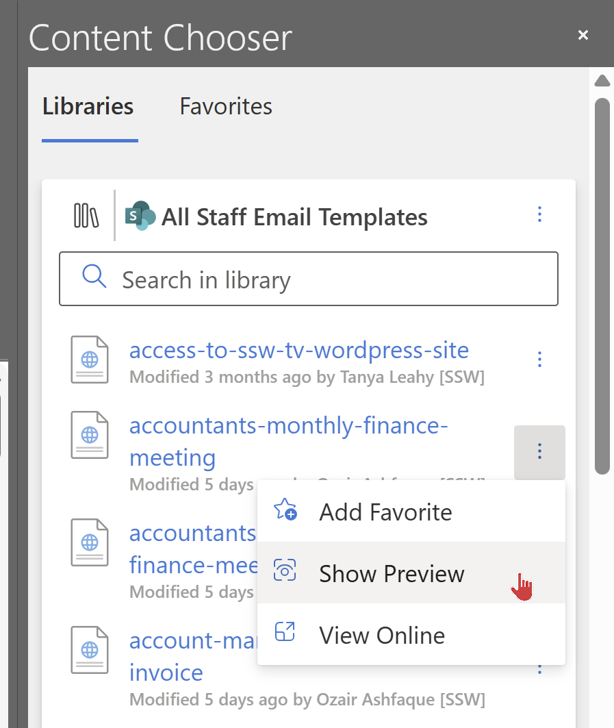
Also I would make it easier to preview to avoid needing to click the 3 dots…
See the red mouse, after 2 seconds of waiting I would show an option “Show Preview…”
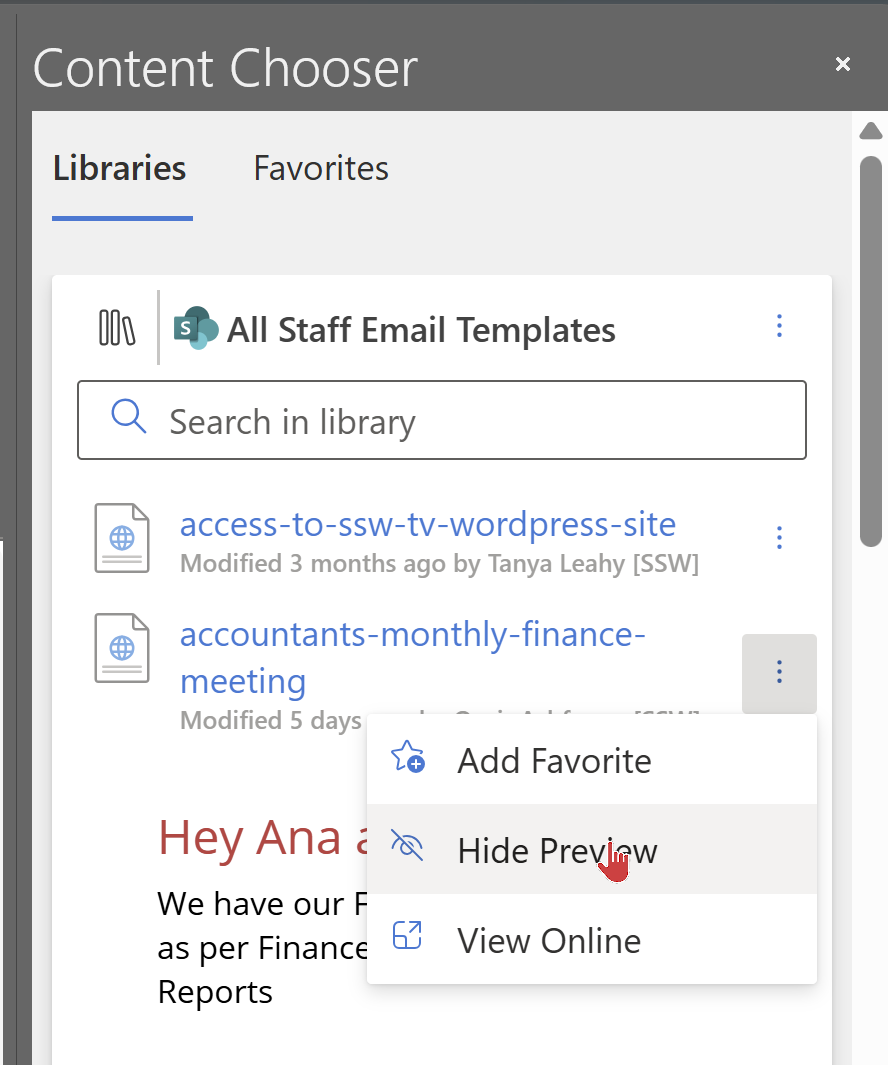
…which would popup open a new window with the preview
Have you ever been asked to improve search? (so you can find text inside forms)
We are nearly complete on an AI solution – it is being built on top of Microsoft Teams and Azure OpenAI APIs. We call it SSW YakShaver.
The product has a blocking issue. We are recording a Teams call (and screen) and we have hit something called a “compliance policy”.
The below is what we plan to do from here. I would have assumed we would have gone with Option 1 (using the Teams bot with a compliance policy) but it seems like we are going to use the Graph API (simpler).
Thoughts?
——————————————————————————————————————-
I got this email from the YakShaver team:
We have been trying to get the compliance policy working in MS Teams (Option1), but have pretty much given up.
We have decided to do Option 2 below followed by Option 2.1.
We are *not* doing Option 1.
Here are all the points we have learnt.
Then the user flow.
Then the pros and cons.
Using a Teams bot with a compliance policy to record the audio and video, it will record every participants sound individually, those who are not in the policy will not be recorded.
Using the Graph API to do the work, the user manually start and stop recording, and then the YakShaver will get the transcrips for the user manually.
Use communication service to automate the call record process – need a POC after Graph is done.
– It’s easy to use
– We can get rid of the compliance policy which is much much simpler!!!!!
– I can see the potential of making YakShaver into a commercial project.
– We can define our own compliance rule rather than rely on Azure to set up the compliance policy
– Calls have to be initialized from communication services
– It’s our responsibility to notify recording – very important
– We have to do compliance recording policy ourselves if we make it commercial later – might need a lawyer
Things we are sure of from the documentation:
We have built a cool reporting tool www.sswEagleEye.com that uses the Microsoft Graph API to produce insights into employees’ email data.
However, when an employee leaves the company, we are no longer able to access that former employee’s email messages. This makes sense normally, but not in our scenario.
We need former employees’ email data or we have incomplete and potentially misleading reports.
Suggestion:
Microsoft Graph API should provide a method to access former employees’ email data, either through a dedicated endpoint or by incorporating a flag or parameter in the existing API requests.
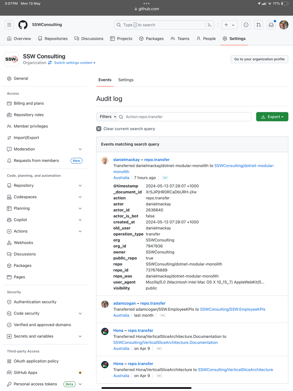
It is important that we can rely on the GitHub audit logs telling us who did what.
In this case I know some repos were transferred into SSW Consulting, but I don’t know who clicked the “Accept” button.
In the below UI, that person should be listed, so I know who to talk to.
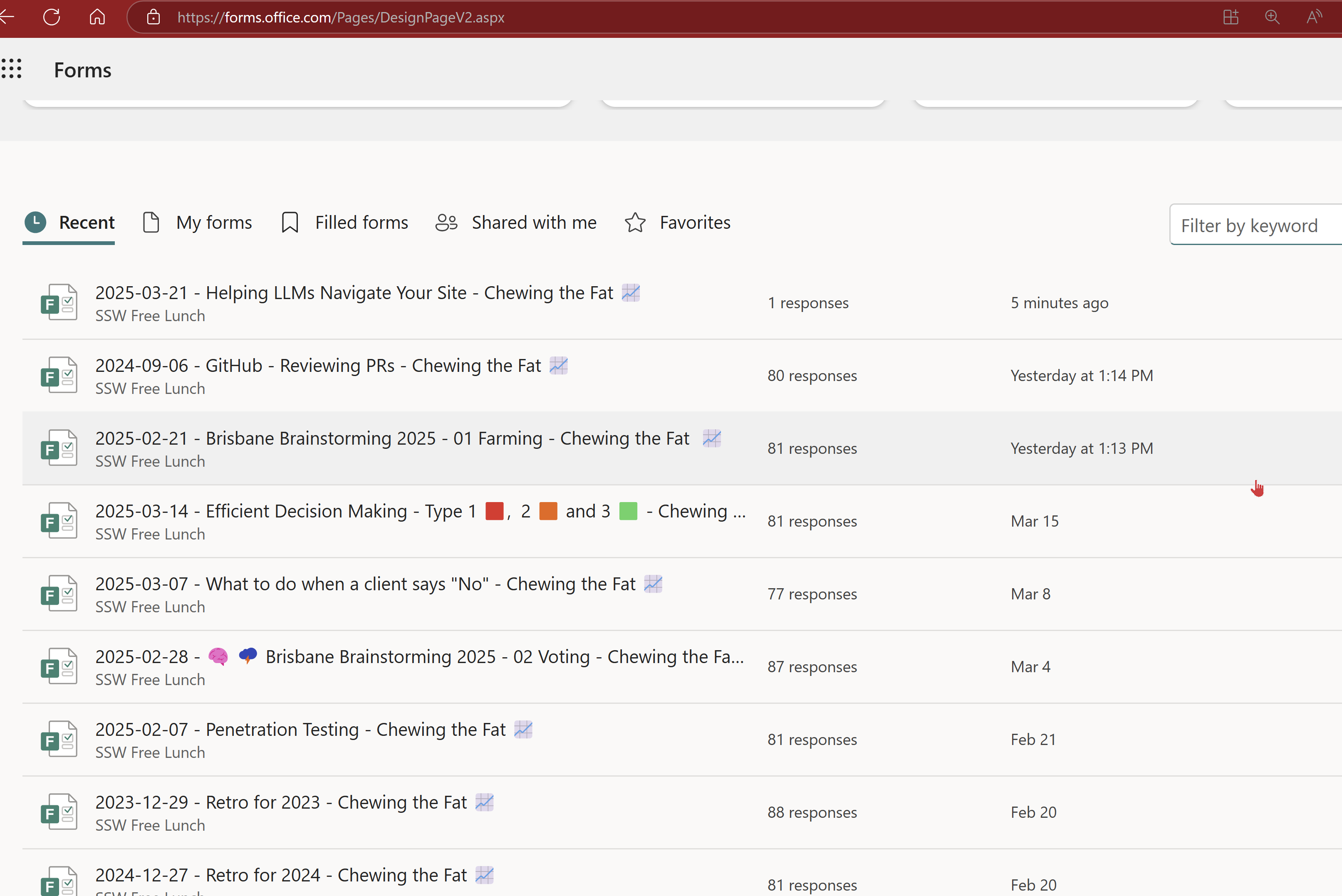
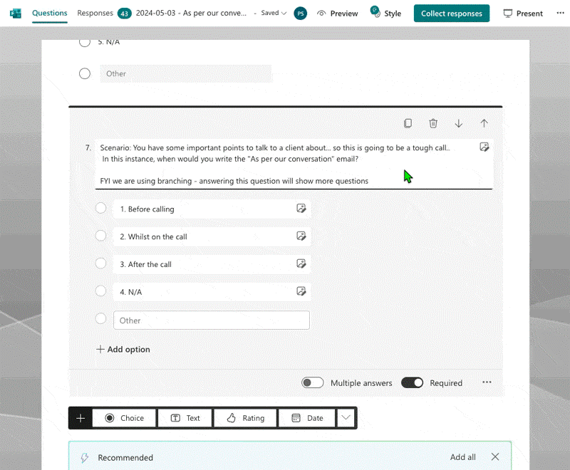
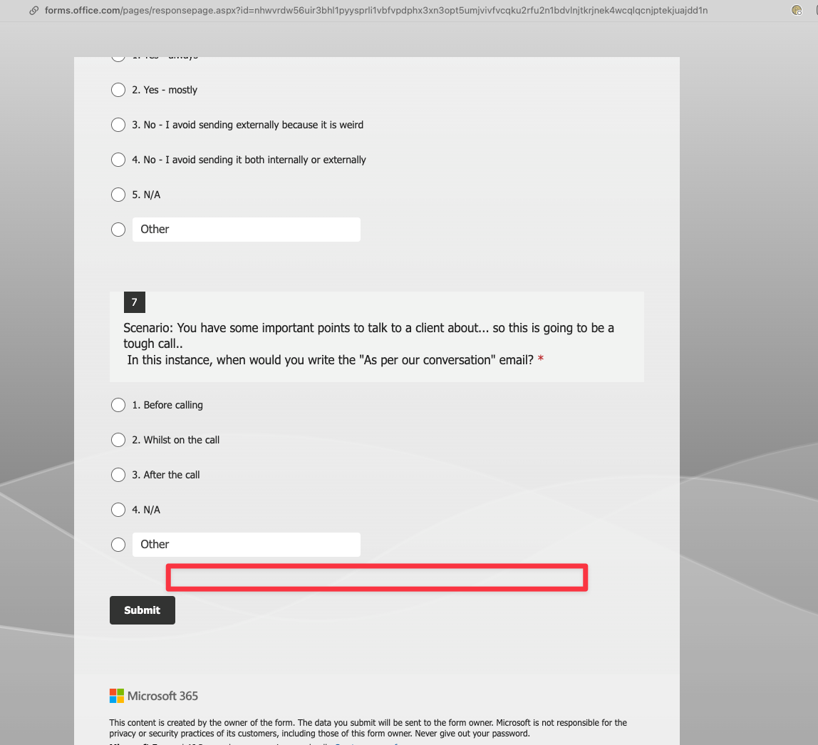
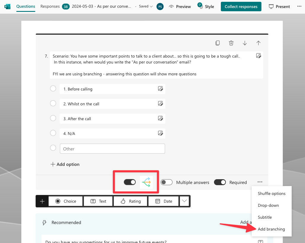
We run forms frequently and this morning we had a problem. There was a question with branching logic enabled and this caused a couple of issues:
Suggestion #1: Add an option to add a progress bar to the form so that people completing the form know that there may be more questions
Suggestion #2: When a question has branching turned on, make it obvious for the person editing the form
Add branching
To
Edit branching
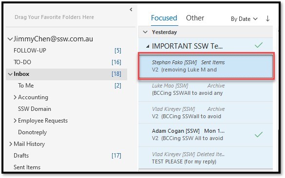
A cool feature of Outlook is when somebody is on holidays, you can access their mailboxes. An uncool feature is in the UX, it combines all emails when you are using the view of “Show as Conversations”.
For example, in the UX, a thread groups all emails from different mailboxes, regardless of who the email was sent to. This causes confusion as you assume the email was sent to you.
Suggestion: Microsoft Outlook should change its logic and not include the emails from other mailboxes in the Conversation view.
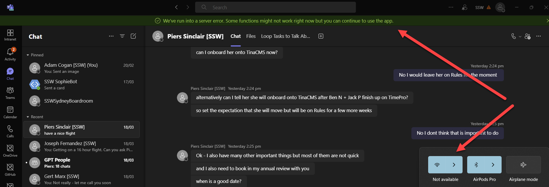
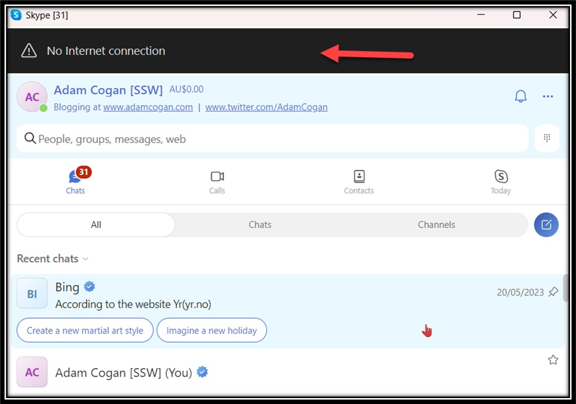
I wish all Microsoft applications behaved the same when offline.
Ideally, they would all have a black bar (or reverse when in dark mode), when they had reduced functionality.
I am on a plane with no wifi…
⚠️This new green message when you are offline, is pretty unfriendly:
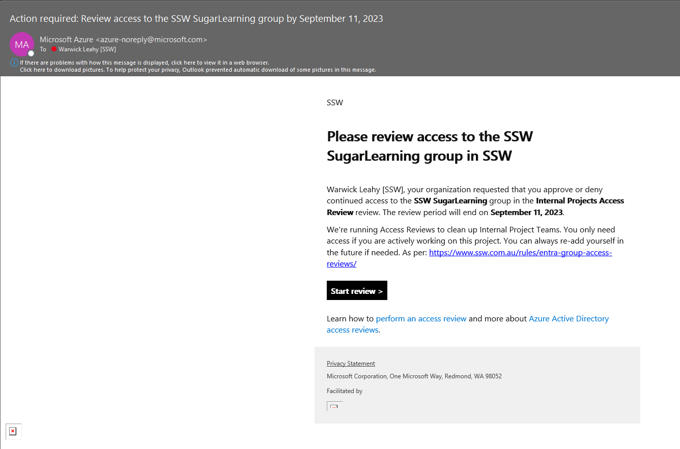
SysAdmins find it a lot of work to keep giving people permissions to resources like Azure.
I wanted to say that we’re now really enjoying using Azure Access Reviews. We’ve written about how we use it on ssw.com.au/rules/entra-group-access-reviews.
At SSW we have so many Teams and Groups – almost all set to public. Since people can join so many, they poke around, join a group, and never leave. That means they are included in every calendar appointment and every team email and the noise was reported as an employee dissatisfaction.
Access Review has been invaluable because it effortlessly removes users when they no longer need access. We have set it to run every 3 months and they need to say they are still a member.
❌ The Access Review email does not look like anything SSW SysAdmins would send, so it gets deleted mistakenly by many people in our company.
Having the ability to customize the email is important.
Suggestion: