Basically what the Hyatt does – see LinkedIn post: KTLA 5 showcases our electronic locks using room key in Apple Wallet in partnership with Hyatt Hotels Corporation.
Control4 – Home/Office automation
While running a Control4 showroom in Sydney, our customers and SSW consultants have come across these issues. More info at Smart Office & Smart Home consulting page and Rules to Better Control4.
History – Help me see the alarm notifications 🚨
On the Control4 App | Locks & Sensors we do not see the alarm notifications. This appears to be a bug.
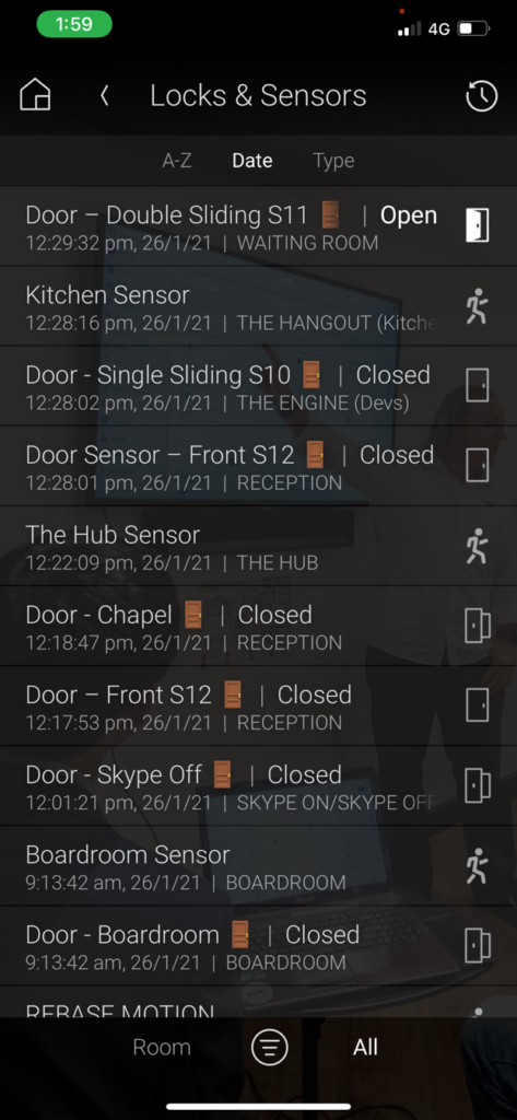
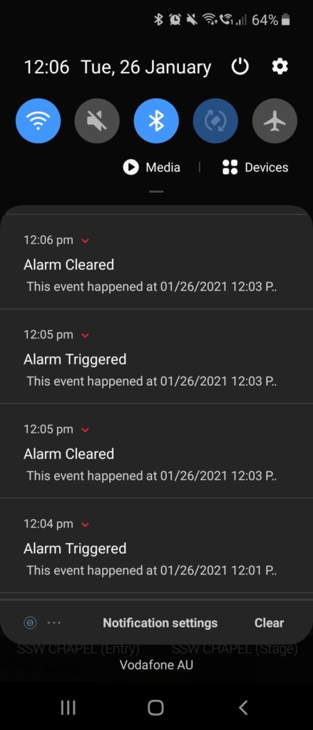
Better History controls in Control4
In the latest Control4 update (3.2.0), an option has been added to the Control4 app called “History”, where you can easily see all events that happened around your environment. This is great but a little noisy.
It shows “movement” events in a weird way, putting “opened” and “closed” at the end of it, e.g.:
- Entry Movement open
- Entry Movement closed
This shows that the movement started and ended, which is fine.
Figure: Bad Example – Opened and Closed is not the best wording for movement
It is not a natural way to read quick movements. For example there is a difference between a car that quickly passes by and one that parks. Say you had a camera facing a busy street, do you want 2 events (open and closed) for every car that passed by?
The same argument works for people that walk past a sensor. This creates visual noise.
2 improvements for the UI would be:
- Change the wording – instead of “Entry movement open” and “Entry movement closed” use “Movement started” and “Movement ended”
- Single status message – Have a record for “Brief movement” instead of “started” and “ended” for the quick movements
- 2 status messages – For activities where someone was in the room for say 10 minutes, you could change “Entry Movement ended” to”Movement ended (10 minutes)”
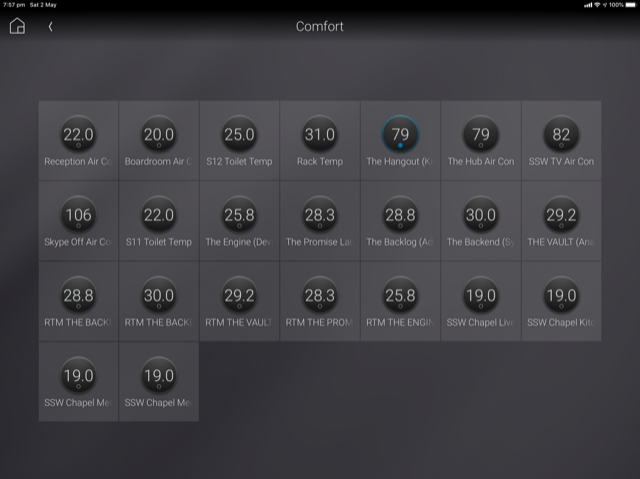
Help me see the most used Air Conditioners
- See image – Improve the view to include:
“XXX hours used over the last week | month | 3 months | 6 months“ - Give the ability to sort descending by that column so you can instantly see the most used
- Give the ability to remove the decimal place – it is just noise
- Give the ability to rename “Comfort” to something else eg. “Air Cons”
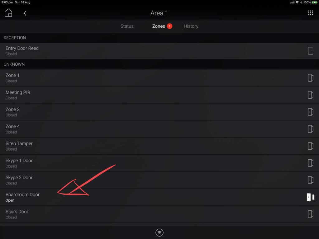
Help me quickly see the active Zones
A: In the top tab, I see a red count eg. 1 … so I expect to see a red dot on the relevant items under it 🔴
B: The 2 columns are too far from each other – the middle gap is unnecessary
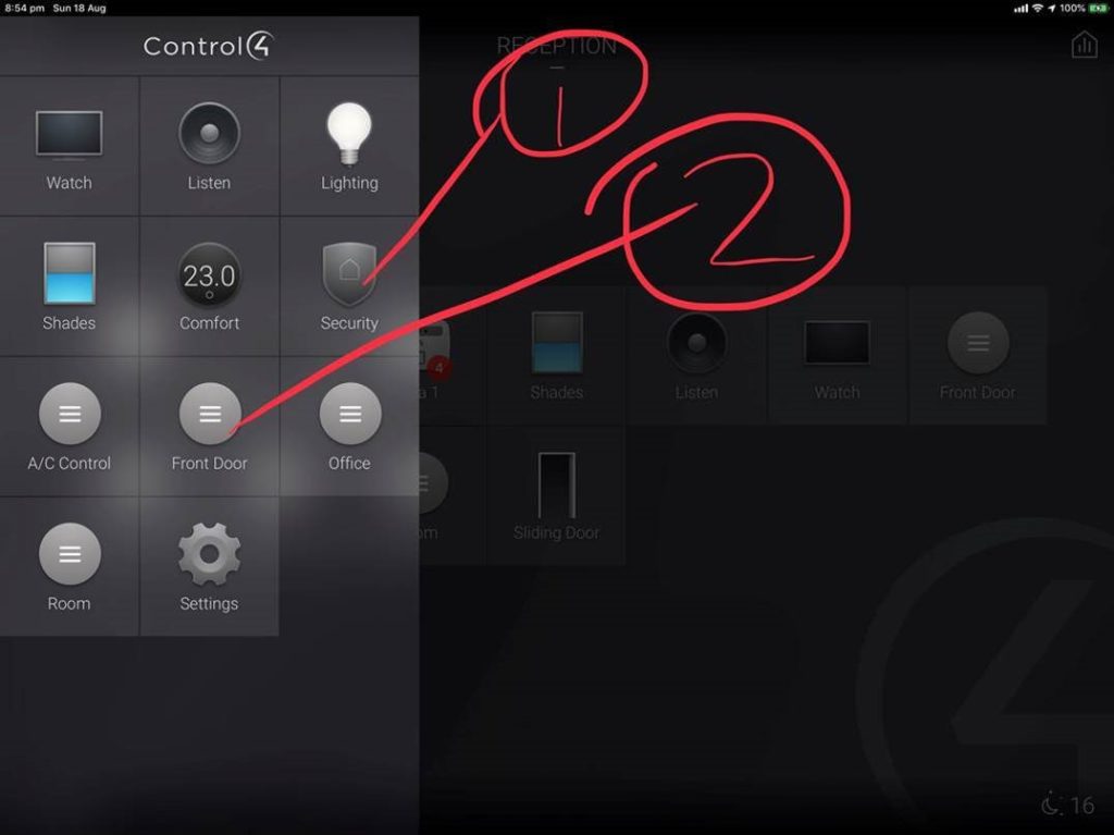
Help me customize the order on the Main menu
For example I would like to change the order to be:
- Security
- Door – Front
- Door – Double
- Lights
- AirCon
- Shades
- TV
- Music
Give us PowerBI for history graphs
Give us PowerBI for history graphs on the data E.g. Air conditioner
More info: https://www.ssw.com.au/ssw/Consulting/Power-BI.aspx
You have a red (1) warning but then you can’t find the red text
I suggest changing from Blue text to either Yellow or Red.
- Warnings in Yellow ⚠️
- Bad things in Red 🛑
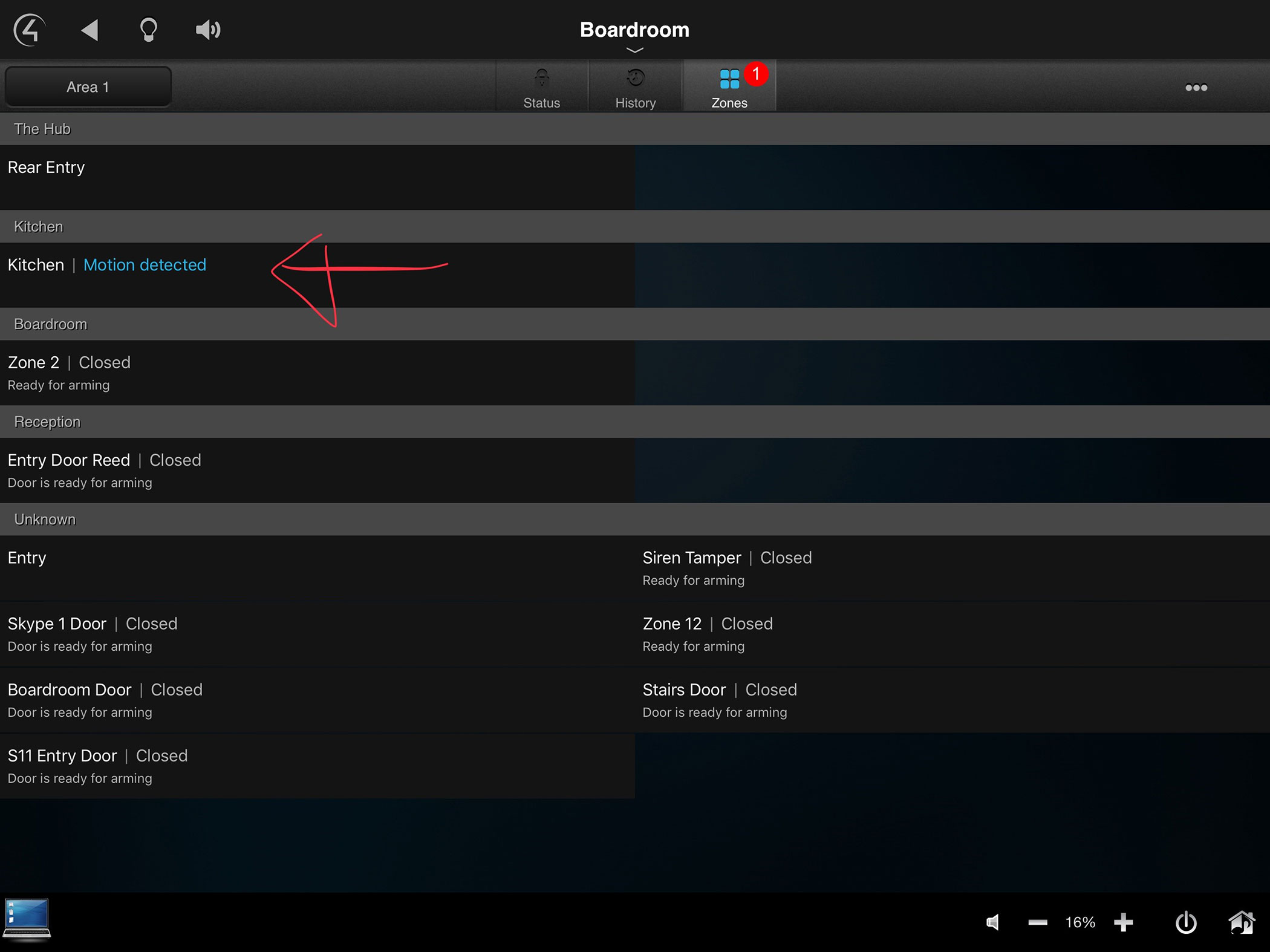
Figure: Change text color
Have a public suggestions site people can vote on
Can you consider a public suggestions site you can vote on?
E.g. UserVoice.com
Show me what’s turned on
Help me see how many of each is turned on:
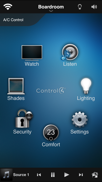
Eg.
- Lighting (11)
- Comfort (5)
Like the red notifications you see on an iPhone:

 -
-