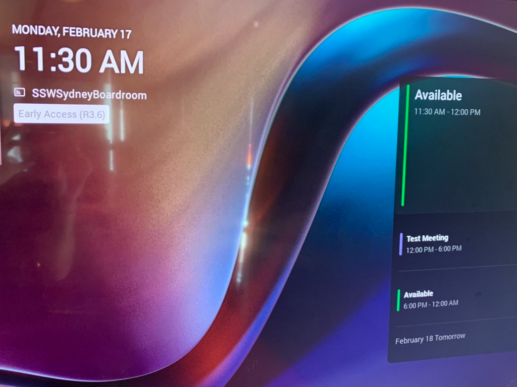
Microsoft Teams Rooms devices have a useful standby screen, showing a calendar of upcoming meetings for the room.
However, the visual hierarchy does not make it clear how long each booking is for, or how much available time there is before the next meeting starts. While it makes sense to highlight the current time period, the size of the boxes should match the periods of each booking. This would be consistent with other calendars, e.g. Outlook.

Suggestion:
– Change the calendar boxes to match the time period of each booking/availability
– Add a time period next to each title, e.g. change from Available to Available (30 mins).
 -
-