
 -
- I’ve just started to use stacked columns… For some reason I’ve always avoided then in the past.
See screenshot… You can see trends with red and green but not black.
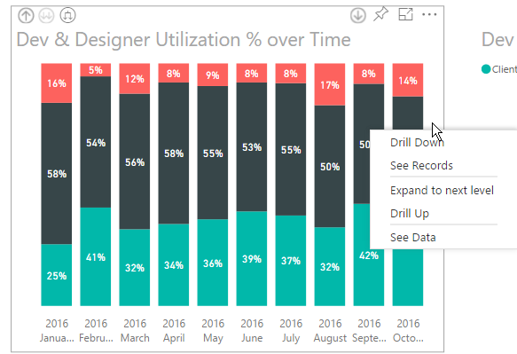
Figure : Bad example – the black data is hard to focus on
Suggestion to Microsoft: A user, without editing a report to add a slicer, should be able to right-click and choose to “Change order” or “Hide red | Hide black | Hide green”