Reduce inside noise as per the thread below.
I have a Tesla Model S. Has anyone noticed that the road and wind noise is much greater in the Tesla than other comparable cars like BMW and Mercedes? Those cars are much quieter.
by Frank Kemper

Do you agree that products always have room for improvement?
"Every day there are little things in software that we find annoying. Some write books about it, like Annoyances.org, but I thought this site would be more constructive.
BetterSoftwareSuggestions.com is proudly maintained by myself and the developers at SSW."
 - Adam Cogan
 Reduce inside noise as per the thread below.
I have a Tesla Model S. Has anyone noticed that the road and wind noise is much greater in the Tesla than other comparable cars like BMW and Mercedes? Those cars are much quieter.
by Frank Kemper
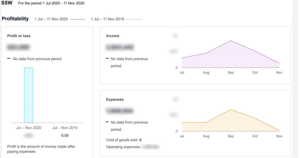
We see the income and expenses. We should also see a 3rd graph under the income & expenses being profit.
Can you make these fields wider?
Or at least add a tooltip so I can read them via the mouse.
In the latest Control4 update (3.2.0), an option has been added to the Control4 app called “History”, where you can easily see all events that happened around your environment. This is great but a little noisy.
It shows “movement” events in a weird way, putting “opened” and “closed” at the end of it, e.g.:
This shows that the movement started and ended, which is fine.
Figure: Bad Example – Opened and Closed is not the best wording for movement
It is not a natural way to read quick movements. For example there is a difference between a car that quickly passes by and one that parks. Say you had a camera facing a busy street, do you want 2 events (open and closed) for every car that passed by?
The same argument works for people that walk past a sensor. This creates visual noise.
2 improvements for the UI would be:
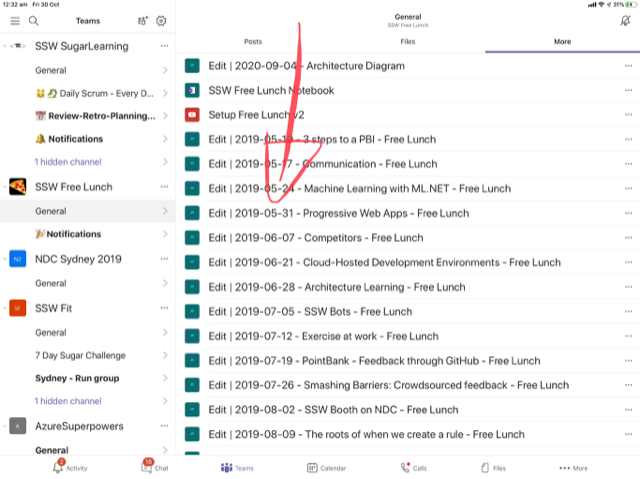
Currently, any images or documents shared in a Team chat conversation will automatically be in the “Files” folder. These files are often temporary.
The “Files” folder should have only permanent files that are relevant to the project.
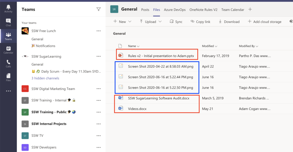
We believe chat images should go into a separated “Conversations” folder, so we have 2 folders (tabs):
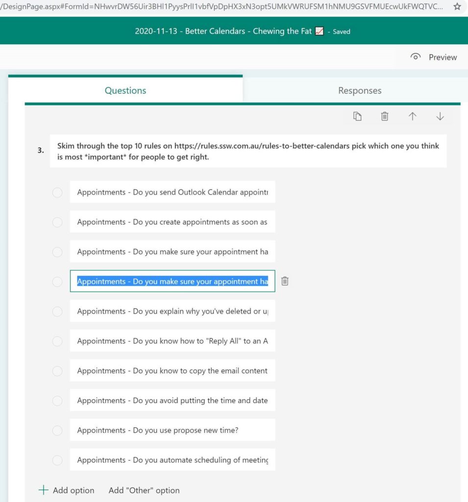
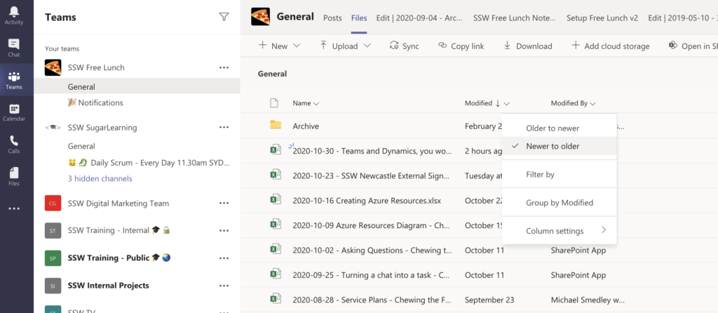
When you have a bunch of Microsoft Forms – it would be nice to sort descending:
PS. Easy thing in a PC…
I add people into Teams calls all the time and I switch devices during group calls often. No problems.
There is a problem on an individual call and I believe there is a nasty scenario that the other person experiences when I change devices. The other person accepts the new call from me and then they have a:
…Right now I am in a call (with a person called Jernej K) and the Teams | Calls list does not reflect my current call… it would be handy to show that person at the top eg.
Jernej K
(your current call)
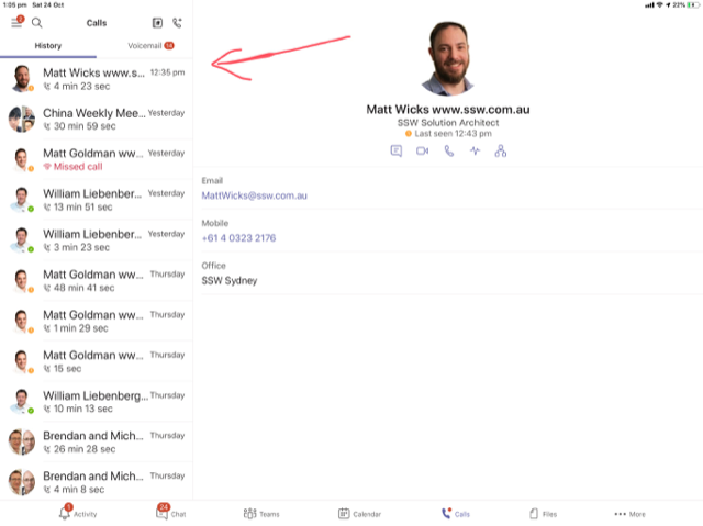
…For this current example, when I call him from another device (say my current ipad battery is low or the camera is temporarily not working until a reboot) it would be good to clean up the current experience.
Currently he receives another call from me and answers it like normal.

Then he sees the existing call is ‘On hold’ (but he can hear me fine).

On my end I see the current call… and the old device has that call ‘On hold’ so I naturally hang up the call from the original device (eg. iPad with low battery), the ‘On hold’ call disappears on the other’s side and the call is still active.
When this happens, he can’t see the call and there is no visual indication for it (eg. if I was to go mute, I can hear him but he doesn’t know he’s still on a call). 💥
Note #1: *IMPORTANT* His current status in a Teams is showing as “In a call” instead of “In a meeting” (so there is a way he could detect the phantom call).
Note #2: I was using 3 iOS devices and a Surface Laptop and the other person (Jernej K) was using a PC (Windows Desktop client). We were able to replicate this every single time in various setups.
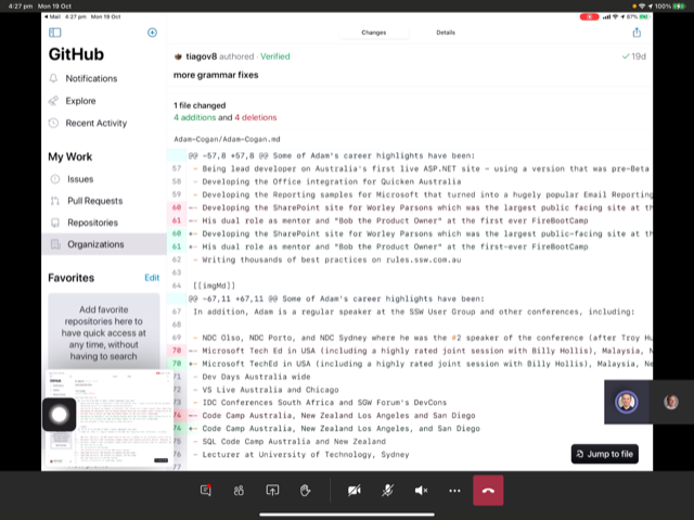
I discovered a possible UX issue when modifying a GitHub Pull Request using the iPad App.
There are multiple popups that appear, which is noisy and unintentional.
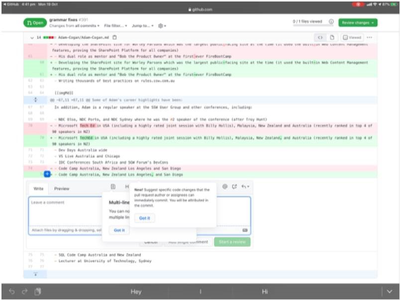
I wonder if this is the intended UX… I am aware one benefit of this UX is that the user knows which popup to read first.
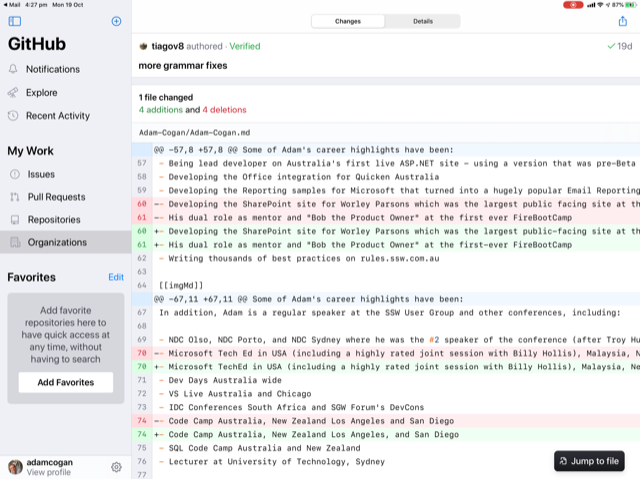
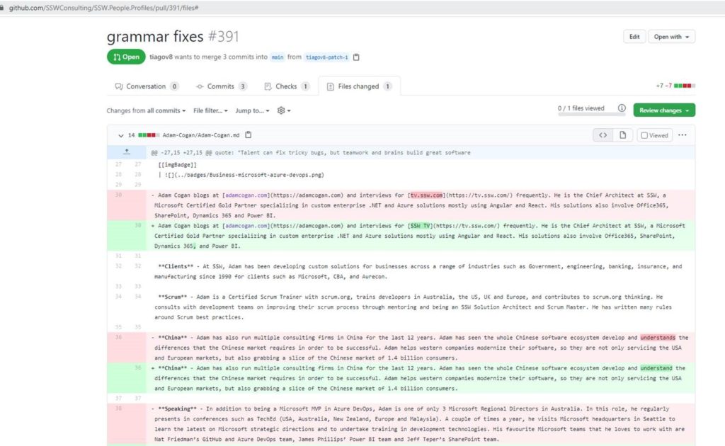
I found an issue when using the GitHub App on the iPad when reviewing a Pull Request.
It’s not clear to see the changes and for small grammatical changes the web view is required.