On Invixium | Access Rule we have “Biometric + PIN”…
Can we also have “Biometric or PIN” so if our fingerprint will not work we have a backup option?
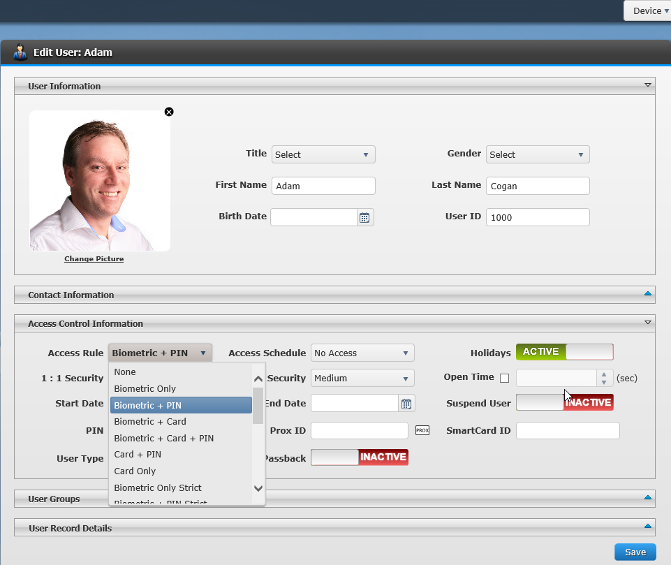
On Invixium | Access Rule we have “Biometric + PIN”…
Can we also have “Biometric or PIN” so if our fingerprint will not work we have a backup option?

I felt like wasting my time with all these pop-ups since only a fraction of the calls we receive are from clients or serious leads.
For most of the calls received, no CRM action is needed because it’s a telemarketer, a recruiter, a wrong number, or a non-client. I would also have preferred if instead of a whole new window, a small alert appeared in the task tray… which if clicked would then open the CRM window, so you could choose when to use it, instead of having it forced upon you every time.
I found the forced-opening of new CRM tabs every time anyone answered the phone was intrusive. Ideally, the pop-up would only open for the individual answering the call.
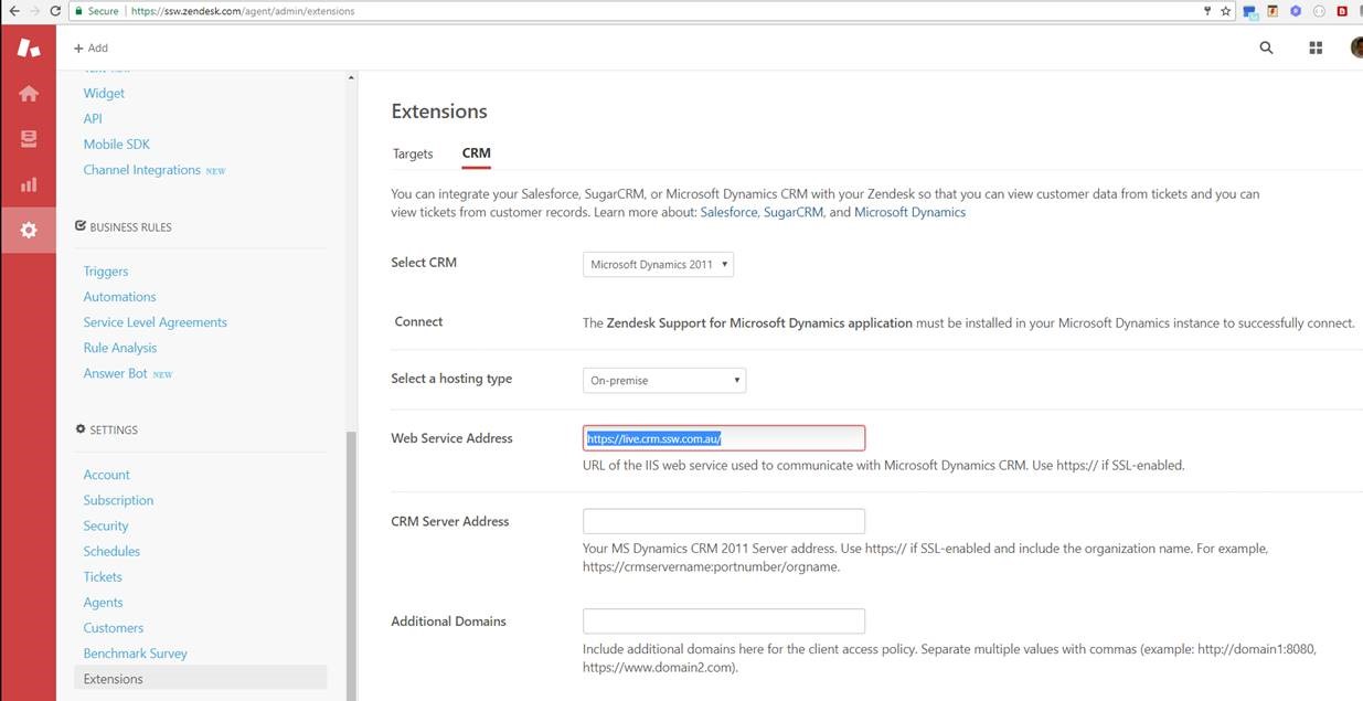
Zendesk only has an extension for Dynamics 2011.
I expect to see 2 more options: “Dynamics 2016” and “Dynamics 365”.
ZenDesk IOS app chats – How do I see the history of chats and review my guys’ conversations?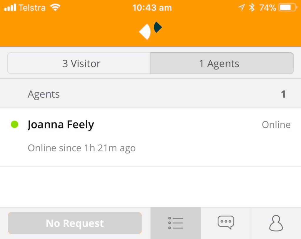
I have a lot of editing options on Photos App for Windows 10, but I can’t resize. Had to open Paint to do so. Photos Apps should have this functionality or at least link me to Paint.
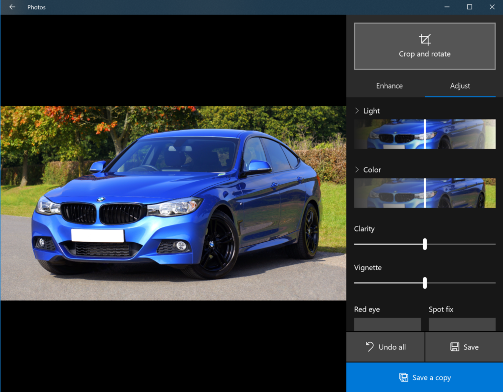
Figure: Windows 10 Photos built-in app doesn’t have a resize functionality
Help me see how many of each is turned on:
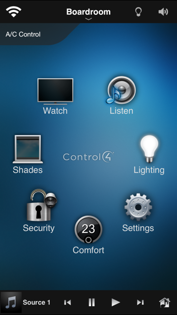
Eg.
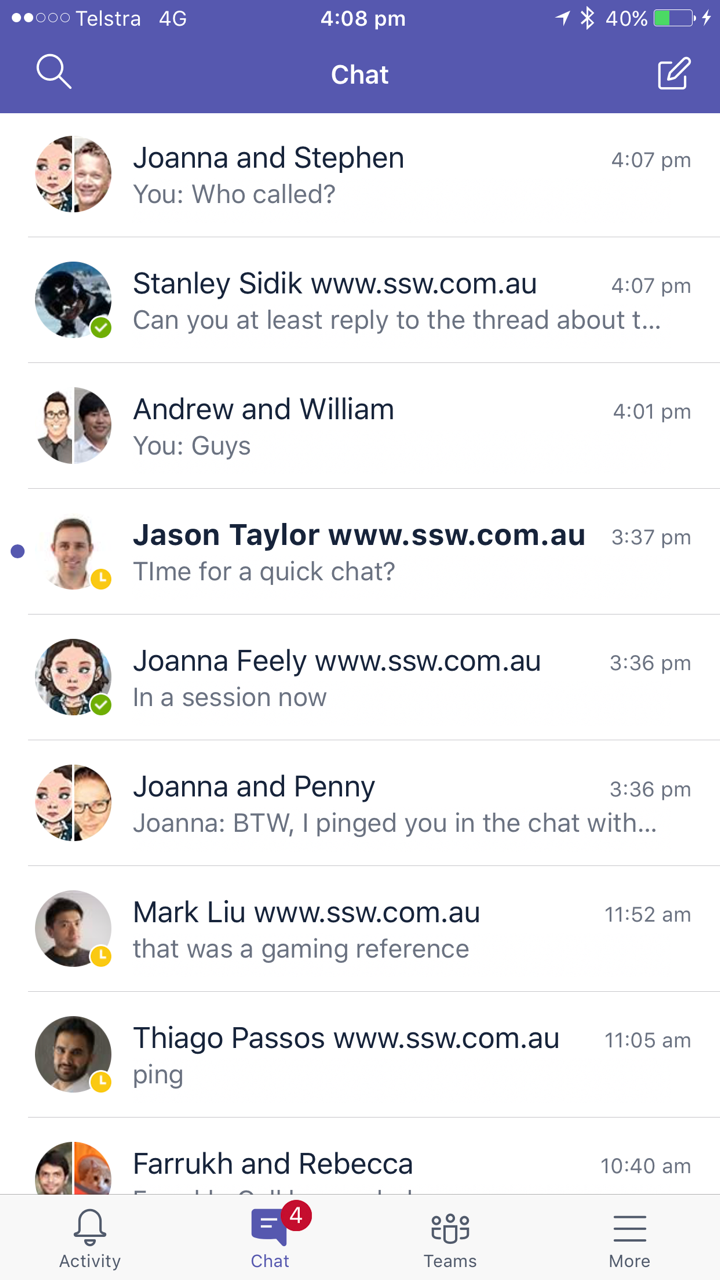
Like the red notifications you see on an iPhone:

I have more than 4 people to get back to…. So please give me the ability to mark a message as “unread” …
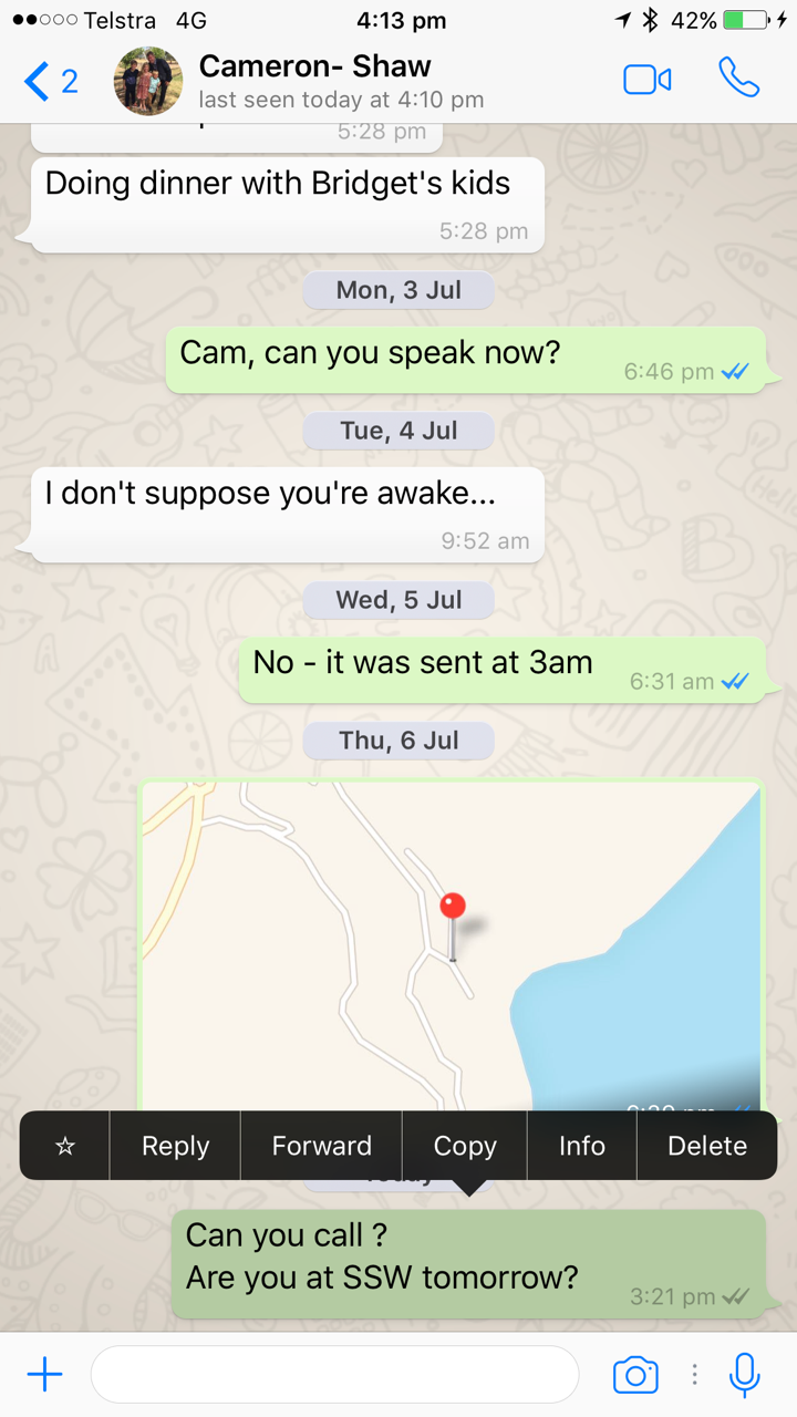
Or even better “star” a message like WhatsApp:
Or give me categories like outlook.
Sorry I’m just forgetful. 🔥
If trying to print a report from the web published view (i.e. https://app.powerbi.com/view…….etc.) , it zooms in on the middle right of the report, instead of printing the full page.
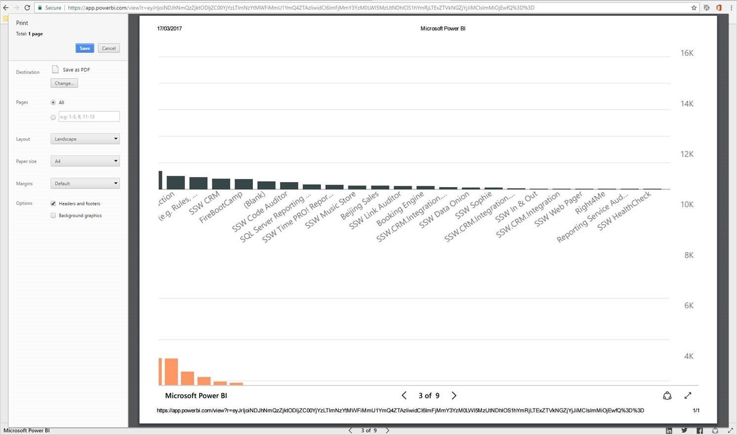
Figure: Bad Example – Print view of a Power BI report from the web published view zooms in to the middle of the report
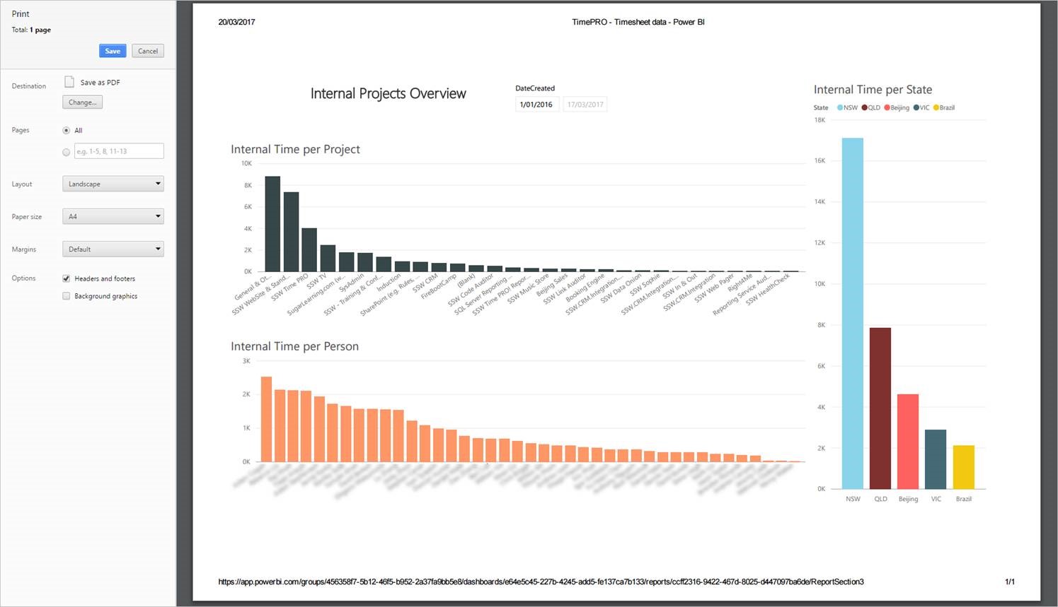
Figure: Good Example – If you’re properly logged into the Power BI portal, the report prints fine
This needs to be fixed.
Why can I like a Team message…

…but not do the same in a Chat message?
