Help my menus have a nice way to customize them with images 

For our customers we get their SharePoint site pointing to Teams and vice versa… I believe it is the right thing to do but the right emoji would cause this to be more UI obvious ✨

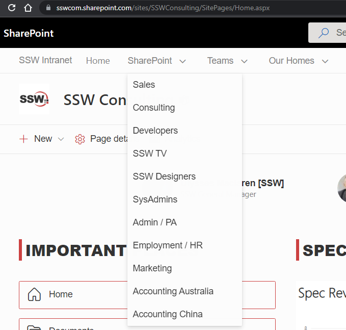
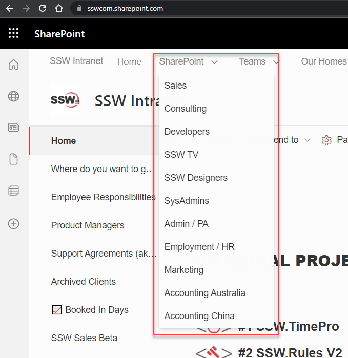
In SharePoint there is an issue with menu customization that blocks good UX. E.g. I want to have links to both the SharePoint portals and the right Teams in the menu.

Figure: Plain menu without icon/emojis is not very welcoming
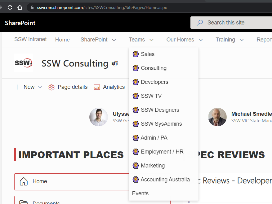
Figure: Emojis make it a bit nicer in some cases. In this case they are the wrong UI… I want to emphasize the fact that these are links to Teams (rather than SharePoint) being https://teams.microsoft.com/l/team/xxxxx

Ideally we should be able to use SharePoint and Teams official icons, i.e.:

Teams
SharePoint

But there doesn’t seem to be any supported way to do so! 

I assume it is a bad idea to inject HTML via a custom SPFX solution or some nasty CSS… It is better to stay within the framework and have easy upgrade.

In summary I am saying that emojis do not do the job every time (BTW I do love emojis). This is one example where emojis are not as good as images.

SharePoint is important to us. It is the intranet of almost all SSW’s clients. I am suggesting that SharePoint should not be making the job of putting images in a menu, hard. It should be simple. 

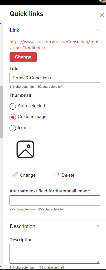
The goal should be to make it the same as other webparts. I’m thinking of the ‘Quick Links’ Web Part.  Please allow us to add a custom image or an icon to all of our menu items.

✅ Figure: Good example – Add a custom image in the Quick Links web part is easy

Help me to allow SSO from Azure

Being able to sign in using Azure to almost everything has been around for a few years now. Why is this still not available to use in 1Password? This means that staff just require a single password to login to almost all the services that they use. They can make that a nice long password or even be password-less and sign into everything.

If SSO with Azure was enabled then we would also be able to use Conditional Access Policies. We already have Conditional Access policies that not only check where a user is signing in from (which can also be done in 1Password) but we are also able to restrict which devices can login and for users of Azure AD Premium P2 we can use Microsoft’s AI and stop ‘Risky Users’ from signing into our 1Password. This would also allow us to use our existing MFA solution (instead of needing a new one for 1Password).

Help me to add folders and subfolders

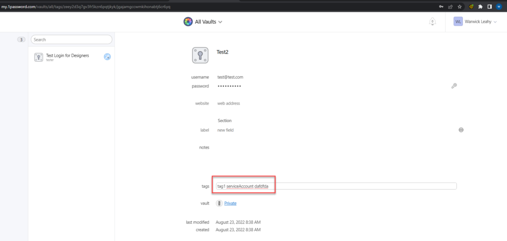
1Password has decided to use a solution to sort passwords using free text tags. This works well in small teams but in large teams this won’t work. Can you imagine how many possible spellings there are for Service-Account? The only other solution is to have multiple vaults, but that isn’t ideal either as then we would need a vault for SysAdmin-SVC-Accounts, Designer-SVC-Accounts and Dev-SVC-Accounts. This presents problems because then we would need to set permissions on each of those. There is also a possibility that we might need to put the same login in more than 1 of those vaults. This would not be a problem if we had folders and subfolders.

It would even work better if Tags could be specified by Admin users and passwords could be set to require at least 1 tag. But as it stands, if we want our users to add and update details then they are able to create free text tags or even worse not put a tag at all.

Figure: Note that tags are entered in free text and not required

Help me have consistent short URLs

I think URLs matter and I prefer neat ones.

I’m experiencing a weird bug on our Intranet and cannot figure out why this is happening.

Everytime I click on one of the menu items the URL shows slightly differently.

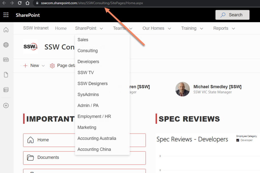
We have several portals (Team Sites) linked from our Hub Navigation:

Figure: Each item links to a different portal, i.e. https://sswcom.sharepoint.com/sites/XXX

Every single link is setup using the short URL form – i.e. not linking directly to the aspx page.

However, sometimes/often/randomly, when clicking one of the menu items, the URL is somehow rewritten to https://sswcom.sharepoint.com/sites/XXX/SitePages/Home.aspx

Figure: URL being randomly rewritten to the “full” form (i.e. full page’s path)

Moreover, clicking the Site’s “home” tile (i.e. Site Logo) will almost always toggle – yes toggle – between the two URLs… 

I have noticed that, before it flicks to the “long” form, there is a weird querystring parameter being added for a split second, and then the rewrite happens:

Figure: Weird “sw=auth” querystring parameter
  1. Can you please explain what is causing the issue?
  1. How do we fix it? 
    We want to be using the “short” form as much as possible

Help me find the advanced location to manage access

Hey Teams / SharePoint Team Product Owner,

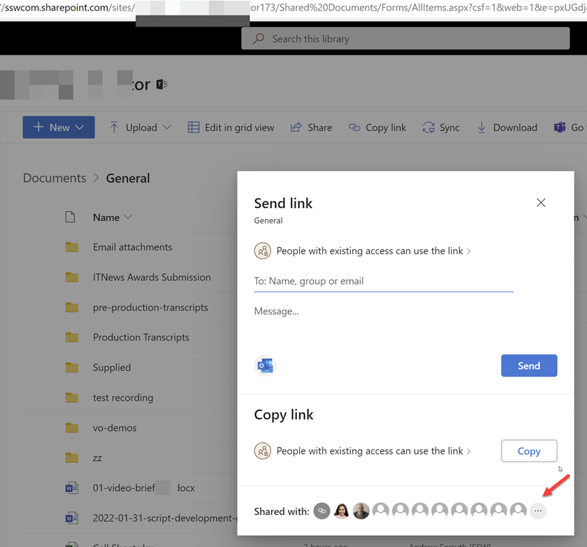
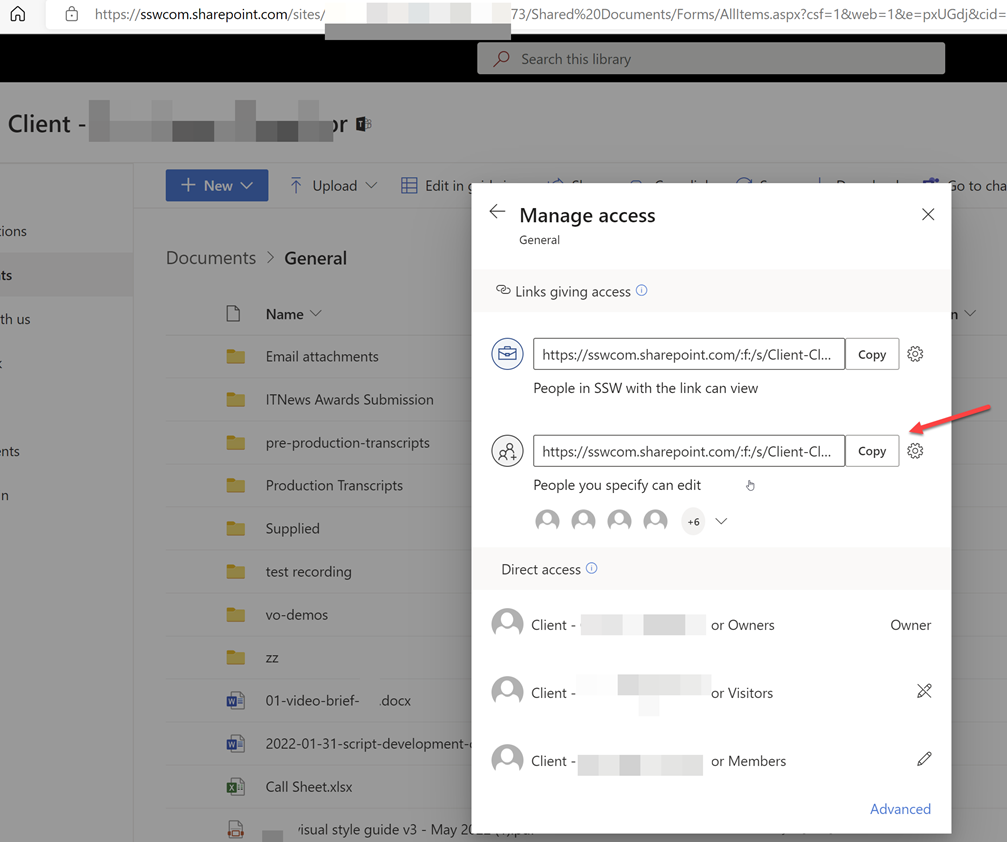
I don’t think this UI is clear to users. I just did a quick poll and people that use this UI did not know about the 3 dots “…” (see red arrow)

Please change to a 3rd button that says “Manage” or “Manage Access” 

Figure: Bad UX – Who clicks these 3 dots?

It then brings open this …

Figure: Use the Share | Shared with | Manage access… – then users can get the correct link to give users

Help me see changes in the Audit logs for distribution groups

Say you add user to a group… you should be able to see this change in the Azure AD Audit logs.

Figure: New user added to a distribution group

The Audit log details work great for users. For example, when you make a change to a user in AD and sync with Azure AD (using AAD Connect), you get great visibility of what was changed.

✅ Figure: Good example: Azure AD | [user] | Audit logs | Audit Log Details with Old Value & New Value

Sadly you can’t see who changed it.

When you make a change to a distribution group in AD (e.g. add a new member) and sync, there are no details at all

❌ Figure: Bad example – Azure AD | [group] | Audit logs | Audit Log Details shows no details (you can’t see that a new user was added to the distribution group)

Suggestion: Please add the details of who changed what for both users and distribution groups in the Audit logs.

Help me know who I am signed in as

When filling in a form the user icon (aka Account Name) on the top right is missing.

It would be awesome if the Forms questionnaire showed who was signed in. They could copy the Forms responses which is really clear. So it would be awesome if they had the same green bar below:

✅ Figure: Good example – In the green bar I can see who is signed in being “PW”
❌ Figure: Bad example – How the forms currently look – there is no indication who is signed in

Help me know what license I have

There is inconsistency in the Person menus…

✅ Figure: Good example – Power BI shows my “License type:” is Pro
❌ Figure: Bad example – Office 365 does not tell me what license I have
❌ Figure: Bad example – Dynamics 365 does not tell me what license I have

More Info: 

In this case the Office | Person menu should show ”Microsoft 365 E3”

And link off to  https://portal.office.com/account/?ref=MeControl 

Figure: My Account shows the licenses you own

Teams Search – Help me find documents I have permissions to (BUG)

Teams search is super important, and I hope this one is on Microsoft’s backlog.

I expect Teams search and SharePoint search to have consistent results. Do others?

Not finding stuff you have permissions too is super frustrating. So this one has always confused me…. Do you consider it a bug?

Watch this one:

Figure: Teams and SharePoint Search Bug with Jean Thirion – YouTube (5 mins)

I think Jean did a great explanation of the permissions problem.


More info

This is really weird behaviour – fire up Fiddler and you can see what Teams is doing in the background. 

Turns out that when you search in Teams before it shows you what you have access to, it weirdly adds a refining query to only show documents from a list of every group you are a member of… 

Figure: This string of group id’s is about 75 items long, and I believe it is made up of every Team I am a member of… I’d like to turn this off
Figure: Query yields 1 result

When I remove that refining query, it works as expected:

Figure: In Fiddler when you edit the request and remove the group id refining query …it yielded 21 results

So I would say this appears to be a deliberate decision rather than a bug, though I think it is important to be able to turn it off if you want to find stuff using Team’s search 😂

In fact I would turn it off by default, so it is consistent with SharePoint Search