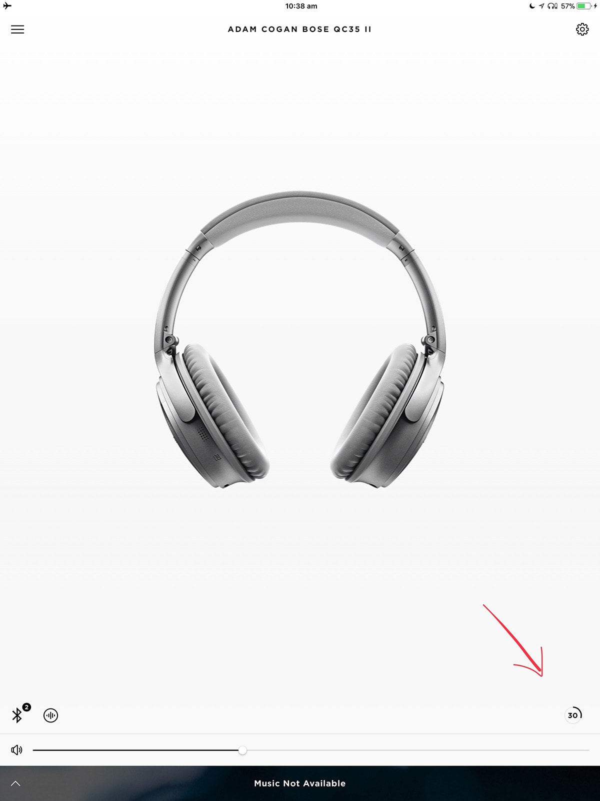
I can click on the 2 left icons, not the 1 battery icon on the right. That’s not good UX.
Can you enable it and show a graph of it degrading over the last 24 hours.

I can click on the 2 left icons, not the 1 battery icon on the right. That’s not good UX.
Can you enable it and show a graph of it degrading over the last 24 hours.
