Hey Teams / SharePoint Team Product Owner,
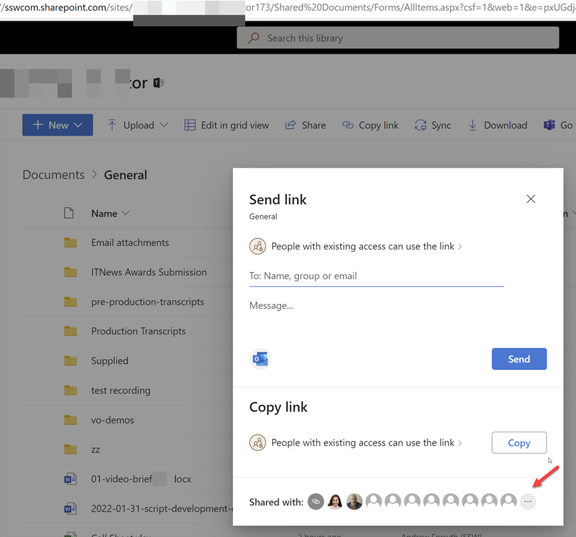
I don’t think this UI is clear to users. I just did a quick poll and people that use this UI did not know about the 3 dots “…” (see red arrow)
Please change to a 3rd button that says “Manage” or “Manage Access”

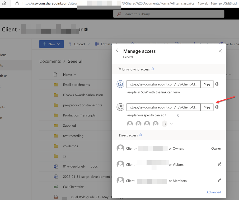
It then brings open this …

 -
-