-
- When you’re working, you’re usually working on a single project, and Azure DevOps and Github are great to use. However, I often find myself needing to look across all the active projects that are going on in a company, and that is the stuff that’s hard to quickly see what they are. There are gaping holes to being able to see what the current projects are and what the tech inside them are. This post is about the tech we currently use, and what we’d like to see.
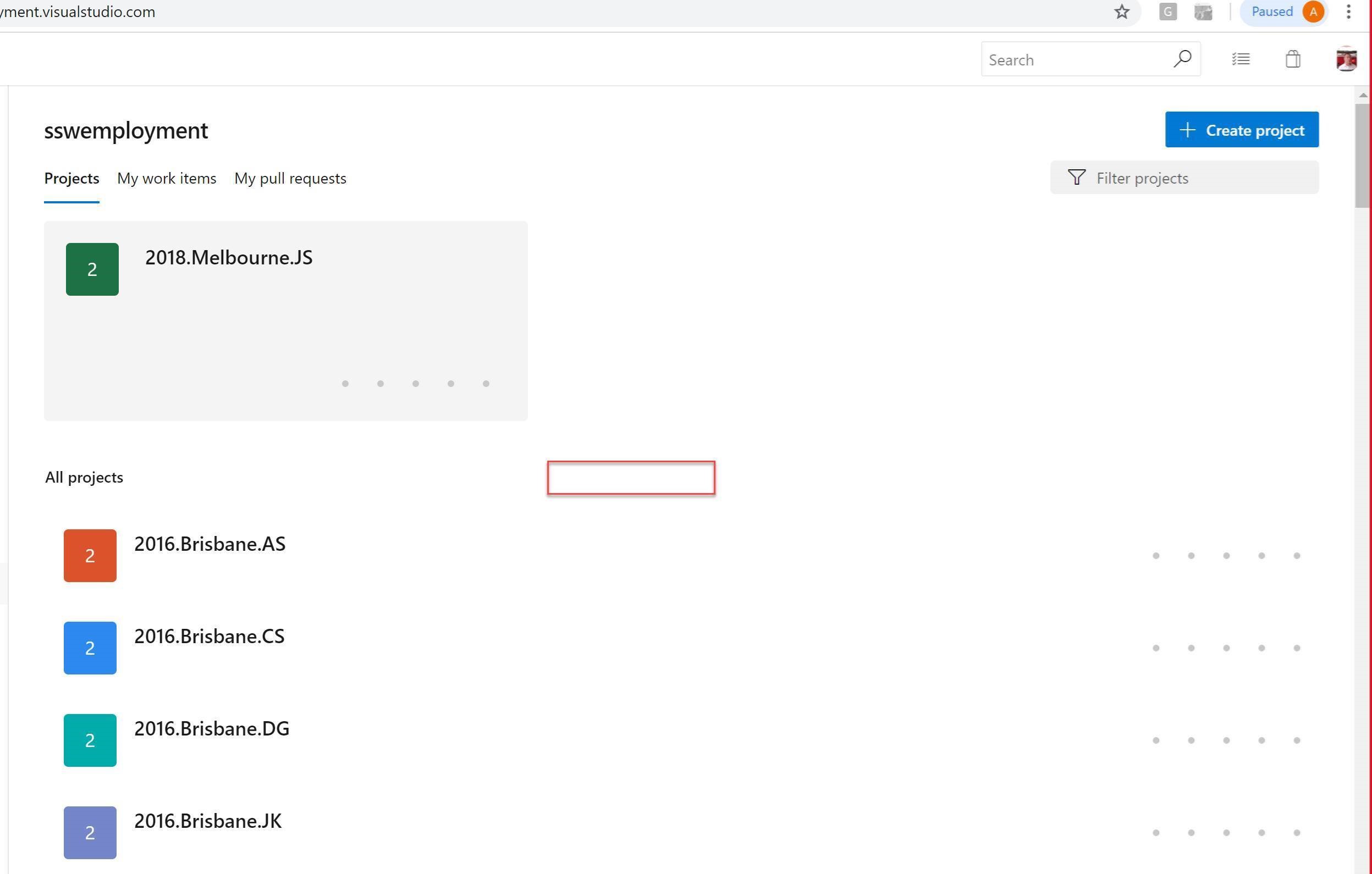
Going to a company and seeing the current projects and what tech is in them is not a particularly easy process – it’s a lot of manual work, and it’s easy to miss a couple.
Say your project is basically a Vue.js, .NET Core 2.1, Azure Logic Apps and Azure AKS. I think it would be wonderful to see that straight away in the tags.
Some NuGet packages are important. e.g. Entity Framework or Azure Table Storage. These tell you a bit about the project before you even have a look at it. An amazing feature would be to improve the Auto Tag feature (for both products). I also think showing these tags would be good advertising for Azure.
More info
For any project, we would like to know the Languages in use (e.g. C#, TypeScript, JavaScript) and Technologies in use (e.g. ASP.NET Core 2.2, Hangfire 1.6).
GitHub has Topics to represent Technologies. The Topics can come from the most popular Topics or can be custom, but they are not automatically added to the project.
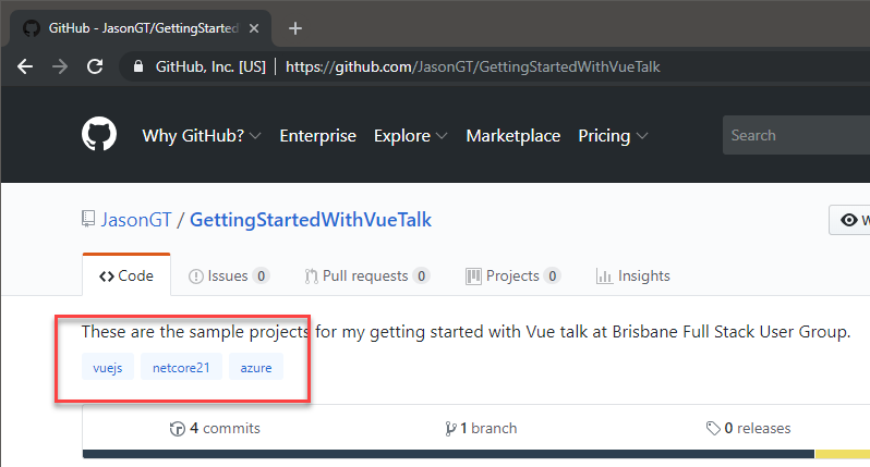
Figure: The technologies are displayed, but are not automatically added
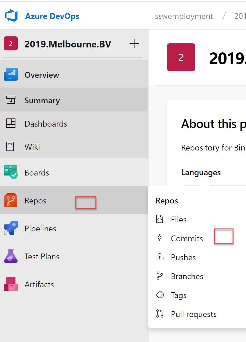
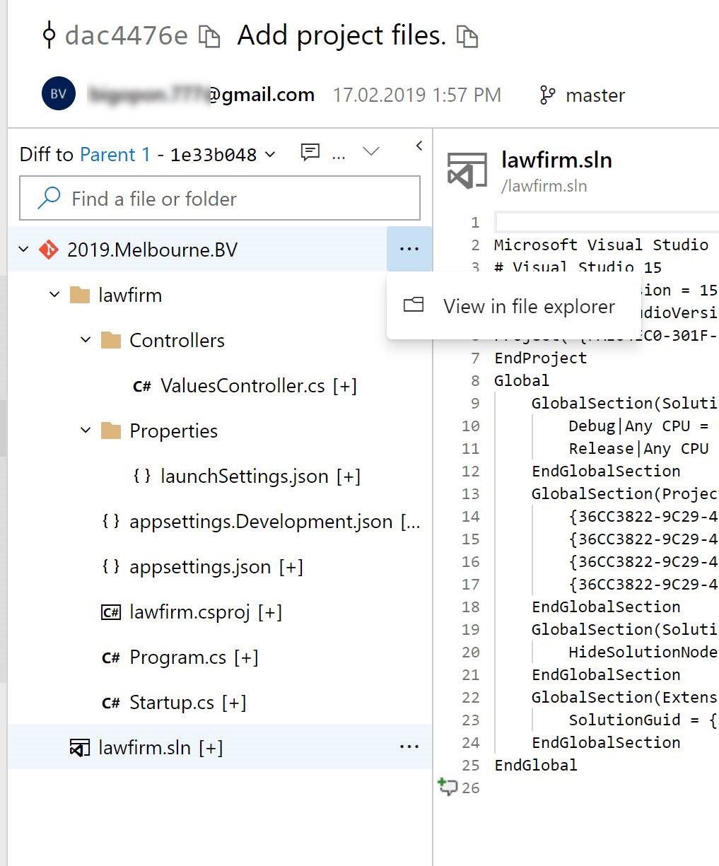
Azure DevOps has Languages and these are awesomely automatically added (see figure below). It also has Tags, and these can be used for Technologies, but this is completely manual and you can’t choose from a list of common Tags.
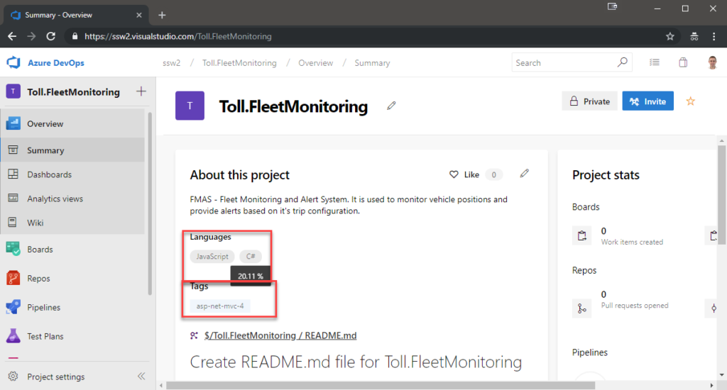
Figure: The Languages are added automatically and include percentage of usage. Tags can be added to represent Technologies
Ideally, we would like to see the best of both worlds as follows:
- GitHub and Azure DevOps should work the same.
- GitHub:
- Technologies and Languages should be auto-added based on the source code.
- We can also add them manually.
- Azure DevOps:
- Technologies should be auto-added based on the source code (as is the case for Languages).
- We can also add them manually.
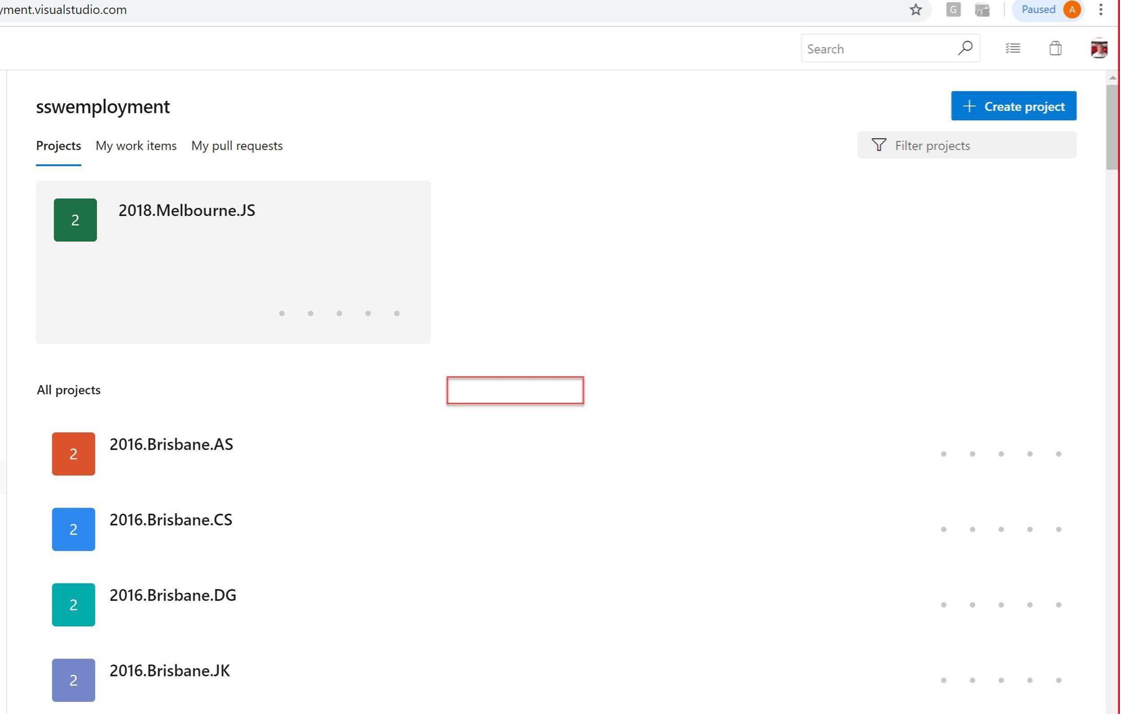
- This information should be able to be analyzed across *all projects* for an organization.
eg. A button “Analyze all projects” to the right of Languages / Tags (in the whitespace).
Wouldn’t it be awesome to use this for comparison across the organization.
PS: Maybe a future relation will be the Analytics Extension (when Code and Build is added) https://marketplace.visualstudio.com/items?itemName=ms.vss-analytics
Of course, if I got this granted, my next wish would be to be able to see bug regressions, number of deployments to staging, number of releases to production.