Do you agree that products always have room for improvement?
"Every day there are little things in software that we find annoying. Some write books about it, like Annoyances.org, but I thought this site would be more constructive.
BetterSoftwareSuggestions.com is proudly maintained by myself and the developers at SSW."
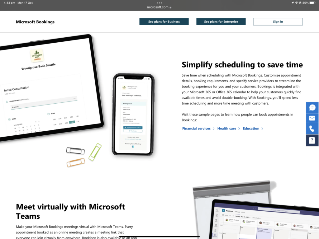
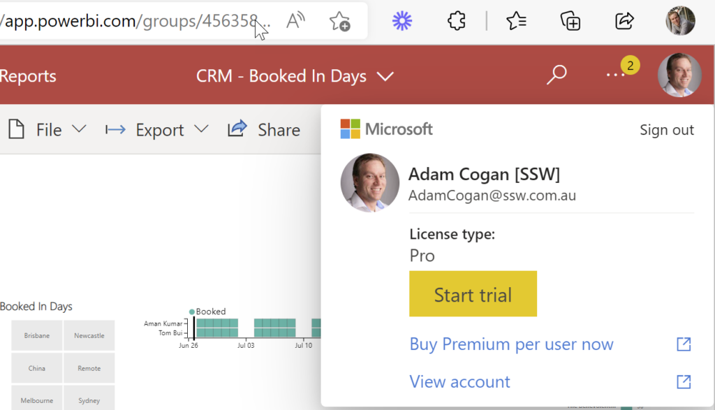
This looks to be a nice scheduling & bookings app.
It might work for prospects booking themselves for initial meetings.
I was hoping it might be a bit more powerful. We looked at it for some customer scenarios and discovered it does not support recurring appointments – an instant showstopper!
I guess an alternative to look at now is the Dynamics 365 Resource Scheduling… Anyone use that?
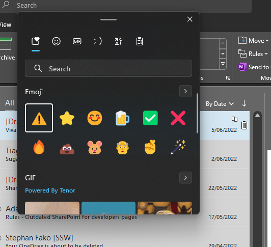
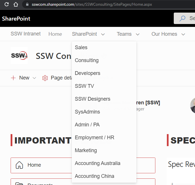
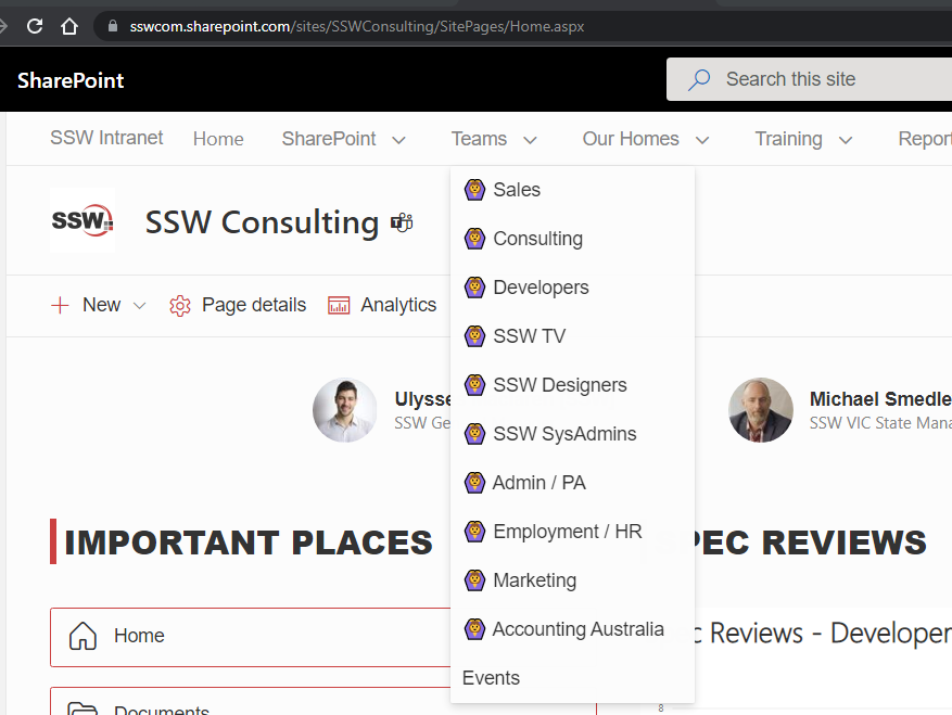
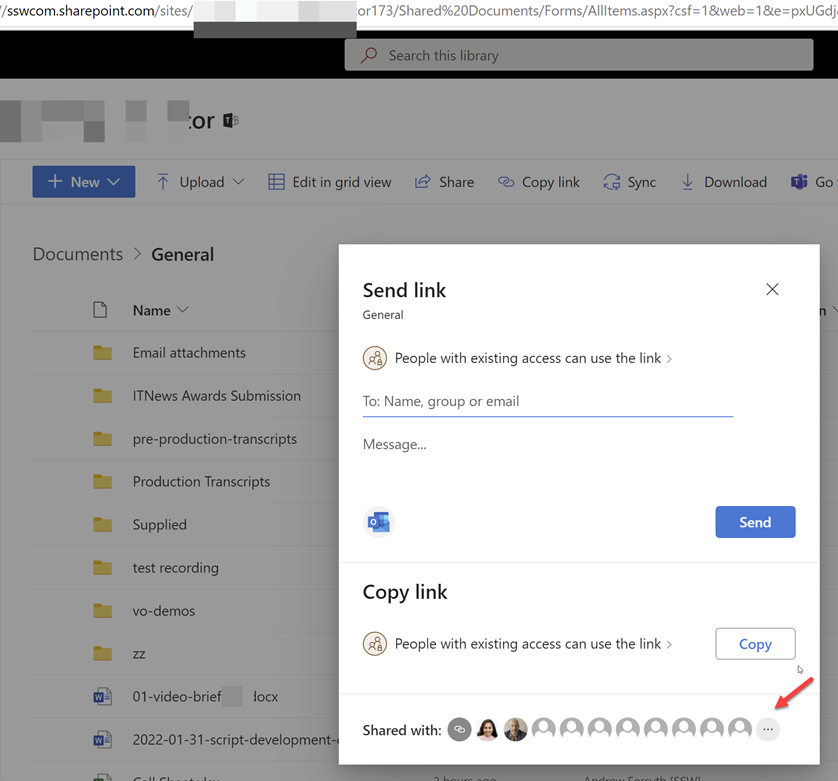
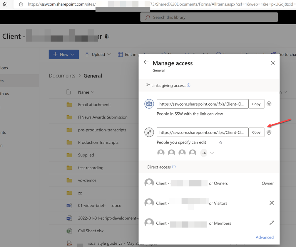
For our customers we get their SharePoint site pointing to Teams and vice versa… I believe it is the right thing to do but the right emoji would cause this to be more UI obvious ✨
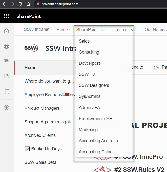
In SharePoint there is an issue with menu customization that blocks good UX. E.g. I want to have links to both the SharePoint portals and the right Teams in the menu.
Ideally we should be able to use SharePoint and Teams official icons, i.e.:
But there doesn’t seem to be any supported way to do so!
I assume it is a bad idea to inject HTML via a custom SPFX solution or some nasty CSS… It is better to stay within the framework and have easy upgrade.
In summary I am saying that emojis do not do the job every time (BTW I do love emojis). This is one example where emojis are not as good as images.
SharePoint is important to us. It is the intranet of almost all SSW’s clients. I am suggesting that SharePoint should not be making the job of putting images in a menu, hard. It should be simple.
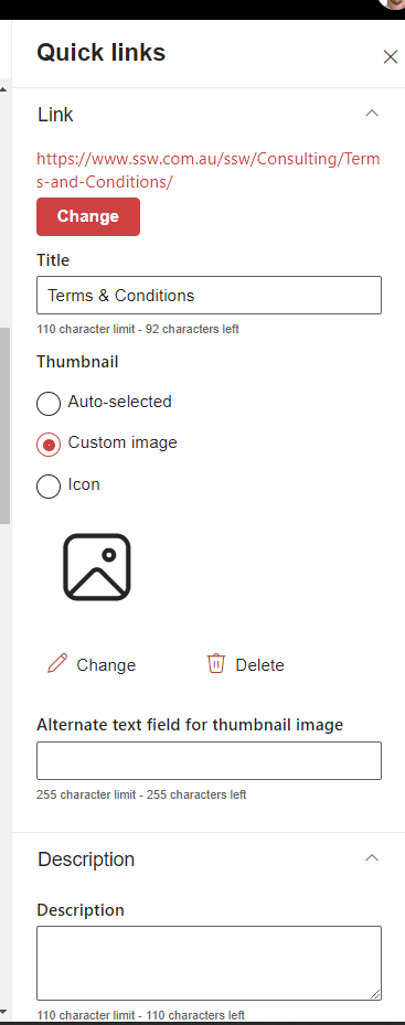
The goal should be to make it the same as other webparts. I’m thinking of the ‘Quick Links’ Web Part. Please allow us to add a custom image or an icon to all of our menu items.
I’m experiencing a weird bug on our Intranet and cannot figure out why this is happening.
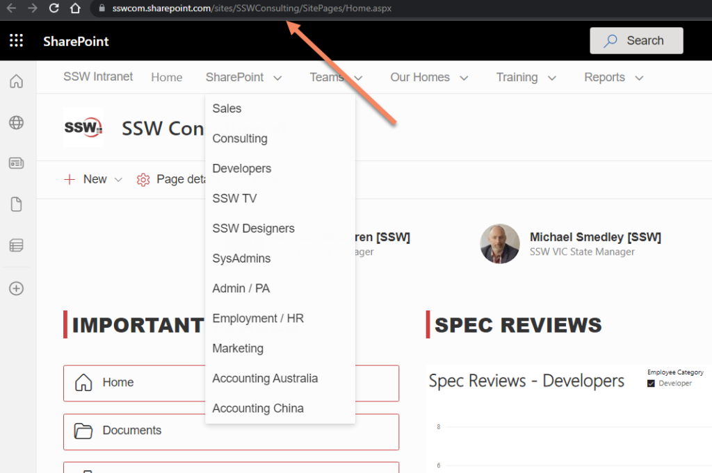
Everytime I click on one of the menu items the URL shows slightly differently.
We have several portals (Team Sites) linked from our Hub Navigation:
Every single link is setup using the short URL form – i.e. not linking directly to the aspx page.
However, sometimes/often/randomly, when clicking one of the menu items, the URL is somehow rewritten to https://sswcom.sharepoint.com/sites/XXX/SitePages/Home.aspx
Moreover, clicking the Site’s “home” tile (i.e. Site Logo) will almost always toggle – yes toggle – between the two URLs…
I have noticed that, before it flicks to the “long” form, there is a weird querystring parameter being added for a split second, and then the rewrite happens:
Can you please explain what is causing the issue?
How do we fix it? We want to be using the “short” form as much as possible
Teams search is super important, and I hope this one is on Microsoft’s backlog.
I expect Teams search and SharePoint search to have consistent results. Do others?
Not finding stuff you have permissions too is super frustrating. So this one has always confused me…. Do you consider it a bug?
Watch this one:
I think Jean did a great explanation of the permissions problem.
More info
This is really weird behaviour – fire up Fiddler and you can see what Teams is doing in the background.
Turns out that when you search in Teams before it shows you what you have access to, it weirdly adds a refining query to only show documents from a list of every group you are a member of…
When I remove that refining query, it works as expected:
So I would say this appears to be a deliberate decision rather than a bug, though I think it is important to be able to turn it off if you want to find stuff using Team’s search 😂
In fact I would turn it off by default, so it is consistent with SharePoint Search
At SSW we moved over to LinkedIn for our recruitment system (aka ATS being Applicant Tracking System) and it has been a good move, although it is much more $ expensive.
I find it annoying that there is no field to keep track of someone’s salary expectations. Currently I write it in a note:
How do you keep track of candidate’s salary expectations? What is the logic of not having this important field?
When looking at the feedback from my forms surveys, I prefer Bar Charts over Pies. Does anyone like Pies? – I find them less readable.
Suggestion: I would like to go to Tools | Options and set my preference
Question: I think I have noticed that Forms show Bars when there are 6 or more options. Right? If so, I guess I should always make sure I have 6 options 😊 😊
VS
That is an odd decision. I was just talking to a person form New Zealand who said:
“we actually have a rule to never use a pie chart :) The only time they’re somewhat useful is if you are comparing 2 things. Anything more and it’s not really readable”
Please fix it or give us an option to allow us to fix it.