Do you agree that products always have room for improvement?
"Every day there are little things in software that we find annoying. Some write books about it, like Annoyances.org, but I thought this site would be more constructive.
BetterSoftwareSuggestions.com is proudly maintained by myself and the developers at SSW."
We have a new feature “Delete” a chat. I’d love to know if people will use it.
I’m not sure I will use it as I like history in chats, but I regularly use ‘Hide” to remove a chat conversation (I am always aiming for a 0 inbox and a 0 chat list).
On the right click menu, notice the last 2 are about getting rid of a chat…. And so is “Hide” chat. Therefore it is in the wrong place.
Please can you move “Hide” with the bottom 2 menu items. Those 3 are related.
We all love Microsoft Teams and I think this UI looks like it is about to be clever, but it is not.
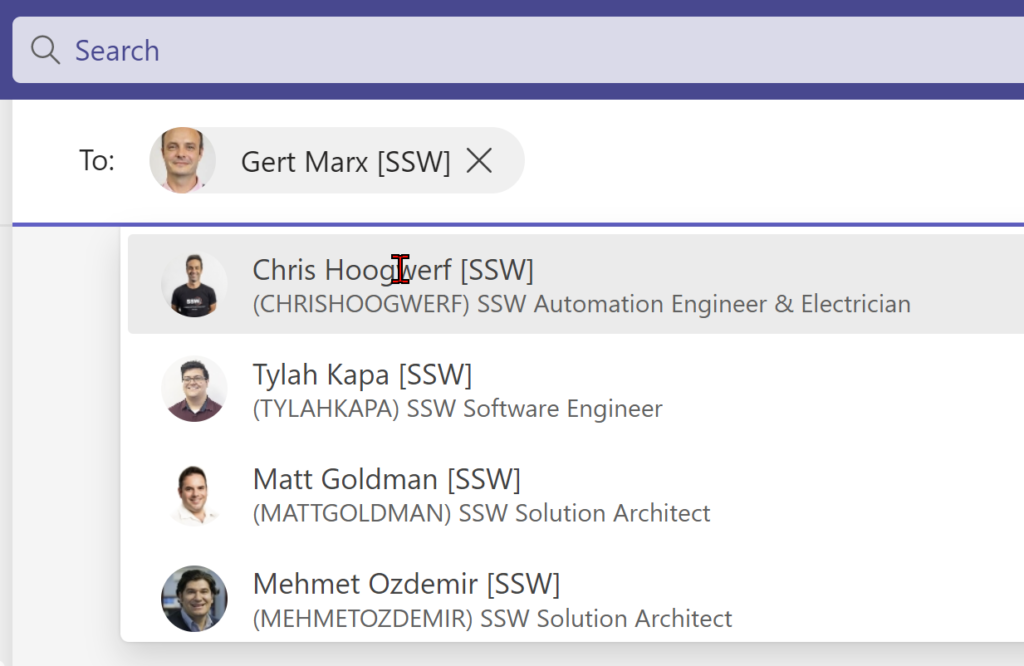
When starting a new chat… If I pick 1 person… please attempt to guess the 2nd person I will add to the chat. People are often related and I know it would be a nice for all Microsoft Teams users if the people picker showed the like people that I will chat with together.
Today, it doesn’t matter who I pick first in the chat, the search always shows the same people.
Figure: I type ‘Gert’ it pops open people, if I pick ‘Bob’ it pops open the *same* people!
Suggestion
Please pick who I will probably pick next … it should change the people based on who I am adding.
More info: Delve tells me who I talk to a bit, that would be ok. But when you talk to a manager, you probably are going to pick another manager. When I talk to an Azure DevOps engineer, I am probably going to pick another Azure engineer (not a React developer).
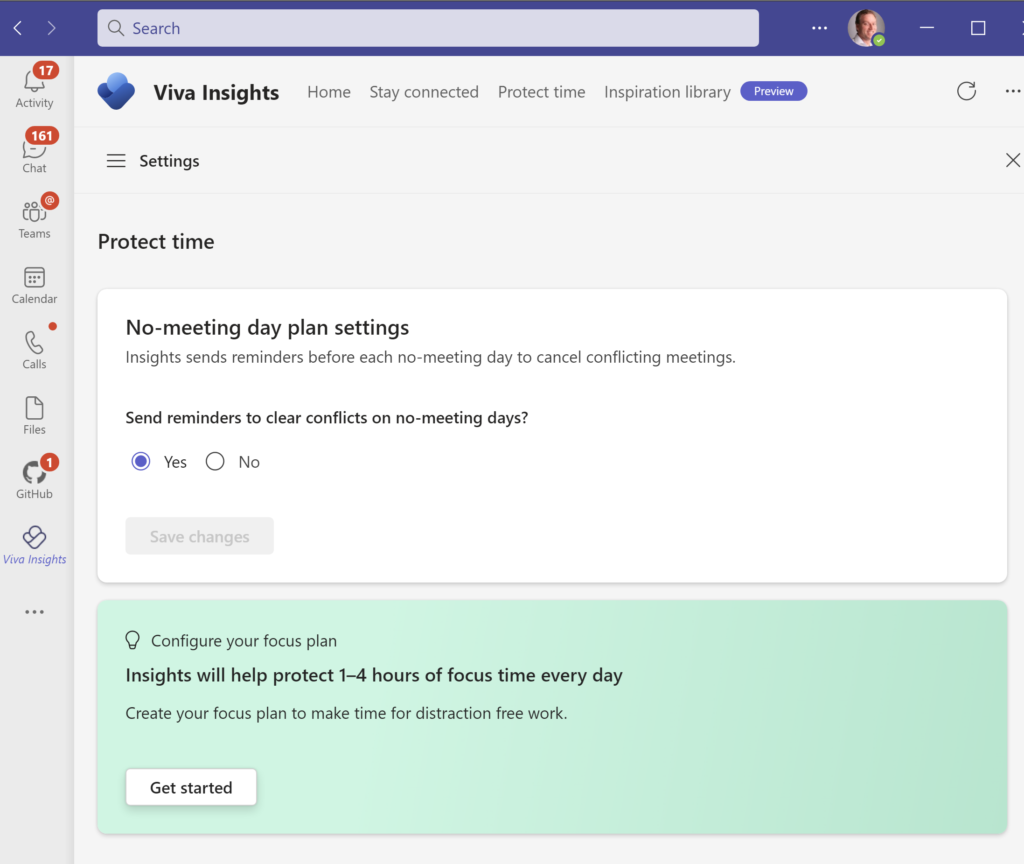
I liked the idea of Outlook giving me time to do work without interruption. All these little appointments appeared in my calendar and I was going to focus and get work done.
Clearly I was dreaming. Does anyone successfully use the auto created appointments “Focus time”?
Figure: I had heaps of these auto created appointments. People interrupted me anyway, so with a heavy heart, I deleted them
Suggestion #1
> Microsoft Viva Insights has scheduled your focus time in accordance with your focus plan and work week settings. > To edit your settings, visit your settings page at Protect Time Settings.
In an Outlook appointment, when I decide to click this link, I expected to see a button “Delete” or “Unsubscribe”
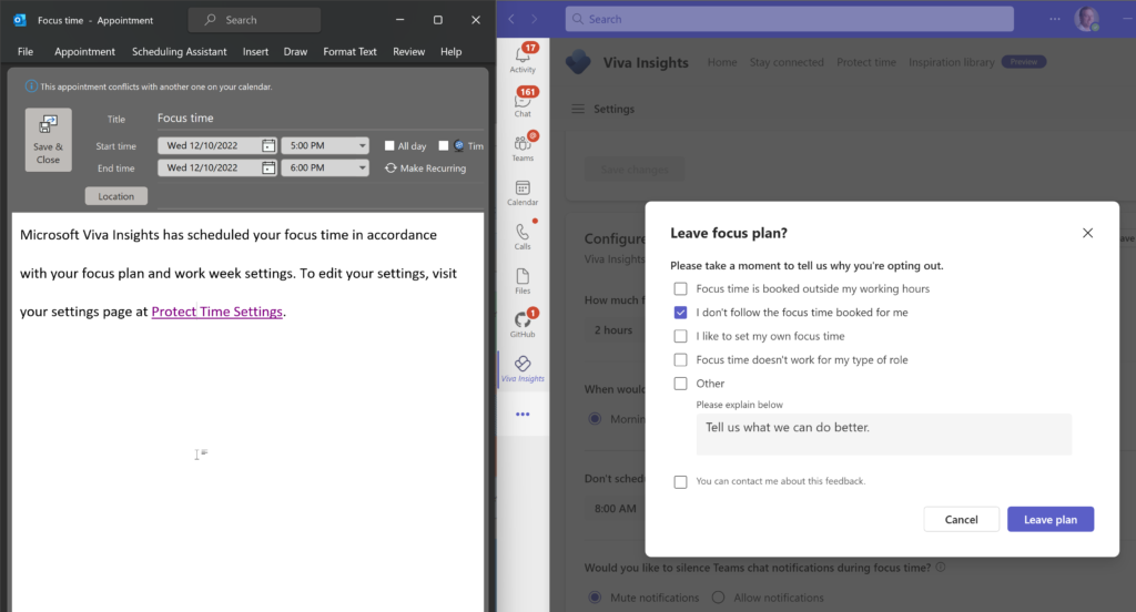
Suggestion #2
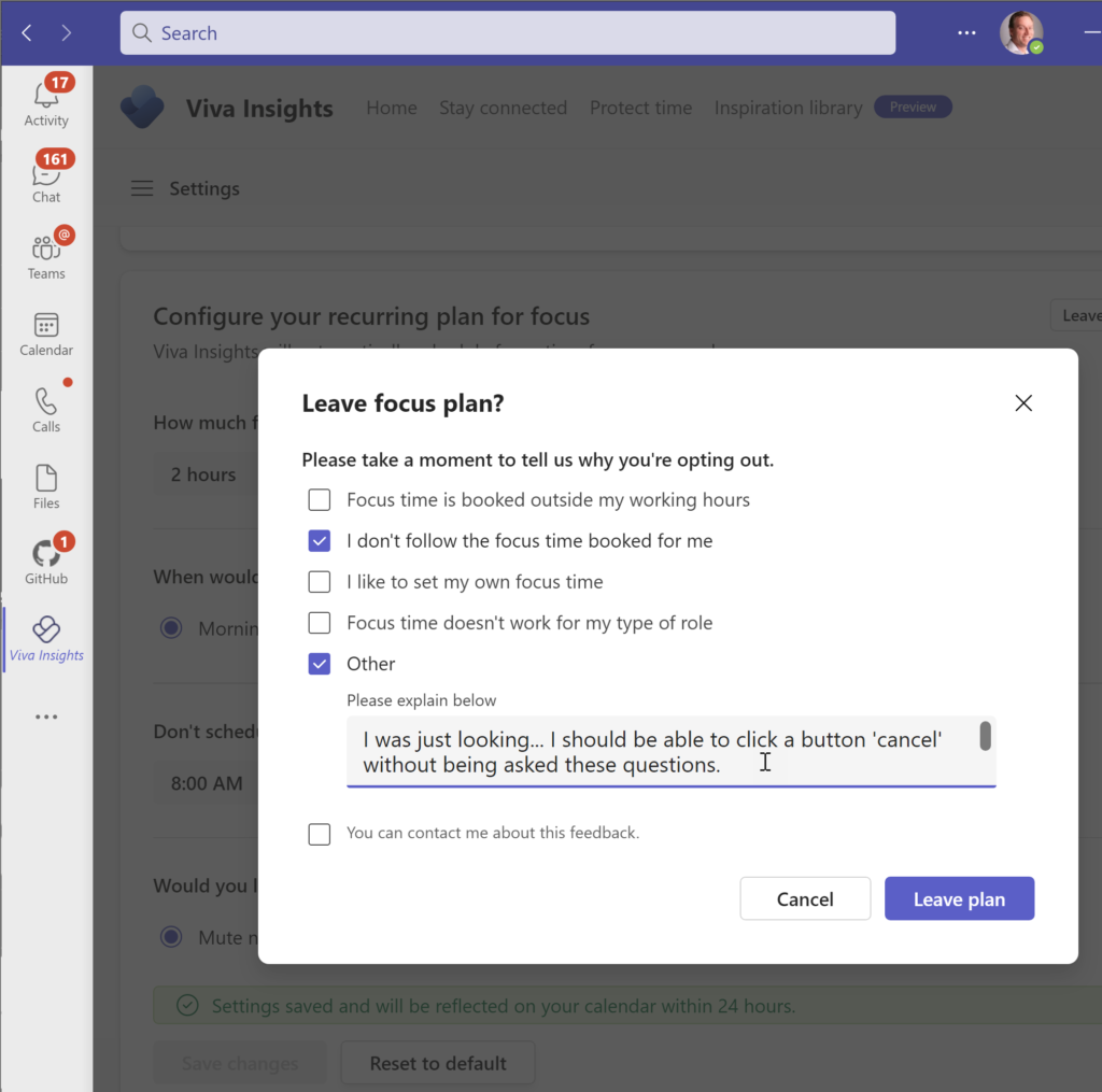
When using this people don’t think of it as a “Plan”… I reckon they think of it as a recurring appointment.
So testing it out, I click “Get Started”…
Figure: Try it out by clicking “Get started”
I am just looking, I should be able to click “Cancel”… I did not know what “Leave Plan” was about.
Also popping up these questions should only happen after I have been using it for more than 24 hours.
Figure: This was weird. You don’t want to be asking users questions this early. It is annoying to the user and useless data for Microsoft
This looks to be a nice scheduling & bookings app.
It might work for prospects booking themselves for initial meetings.
I was hoping it might be a bit more powerful. We looked at it for some customer scenarios and discovered it does not support recurring appointments – an instant showstopper!
I guess an alternative to look at now is the Dynamics 365 Resource Scheduling… Anyone use that?
For our customers we get their SharePoint site pointing to Teams and vice versa… I believe it is the right thing to do but the right emoji would cause this to be more UI obvious ✨
In SharePoint there is an issue with menu customization that blocks good UX. E.g. I want to have links to both the SharePoint portals and the right Teams in the menu.
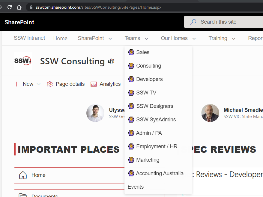
Figure: Plain menu without icon/emojis is not very welcomingFigure: Emojis make it a bit nicer in some cases. In this case they are the wrong UI… I want to emphasize the fact that these are links to Teams (rather than SharePoint) being https://teams.microsoft.com/l/team/xxxxx
Ideally we should be able to use SharePoint and Teams official icons, i.e.:
TeamsSharePoint
But there doesn’t seem to be any supported way to do so!
I assume it is a bad idea to inject HTML via a custom SPFX solution or some nasty CSS… It is better to stay within the framework and have easy upgrade.
In summary I am saying that emojis do not do the job every time (BTW I do love emojis). This is one example where emojis are not as good as images.
SharePoint is important to us. It is the intranet of almost all SSW’s clients. I am suggesting that SharePoint should not be making the job of putting images in a menu, hard. It should be simple.
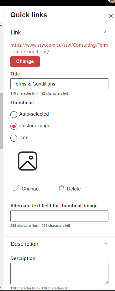
The goal should be to make it the same as other webparts. I’m thinking of the ‘Quick Links’ Web Part. Please allow us to add a custom image or an icon to all of our menu items.
✅ Figure: Good example – Add a custom image in the Quick Links web part is easy
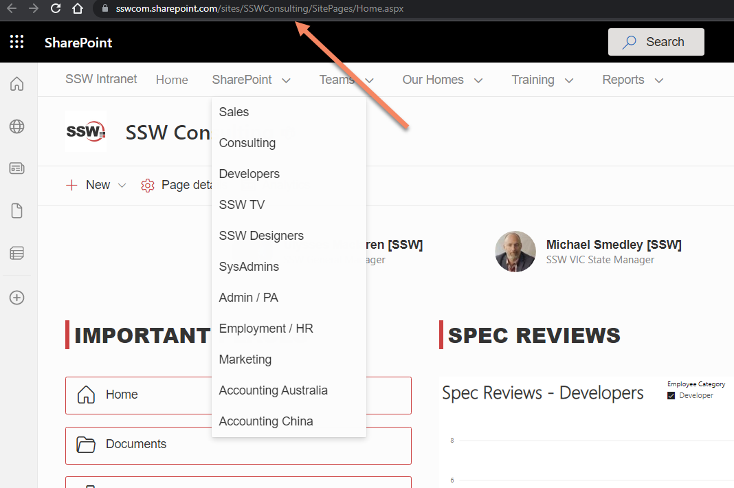
I’m experiencing a weird bug on our Intranet and cannot figure out why this is happening.
Everytime I click on one of the menu items the URL shows slightly differently.
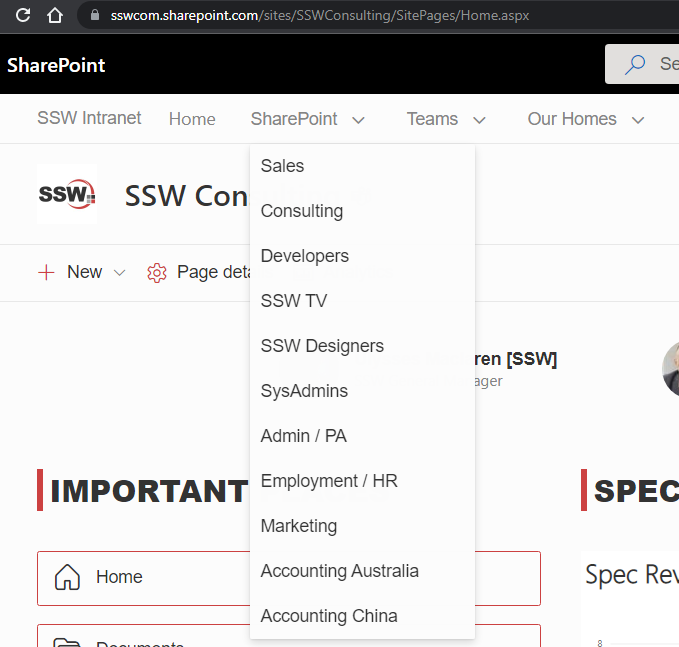
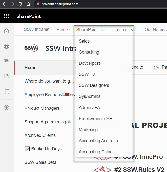
We have several portals (Team Sites) linked from our Hub Navigation:
Figure: Each item links to a different portal, i.e. https://sswcom.sharepoint.com/sites/XXX
Every single link is setup using the short URL form – i.e. not linking directly to the aspx page.
However, sometimes/often/randomly, when clicking one of the menu items, the URL is somehow rewritten to https://sswcom.sharepoint.com/sites/XXX/SitePages/Home.aspx
Figure: URL being randomly rewritten to the “full” form (i.e. full page’s path)
Moreover, clicking the Site’s “home” tile (i.e. Site Logo) will almost always toggle – yes toggle – between the two URLs…
I have noticed that, before it flicks to the “long” form, there is a weird querystring parameter being added for a split second, and then the rewrite happens:
Figure: Weird “sw=auth” querystring parameter
Can you please explain what is causing the issue?
How do we fix it? We want to be using the “short” form as much as possible
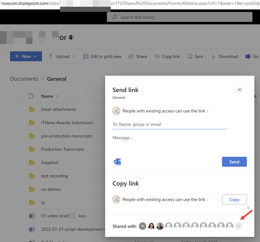
Say you add user to a group… you should be able to see this change in the Azure AD Audit logs.
Figure: New user added to a distribution group
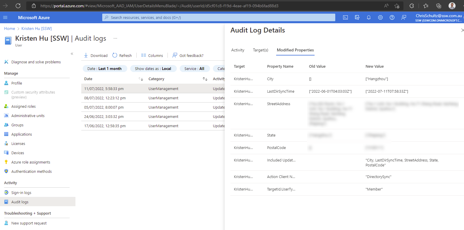
The Audit log details work great for users. For example, when you make a change to a user in AD and sync with Azure AD (using AAD Connect), you get great visibility of what was changed.
✅ Figure: Good example: Azure AD | [user] | Audit logs | Audit Log Details with Old Value & New Value
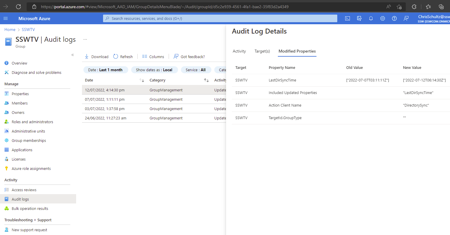
Sadly you can’t see who changed it.
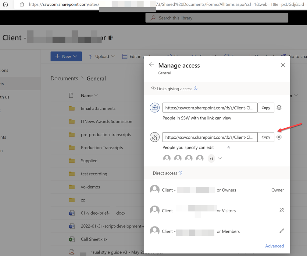
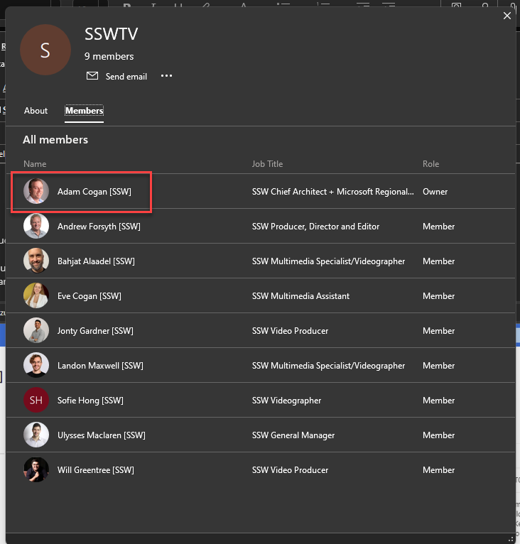
When you make a change to a distribution group in AD (e.g. add a new member) and sync, there are no details at all
❌ Figure: Bad example – Azure AD | [group] | Audit logs | Audit Log Details shows no details (you can’t see that a new user was added to the distribution group)
Suggestion: Please add the details of who changed what for both users and distribution groups in the Audit logs.
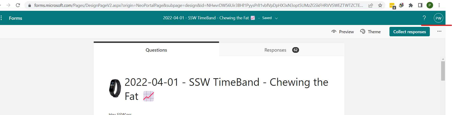
When filling in a form the user icon (aka Account Name) on the top right is missing.
It would be awesome if the Forms questionnaire showed who was signed in. They could copy the Forms responses which is really clear. So it would be awesome if they had the same green bar below:
✅ Figure: Good example – In the green bar I can see who is signed in being “PW”❌ Figure: Bad example – How the forms currently look – there is no indication who is signed in

 -
-