Do you agree that products always have room for improvement?
"Every day there are little things in software that we find annoying. Some write books about it, like Annoyances.org, but I thought this site would be more constructive.
BetterSoftwareSuggestions.com is proudly maintained by myself and the developers at SSW."
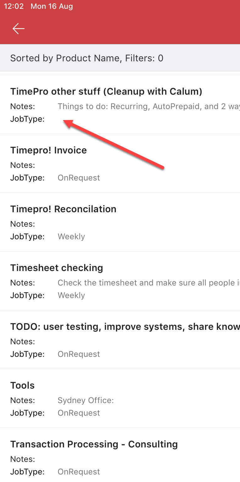
There are accessibility problems. E.g. I am having some of the 50 year olds in SSW reporting that they cannot even use the SharePoint app. Reason – they can’t read anything! Suggestion #1: below Suggestion #2: below
Note: it is not only the SharePoint app
❌ Same issue on the Dynamics app
✅ The Teams app has fixed this issue
✅ The Outlook app has fixed this issue
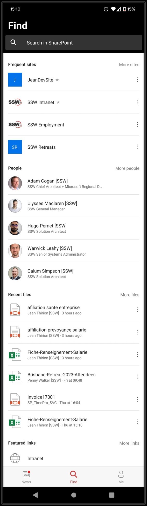
Figure: Android default is too hard to read for some.
Suggestion #1: Fix this accessibility problem by adding pinch to zoom (users expect the same as the web page)
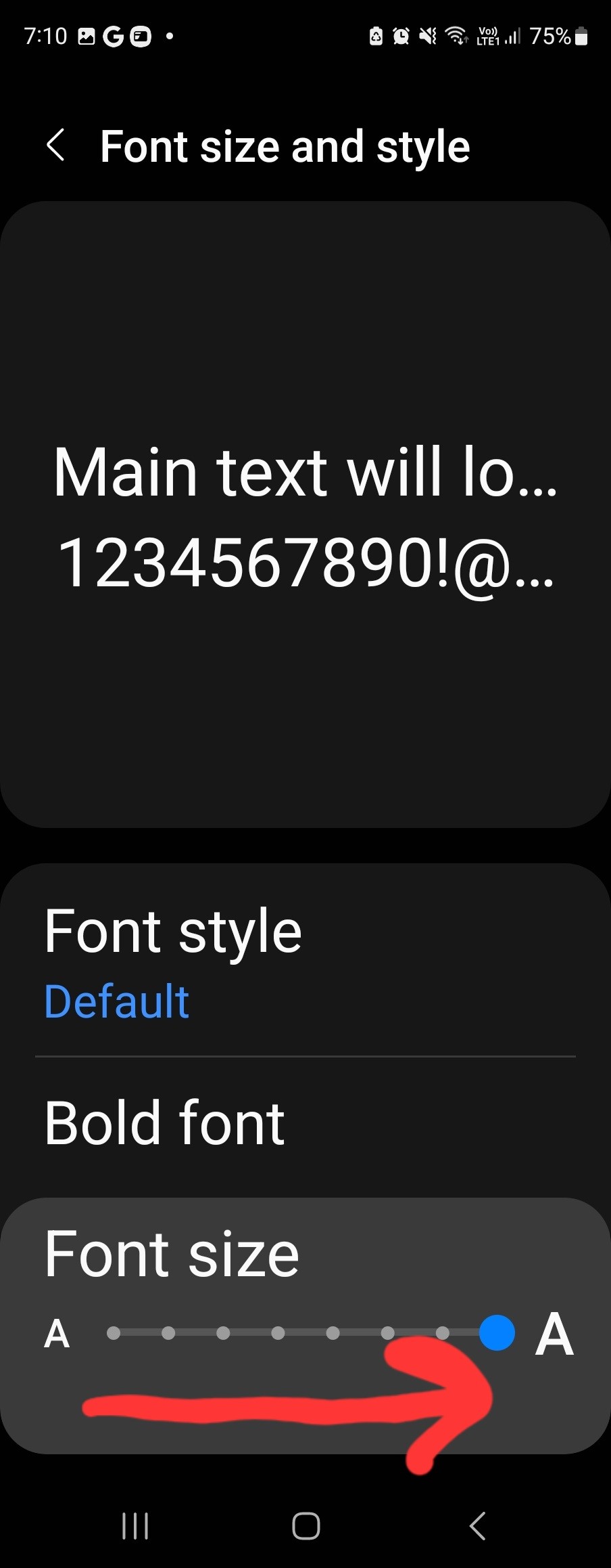
Figure: Android Settings
Suggestion #2 – add a Cogs button that would take the user to Settings | Font Sizeand Style where they can increase the system font size! People don’t want to use this setting because it changes everything on your phone.
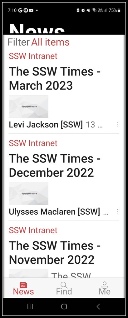
Figure: Android after increasing the size on Settings
Suggestion #2 is magic UX – see it is broadly fixed (❌ the top “News” is weird)
iOS seems to have a different problem
Figure: iOS normal view
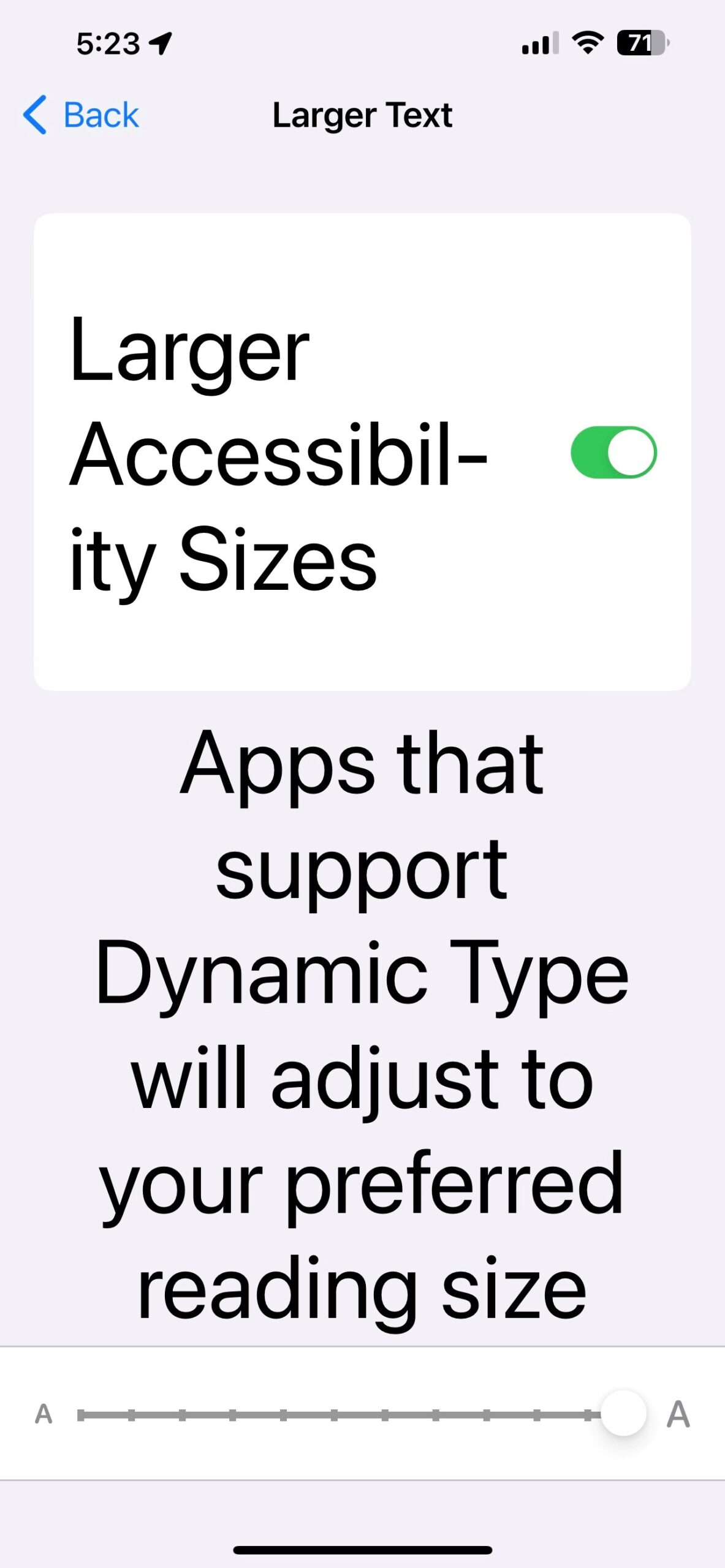
Figure: iOS accessibility settings
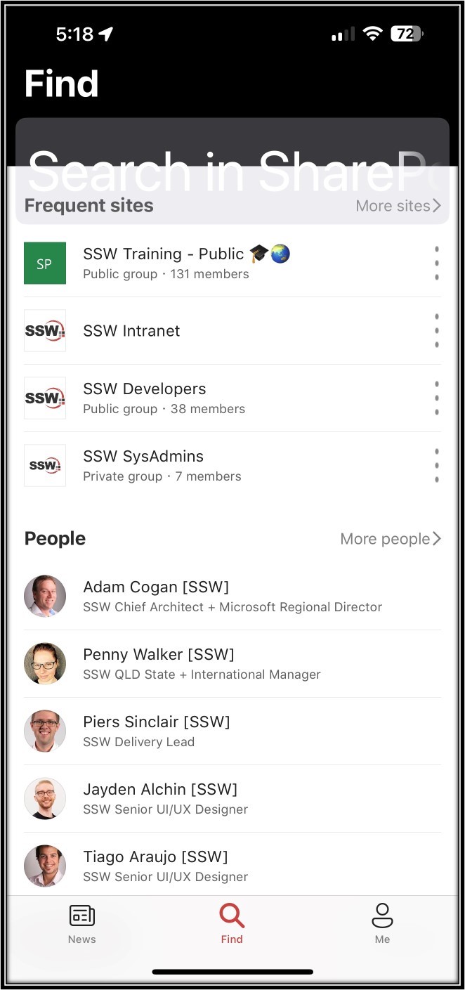
Figure: ❌ Broken – Nothing increased except for the Search box (which is overlapping)
More importantly the page’s content is pretty bad, i.e. it shows different sections and even different content compared to the mobile app.
Figure: This is the SharePoint “Home page” and it needs improving – make it consistent with the mobile app
I would love to see the same categories described above in Suggestion #1 (i.e. Sites, People, then Files).
In short, the content should be the same – whether I use the browser or mobile app (e.g. today even just the Frequent Sites I see on the browser and on the mobile app are different – how??).
Figure: View of list from Android – Expecting to see 9 fieldsFigure: View of list on IOS – expecting to see 9 fields (or at least consistent with Android)
Inconsistency – Why do I see different fields on the same SharePoint list when on Android vs iPad?
Not seeing 9 fields – Neither of these views have the 9 fields that I have in the mobile view?
It seems that the app is ignoring all of the view settings.
Figure: View AppliedFigure: View Settings – Fields SelectedFigure: View Settings – 9 items selected in “Number of items to display…”