
 -
- I use the browser for SharePoint a lot but love the SharePoint Mobile app more.
The initial experience is very different and it should be the same. The mobile app is better, and the start screen could be even better.
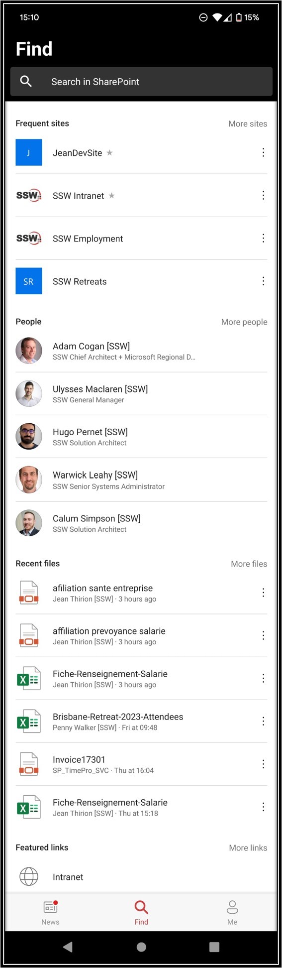
At the moment on my mobile, under the “find” tab, we see 4 groups:
- Frequent Sites
- People
- Recent Files
- Featured Links
#1 Suggestion for Mobile app – Make sections consistent and change from 4 groups to 6 groups
I want to see what I am using, and what the rest of the company is using, therefore I’d love to see this:
- My Recent Sites – i.e. sites that current user has been browsing, renamed from “Frequent” to “Recent” for consistency
- (New) Popular Sites – i.e. sites popular across the organization
- My Recent People – i.e. rename current “People”
- (New) Popular People – i.e. people with highest stats
- My Recent Files – i.e. Documents that current user has been opening
- (New) Popular Files – ie. Most used files across the organization
#2 Suggestion for Web app – Make SharePoint WebApp Start Page consistent
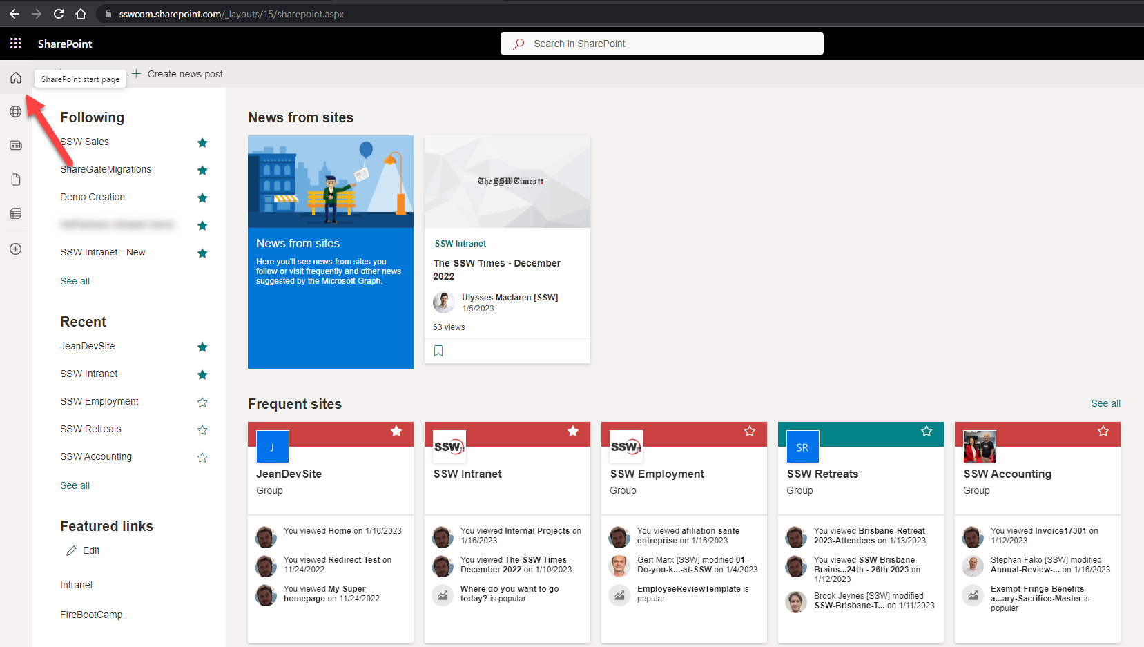
This is the first experience when people reach an intranet home – everyone clicks that 🏠home icon (see red arrow).
Many users first notice the horrible URL, e.g. https://sswcom.sharepoint.com/_layouts/15/sharepoint.aspx
More importantly the page’s content is pretty bad, i.e. it shows different sections and even different content compared to the mobile app.
I would love to see the same categories described above in Suggestion #1 (i.e. Sites, People, then Files).
In short, the content should be the same – whether I use the browser or mobile app
(e.g. today even just the Frequent Sites I see on the browser and on the mobile app are different – how??).
Cheers,