Do you agree that products always have room for improvement?
"Every day there are little things in software that we find annoying. Some write books about it, like Annoyances.org, but I thought this site would be more constructive.
BetterSoftwareSuggestions.com is proudly maintained by myself and the developers at SSW."
There are a couple things that frustrate me about SharePoint News. I believe that Microsoft Forms results should be shown in SharePoint news. By fixing this, SharePoint news will be more useful.
I see 2 problems: ❌ SharePoint News is not used a lot in most companies I work with ❌ Not many people in a company know when is the right time to read a Forms survey results…. Or even that you can.
Suggestion: ✅ When you are looking through the results of a Microsoft form, it would be great if there was an easy option to show the results in SharePoint News.
✅✅ Even better would be a way that the Form owner who reviews the comments, could add their own commentary to give context, before the others get to read them.
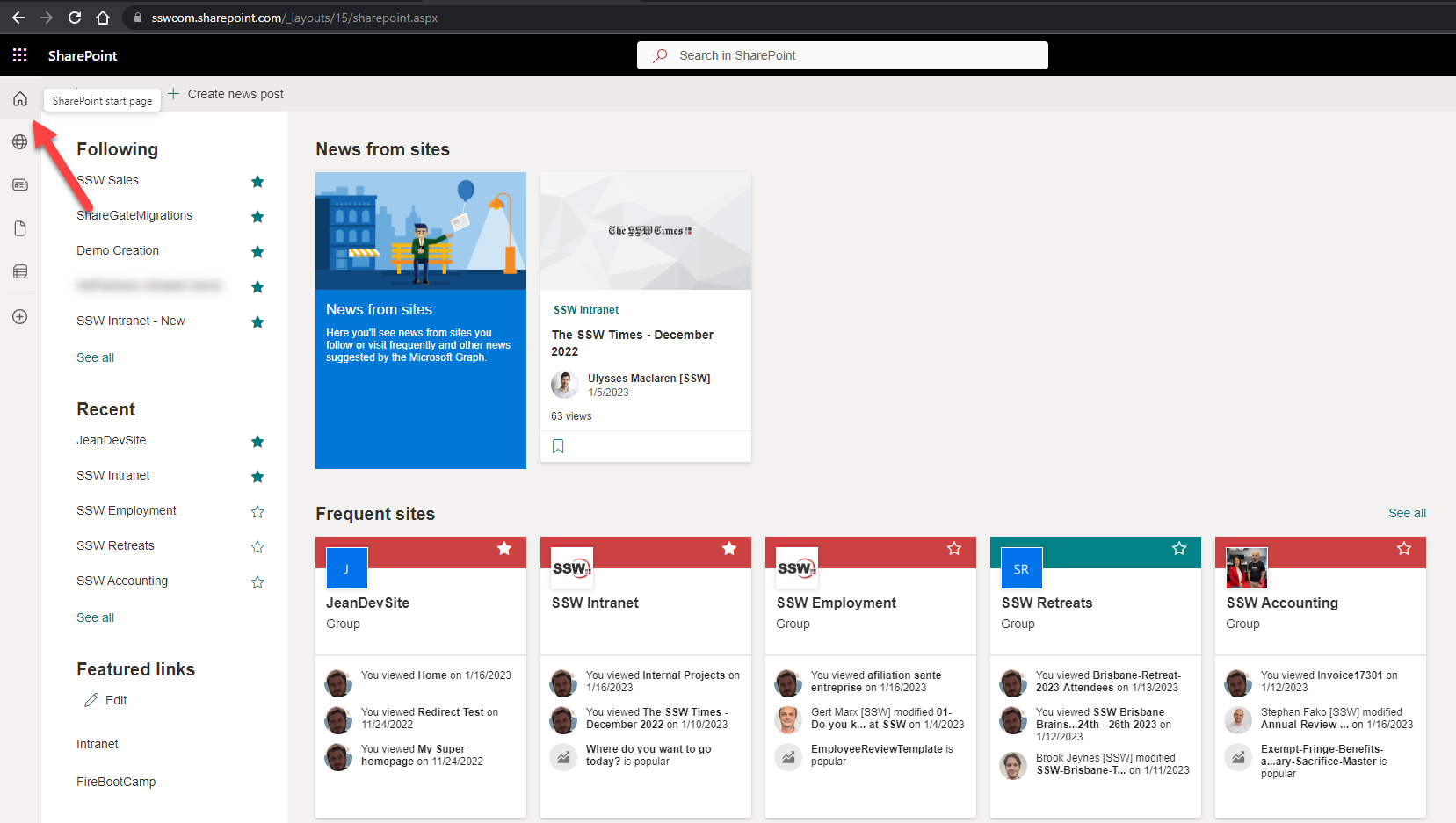
More importantly the page’s content is pretty bad, i.e. it shows different sections and even different content compared to the mobile app.
Figure: This is the SharePoint “Home page” and it needs improving – make it consistent with the mobile app
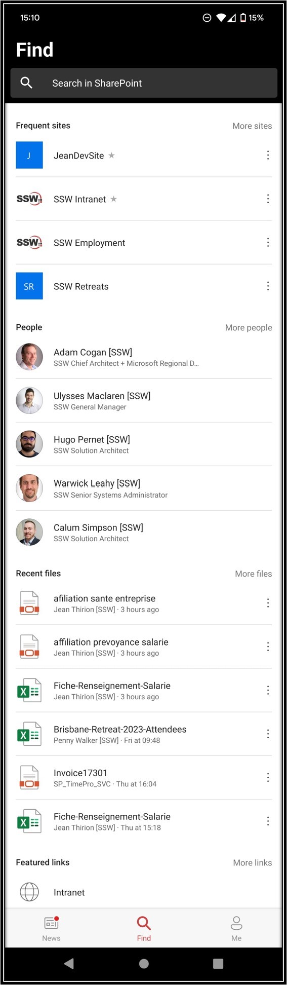
I would love to see the same categories described above in Suggestion #1 (i.e. Sites, People, then Files).
In short, the content should be the same – whether I use the browser or mobile app (e.g. today even just the Frequent Sites I see on the browser and on the mobile app are different – how??).

 -
-