
 -
- Dear Microsoft Forms Product Owner,
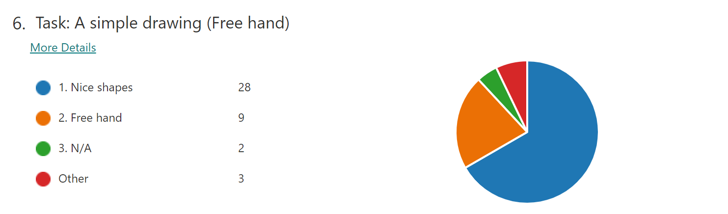
When looking at the feedback from my forms surveys, I prefer Bar Charts over Pies. Does anyone like Pies? – I find them less readable.
Suggestion: I would like to go to Tools | Options and set my preference
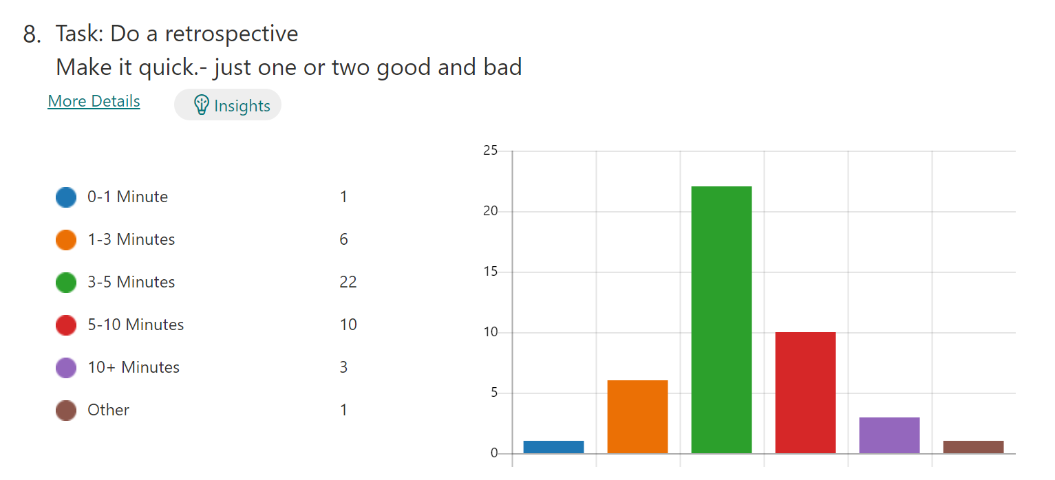
Question: I think I have noticed that Forms show Bars when there are 6 or more options. Right?
If so, I guess I should always make sure I have 6 options 😊 😊
VS
That is an odd decision. I was just talking to a person form New Zealand who said:
“we actually have a rule to never use a pie chart :) The only time they’re somewhat useful is if you are comparing 2 things. Anything more and it’s not really readable”
Please fix it or give us an option to allow us to fix it.