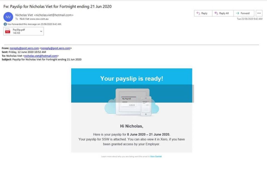
Vote on Xeros’ discussion forums as others always want to improve the look of the payslip emails eg. Add the company logo + change to the company colors

Vote on Xeros’ discussion forums as others always want to improve the look of the payslip emails eg. Add the company logo + change to the company colors
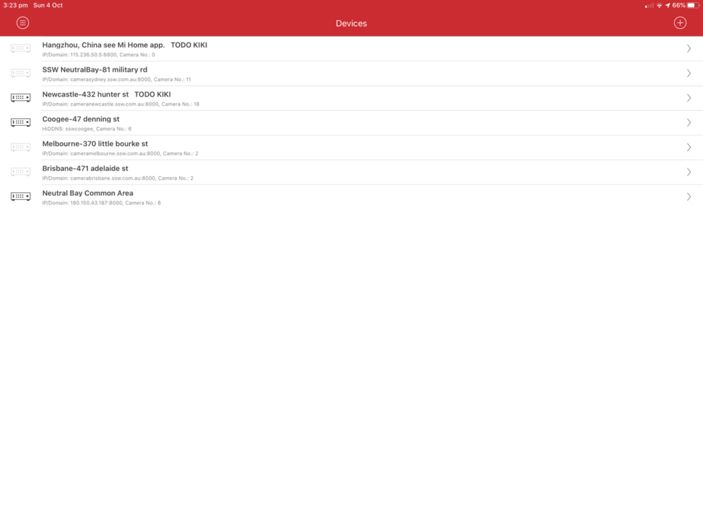
Feedback on iVMS-4500(iOS) devices screens:
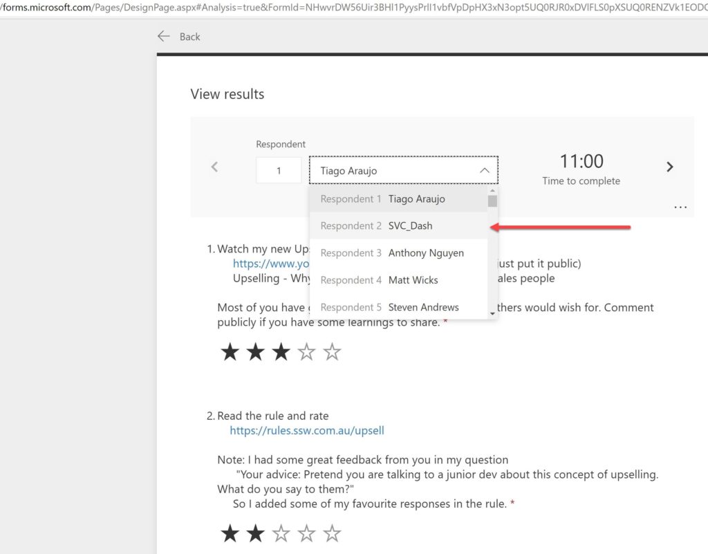
I love using Microsoft Forms and in the end, reviewing the answers is fun. Suggestions to make it even better:
I’d love know if others would like this feature too…
I’d like to talk about this new feature … aka Network Device Interface for video recordings.
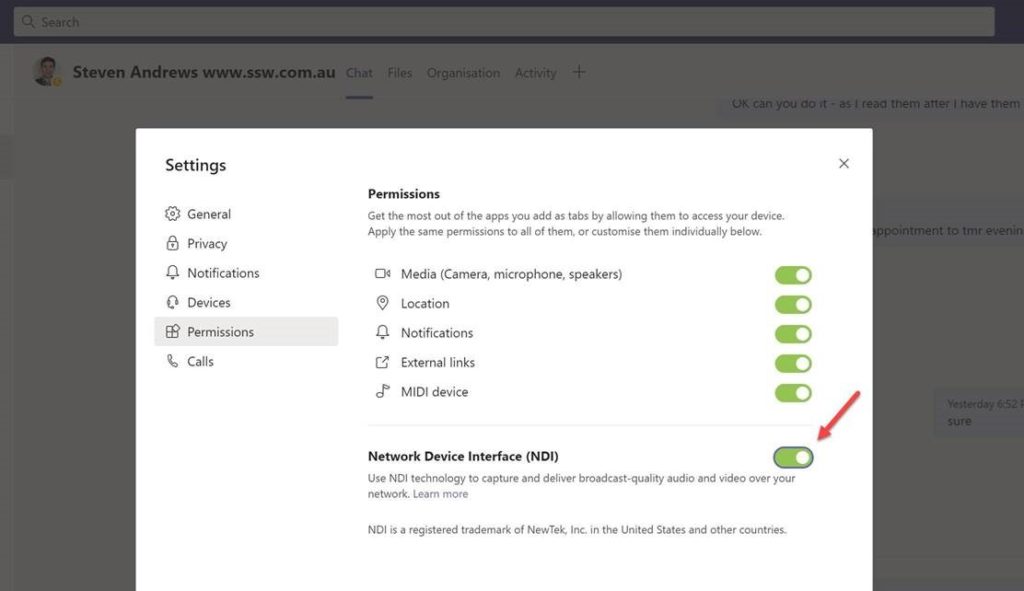
At SSW we have 3 guys who run SSW TV (a youtube channel for .NET and Azure devs) so we are all excited about the new NDI feature – this was released in Microsoft Teams a week ago (September 2020).
We also run 6 .NET + Azure User Groups around Australia and China and it has been really hard during COVID-19 to run these live. We have been pre-recording the sessions and then pretending they are live and it has worked. That said, it is not at all the same as a live event.
Therefore I am certain NDI It is going to help us so much. I want to share our first experience from our first live event using NDI. We were able to run a free event with 5 speakers and it went well from my side. Afterwards this was sent to me from one of the SSW TV engineers who ran the event using the new NDI feature of Teams.
From: Raj
Hi Adam
The experience was mixed. When it works the feature allows me to really pull off a broadcast level show (without very expensive specialist hardware).
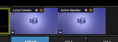
You can see below the multi view and picture in picture (of 5 speakers) that I was able to create. Each person on the call is an individual input much like a normal camera, so I’m able to do the same things as if I had a real in-studio multi-camera setup (like you would see on the news or big broadcast shows).

So in theory this should be excellent, but there are some issues that are essentially deal-breakers.
Firstly, the general reliability. In the image below you can see one of the sources has changed from the person’s camera to a Teams logo. This must be a Teams bug.
For some reason the input randomly does this with some people and not others. It happened during our stream with the screenshare input (a big deal this is the most important thing I want to output).
In other tests, this hasn’t happened at all, so it seems to be random. It can’t be blamed on networking issues because technically the NDI output is still active, because if it wasn’t, you’d be seeing a black screen.
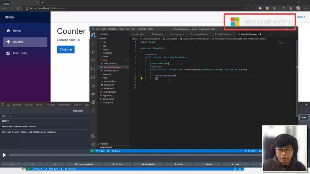
Secondly, I love that I can bring in the screen share as its own source, as I can do lots of funky looking things like the picture in picture. However, my second issue is to do with the screen sharing output. That massive Microsoft logo watermark in the top right is extremely intrusive and ruins the shot. For some reason, it only appears over the screen share output, which makes no sense to me since the majority of screen shares will be Windows-based machines where their branding is clearly visible. This is completely unnecessary and ruins what is otherwise a super useful feature of Teams.
I’ve googled and I’m not alone in thinking this: https://i.reddit.com/r/VIDEOENGINEERING/comments/ikmr85/ms_teams_ndi_watermark/
> Teams released an update with NDI integration. I’m finding that in a scheduled teams meeting, there’s a god awful watermark in upper right corner over NDI
This will need to be fixed in order for us to use this. It’s not just distracting, it’s actually ruining the user experience because it covers the content (e.g. Visual Studio coding and PowerPoints etc.).
SSW is an enterprise customer and this just seems entirely unnecessary. Even if it’s an extra charge, the option should be there to remove it.
I hope this helps and I hope it gets better.
Raj Dhatt
SSW TV Engineer
NDI (Network Device Interface) is great… For those that don’t know it is an open standard invented by NDI.tv | Your Official Destination for All Things NDI® Microsoft Teams has now started to bring this to the masses!
Well done for beating Zoom ⭐
I seriously hope Microsoft keep the quality higher than the Zoom team can.
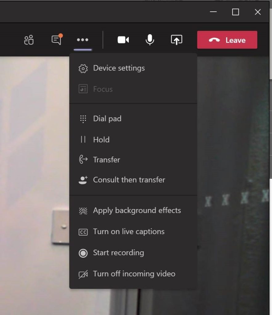
My questions and suggestions:
Love to know if you agree…
We want a ‘Team Calendar’ tab to put on each Team ….. we want team members to make calendar invitations from the Team, not from their personal calendar… as it is part of the information of the team.
This should be built-in, and whilst it can be solved with SharePoint – it is tedious. I’ve written up my solution here: Do you make your team meetings easy to find?
Matt Wicks
UserVoice: Add a team calendar to Teams or allow a project team calendar to be added as a tab.
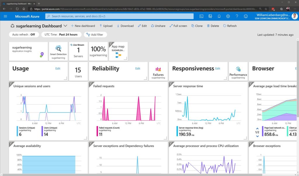
It would be awesome if we could see who added or configured a widget on an Application Insights dashboard.
When a widget has appeared on the page and you would like to speak to the person about the purpose of it, it would be nice to see an “Activity Log” or “Dashboard History” page.
Dear Microsoft Teams Team,
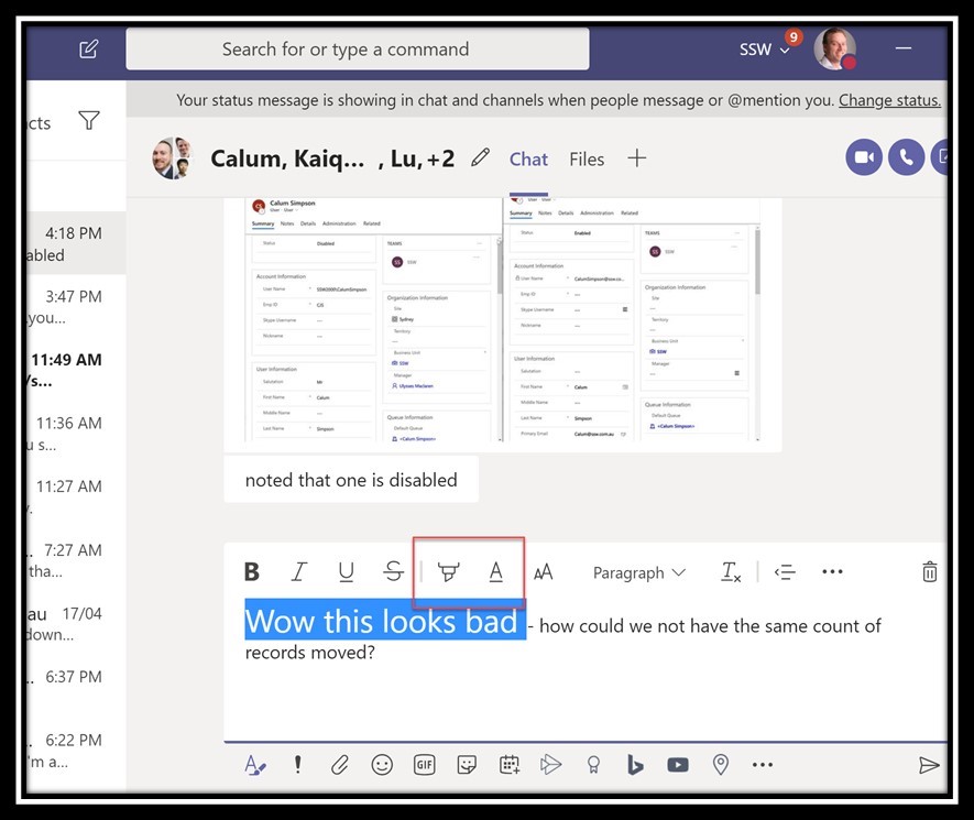
Microsoft Teams suggestion – Help me find the highlight and font color
I expect no-one uses these 2 buttons regularly like they do in Outlook and Word. Therefore I think if you look at the current status of usage, these icons would not be used that much. If you were to change them to look just like Microsoft Word I’d bet the usage figures would go up.
Please consider using the same colour on the highlight and font colour icons

