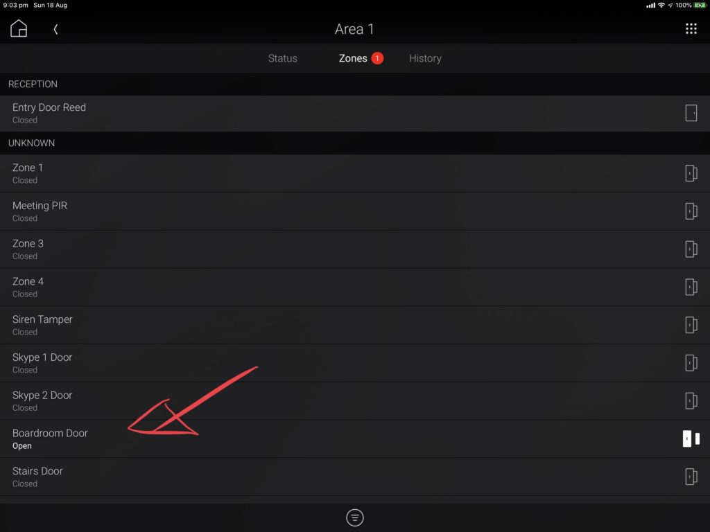
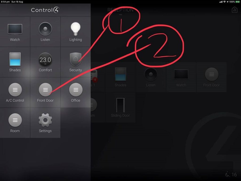
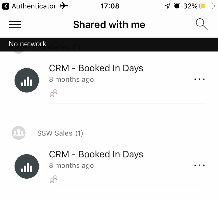
A: In the top tab, I see a red count eg. 1 … so I expect to see a red dot on the relevant items under it 🔴
B: The 2 columns are too far from each other – the middle gap is unnecessary
A: In the top tab, I see a red count eg. 1 … so I expect to see a red dot on the relevant items under it 🔴
B: The 2 columns are too far from each other – the middle gap is unnecessary
For example I would like to change the order to be:
To repro:
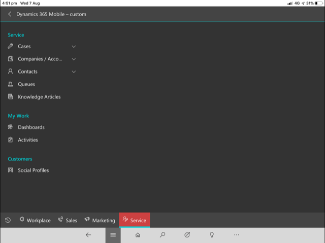
I’m sad it does not show the service calendar on the Dynamics iOS app.
This is where I expect to see it…
Sadly https://sswcom.sharepoint.com/sites/ does not show all the sites.
Instead it redirects to an error page!
https://sswcom.sharepoint.com/_layouts/15/mobile/mblwpa.aspx?Url=%2fPages%2fPageNotFoundError.aspx&requestUrl=https%3a%2f%2fsswcom.sharepoint.com%2fsites%2f&wdFCCState=1
Suggestion: Make https://sswcom.sharepoint.com/sites/ show the sites list.
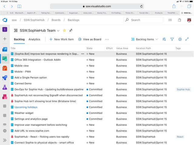
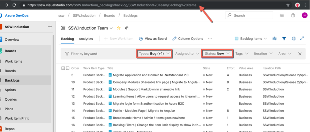
I want to pass the filters for backlog…
1. How do I get the backlog URL right?
Suggestion: When I change the State, please update the URL
1. Is there a good reason for Microsoft to still show old options in the Windows 10 ‘Printers & scanners’ UI?
The XPS options died years ago, so it is time to remove the option “Microsoft XPS Document Writer”
2. And while we are here, no-one has a scanner anymore, so change the UX from “Printers & Scanners” to the more simple ‘Printers”
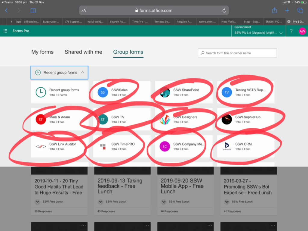
I want to sort by the created by date…. So I have added dates into the names.
Feature request – Can you enable users to sort by names
I love Microsoft Forms records the time taken and give us a summary at the end.
Can you work out a reasonable timebox (a touch of Azure AI) based on the other submitted forms and the number of questions…. and give a little beep say every 5 minutes if they have exceeded the time that is reasonable.
One person can forget to finish their Microsoft Form and leave their browser open and it screws up all stats.
As an example everyone in my company was close enough to the 15 minute timebox – this one person ruined the stats.