Outlook ‘Compact Now’ UI

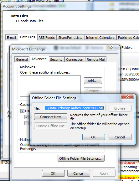
I know I can run ‘Compact Now’ manually. I just did some archiving and ran it now and it took about 12 hours (overnight)… however I should know that I don’t have to.

  1. The UI should explain that this compacting happens in the background. (in the PST’s background idle task).
  2. The UI should so that it is currently running.
    That way you know if the performance problems that you are experiencing are related to compaction.
    Gee Whizzzz?I should not have to ask to show what is going on with my PC?.
    I am just asking for a ‘Polite UI’
  3. The UI should show that this is primarily about space savings, not improving performance.
    After I delete a lot of emails, I should see something different that indicates space can be saved.

    And if the UI is good, after I install Outlook 2007 SP2, and since things changed, (where you allowed the internal free space to grow – for a trade-off to allow for better locality of writes), I would see this in the UI.

    Figure: This UI needs 3 features added

    Figure: This UI needs 3 features added

Make extra views discoverable

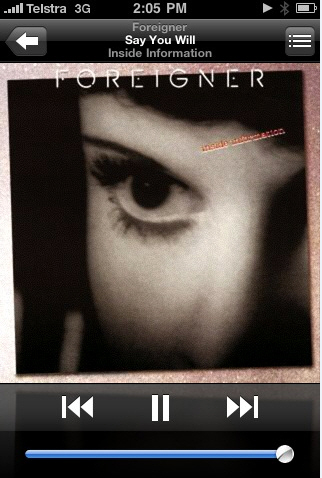
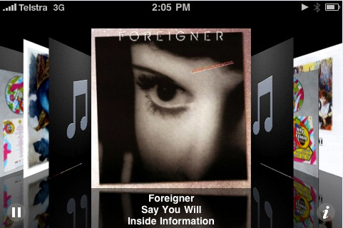
For example the iPhone shows album covers and the actual list of songs that you can flip through? but you would be lucky to find this.

I found this hard to find… I never knew there was a cool new view when you turn the iPhone on the side (This is not a very discoverable feature from Mr Jobs).

Figure: The normal view - give me some indication that there is a new view on the side

Figure: The normal view – give me some indication that there is a new view on the side

Figure: Turn it on the side an you have an interactive 3D flip view

Figure: Turn it on the side an you have an interactive 3D flip view