Help me use full screen mode in Outlook

When screen sharing in Teams or other applications, you want to be able to reduce noise as much as possible. One way to do this is by using full screen mode.

✅ Chrome – F11 works

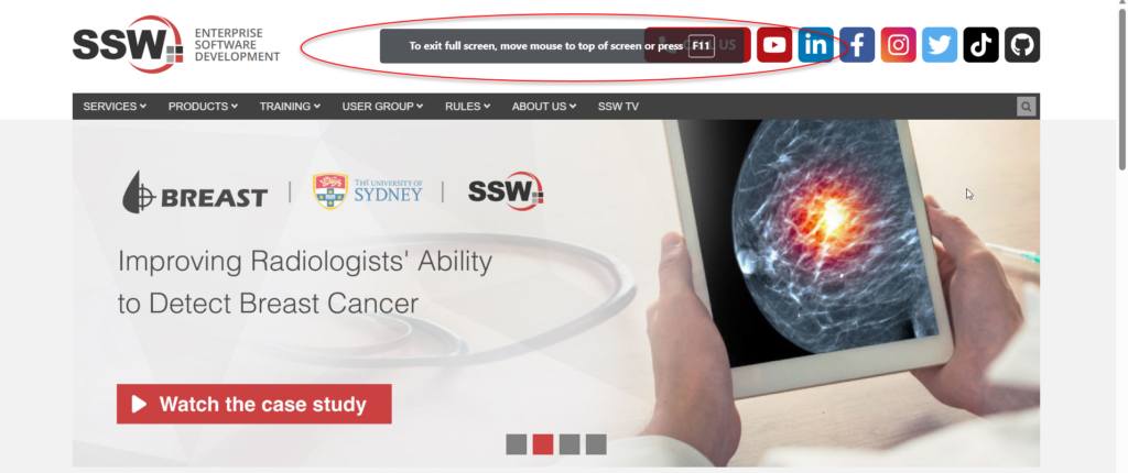
✅ Edge – F11 works

❌ Outlook new email – F11 doesn’t work (does nothing)

❌ Word – F11 doesn’t work (does nothing)

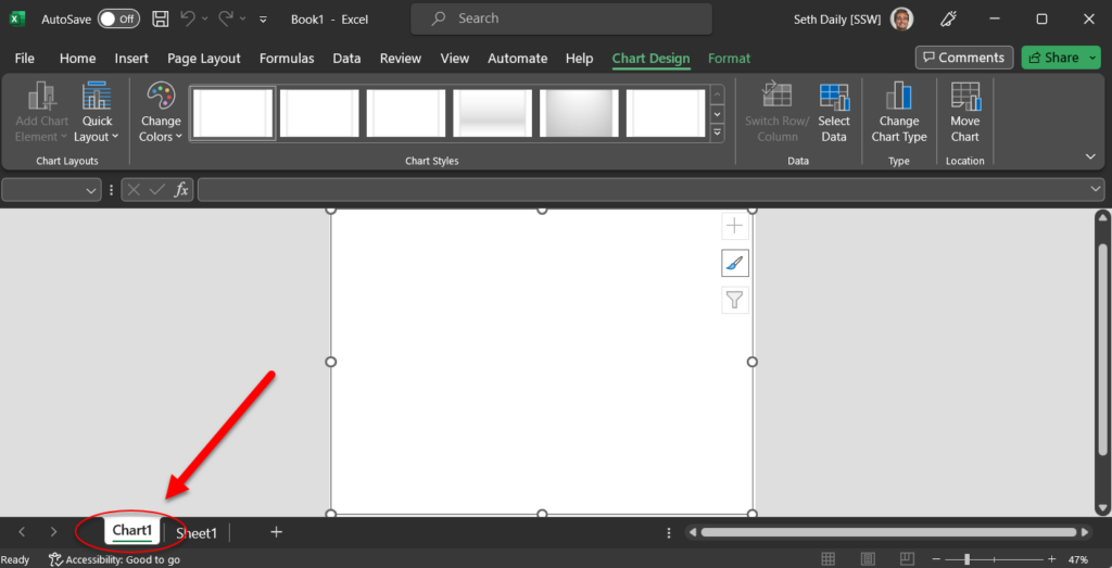
❌ Excel – F11 doesn’t work (goes to Charts)

❌ Figure: F11 key goes to Charts in Excel
Figure: Full screen in Edge with F11

Keeper – Help me to deep link directly to a report

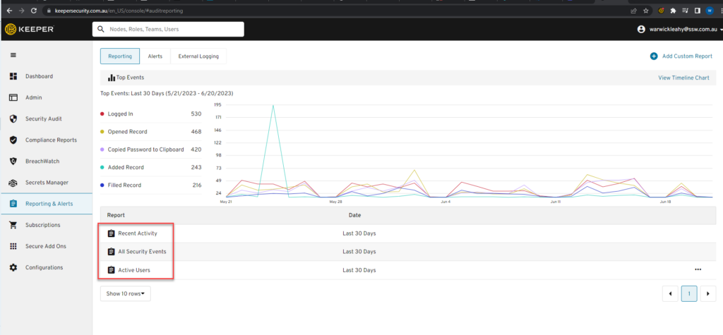
It would be really useful to be able to link directly to particular reports in Keeper. For example I can put a link on our intranet to https://keepersecurity.com.au/en_US/console/#auditreporting but I would like to link directly to ‘Recent Activity’ or ‘All Security Events’.

If you agree please vote for this suggestion on https://keeperapp.canny.io/feature-requests/p/deep-link-to-report

Figure: Allow linking directly to reports

Azure – app registration secret/certificate logs cannot be forwarded to Azure Monitor

Azure AD Audit Logs are very helpful when diagnosing issues. Similarly, sending these logs to Azure Monitor is very useful for storing logs, and for setting up alerts on certain events.

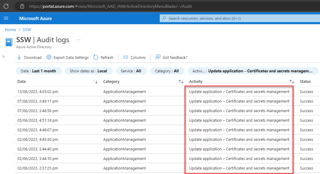
In Audit Logs, we can see when an app registration secret or certificate is created or deleted.

Figure: Azure AD | Audit Logs app registration secret/certificate logs

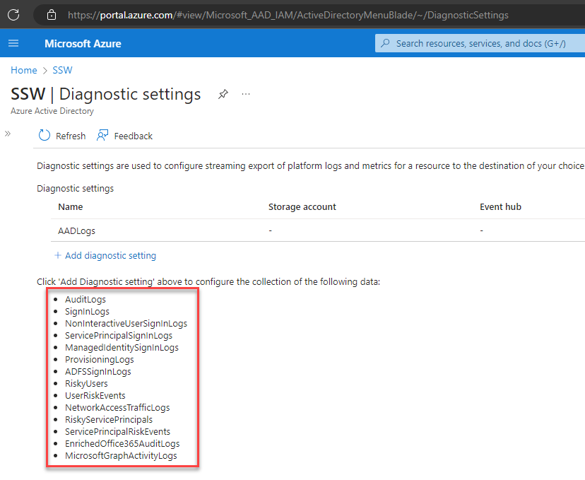
However, there is no way to send these logs through to Azure Monitor so that we can set up alerts on these events.

Figure: no option for app registration secret/certificate logs

Help me know instantly what Tracing Mode is via a rename

Today I showed at NDC Oslo how to build a bot manually with C# and Blazor using the Azure OpenAI GPT services.

Then I showed how to do the same thing automatically with the new PVAs.

At the end I did a poll of the audience (about 300 people) – the Norwegians vote was about 80% saying they preferred the PVA solution.

Well done – the 1st impression is awesome ⭐

Keep the $ attainable please… it is the danger point for adoption.

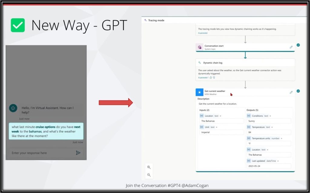
Little UX suggestion… Regarding this “Tracing Mode” screen.
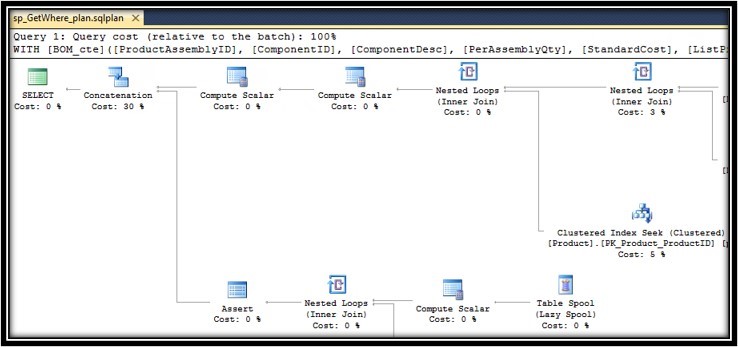
I reckon I would rename it to “Query Execution Plan” or maybe just “Execution Plan”

Then you keep the same name as you have in SQL Server:

SharePoint App – Help Solve Readability Issues

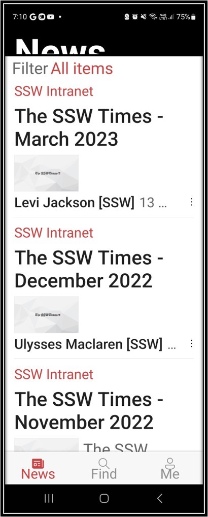
There are accessibility problems.
E.g. I am having some of the 50 year olds in SSW reporting that they cannot even use the SharePoint app.
Reason – they can’t read anything!
Suggestion #1: below
Suggestion #2: below

Note: it is not only the SharePoint app

❌ Same issue on the Dynamics app

✅ The Teams app has fixed this issue

✅ The Outlook app has fixed this issue

Figure: Android default is too hard to read for some.

Suggestion #1: Fix this accessibility problem by adding pinch to zoom (users expect the same as the web page)

Figure: Android Settings

Suggestion #2 – add a Cogs button that would take the user to Settings | Font Size and Style where they can increase the system font size! People don’t want to use this setting because it changes everything on your phone.

Figure: Android after increasing the size on Settings

Suggestion #2 is magic UX – see it is broadly fixed (❌ the top “News” is weird)

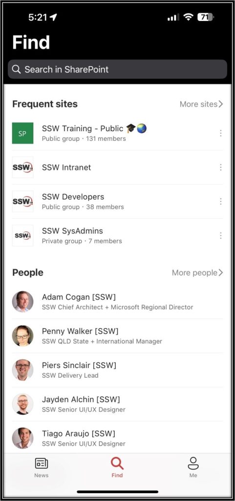
iOS seems to have a different problem

Figure: iOS normal view


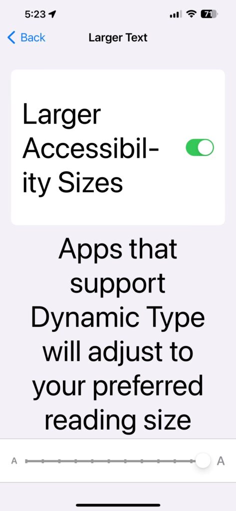
Figure: iOS accessibility settings


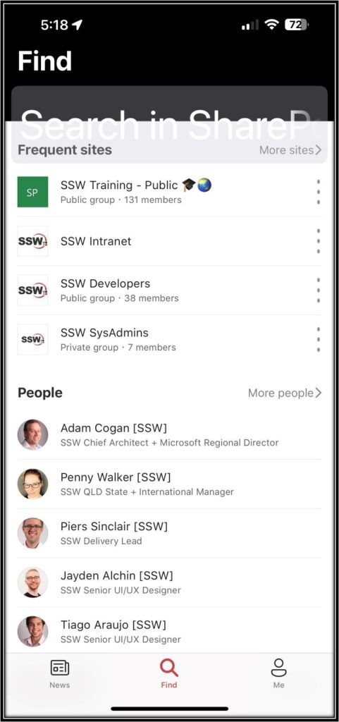
Figure: ❌ Broken – Nothing increased except for the Search box (which is overlapping)


Tina CMS – Help me to add users to roles automatically

https://github.com/tinacms/tinacms/discussions/3816

Currently to add users to roles in Tina CMS there is a multi-step process. First users must be added to Azure AD and added to the enterprise App in AD as users. Then they need to be manually invited in Tina CMS and thirdly added to a role in the particular project. This is a time-consuming manual process and could easily be resolved. This would be really painful in large organizations.

Setting up System for Cross-domain Identity Management (SCIM) for Tina CMS would provide a range of benefits for organizations looking to manage their user identities and access across multiple systems. With SCIM, organizations can easily provision and deprovision users in Tina CMS and manage their access rights.

One of the key benefits of using SCIM with Tina CMS is increased efficiency and reduced errors. With SCIM, user accounts can be created or updated in real-time across multiple systems, ensuring that access rights are always up-to-date and accurate. This eliminates the need for manual updates and reduces the risk of errors, saving time and resources for IT teams.

Enabling SCIM for Tina CMS is improved security and compliance. SCIM provides a standardized way to manage user identities and access, which can help organizations meet security and compliance requirements more easily. By ensuring that access rights are properly managed and maintained, organizations can reduce the risk of data breaches and unauthorized access to sensitive information.

Figure: Roles should be maintained using a SCIM imported group

Microsoft Forms results should show in SharePoint news

There are a couple things that frustrate me about SharePoint News. I believe that Microsoft Forms results should be shown in SharePoint news. By fixing this, SharePoint news will be more useful.

I see 2 problems:
❌ SharePoint News is not used a lot in most companies I work with
❌ Not many people in a company know when is the right time to read a Forms survey results…. Or even that you can.

Suggestion:
✅ When you are looking through the results of a Microsoft form, it would be great if there was an easy option to show the results in SharePoint News.

✅✅ Even better would be a way that the Form owner who reviews the comments, could add their own commentary to give context, before the others get to read them.

Help me improve the experience of writing hands-free emails on Outlook and Word with Dictate

Things I have problems with:

  1. Clunky with list items – You have to slow down a lot to make sure it recognises your commands like “next line”
  2. Can’t do any Alt commands
    • E.g. Can’t add email signature (Alt NAS)
    • E.g. Can’t track in CRM (Alt HY1)
  3. Won’t recognise autocorrects
  4. UI – Can’t easily see that you’re mid-dictation like you can with Siri (the movement to on the icon to recognise noises)

Help me to see how many staff are accessing SharePoint with the mobile Apps

I am very interested in how people are accessing our services.  I especially like how I can see that our users are accessing Dynamics 365 on their mobile app.  

  1. SharePoint should display similar results.  I would like to see how many of our SharePoint users are accessing our intranet via the ‘SharePoint app’ and also SharePoint Lists via the ‘Lists’ app.
Figure: Dynamics usage report shows that a number of people are using the Sales app to access Dynamics
Figure: SharePoint usage report should show the same things
Figure: Office365 Power BI app shows Outlook Mobile and Teams but doesn’t have SharePoint stats

Help me have a better initial experience (🏠 The home page + featured links)

I use the browser for SharePoint a lot but love the SharePoint Mobile app more.

The initial experience is very different and it should be the same. The mobile app is better, and the start screen could be even better.

At the moment on my mobile, under the “find” tab, we see 4 groups:

  • Frequent Sites
  • People
  • Recent Files
  • Featured Links
Figure: The mobile app displays content well, but it could be improved

#1 Suggestion for Mobile app – Make sections consistent and change from 4 groups to 6 groups

I want to see what I am using, and what the rest of the company is using, therefore I’d love to see this:

  • My Recent Sites – i.e. sites that current user has been browsing, renamed from “Frequent” to “Recent” for consistency
  • (New) Popular Sites – i.e. sites popular across the organization
  • My Recent People – i.e. rename current “People”
  • (New) Popular People – i.e. people with highest stats
  • My Recent Files – i.e. Documents that current user has been opening
  • (New) Popular Files – ie. Most used files across the organization

#2 Suggestion for Web app – Make SharePoint WebApp Start Page consistent

This is the first experience when people reach an intranet home – everyone clicks that 🏠home icon (see red arrow).

Many users first notice the horrible URL, e.g. https://sswcom.sharepoint.com/_layouts/15/sharepoint.aspx

More importantly the page’s content is pretty bad, i.e. it shows different sections and even different content compared to the mobile app.

Figure: This is the SharePoint “Home page” and it needs improving – make it consistent with the mobile app

I would love to see the same categories described above in Suggestion #1 (i.e. Sites, People, then Files).

In short, the content should be the same – whether I use the browser or mobile app
(e.g. today even just the Frequent Sites I see on the browser and on the mobile app are different – how??).

Cheers,