Do you agree that products always have room for improvement?
"Every day there are little things in software that we find annoying. Some write books about it, like Annoyances.org, but I thought this site would be more constructive.
BetterSoftwareSuggestions.com is proudly maintained by myself and the developers at SSW."
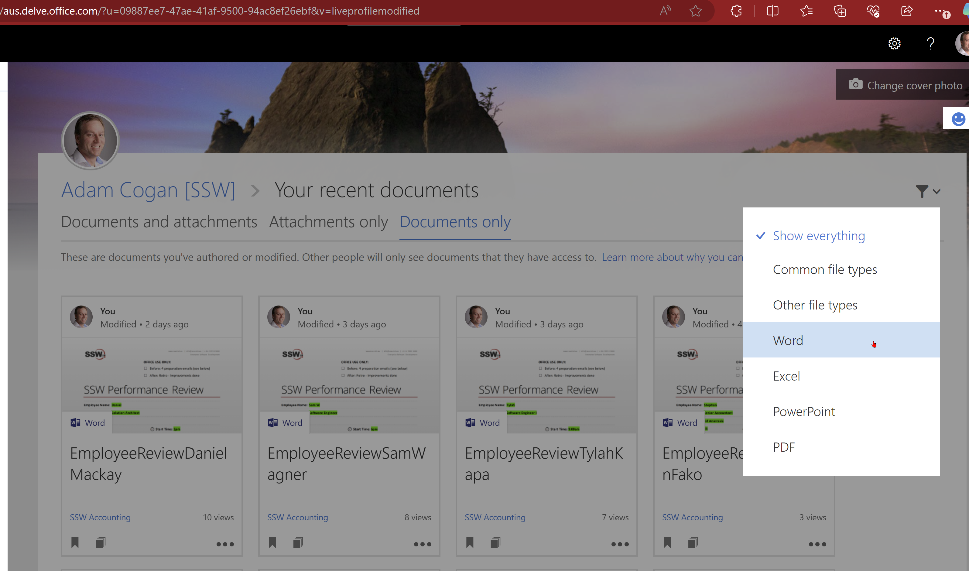
When I fill in forms for my company, I should be able to find each one (just like I do a Microsoft Word doc I created).
I understand that a Form is not a file stored in a Document Library like other Office docs, but I do think you could hack something so it could be surfaced.
Figure: In this view I should be able to see the Microsoft Forms responses I’ve submitted
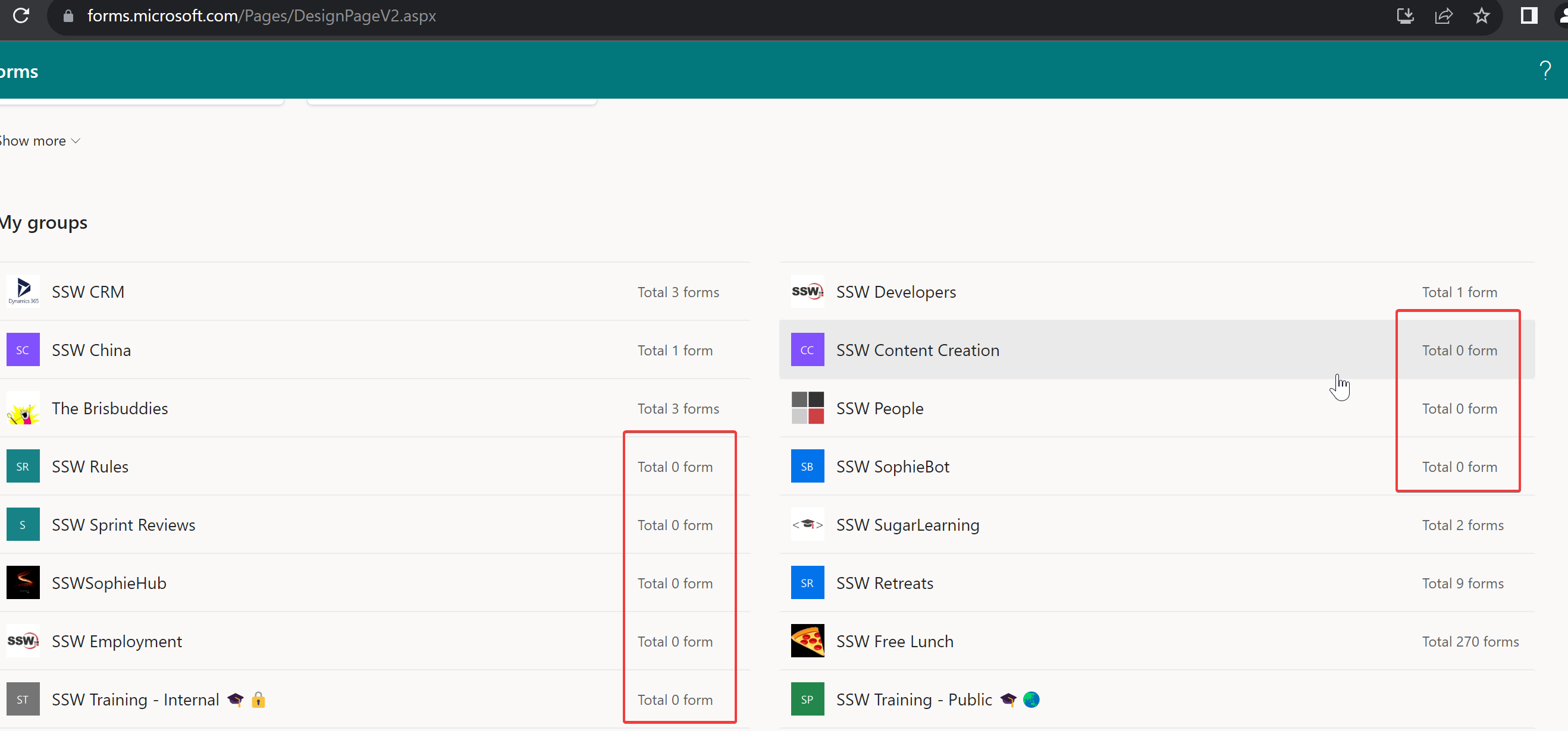
When I navigate to https://forms.microsoft.com I see all the Microsoft Teams. Even ones, with no Forms in them, or which have been inactive forever. That’s a lot of visual noise.
Moreover, the Teams seem to be randomly ordered. It would be nice if they were ordered by last updated by default and we could choose a different ordering (e.g. Alphabetical) if we wanted.
Help me be able to find the team easier by
Hiding Teams with 0 forms
Allowing Teams to be ordered by last updated and alphabetically.
Figure: See red box – There are a bunch of teams with 0 forms, they should all be hidden by default!
When I create a Microsoft Form from a template, I must follow an arduous process to get the Form into the right team so we can track the data.
First, it goes into my personal teams, then I must move it to a team, then I need to add it to a tab, then I must move the excel file to the folder I want!
Instead, there should be an option to choose which team and folder the form goes in.
See this video for the current steps, I’m proposing that most of these steps should be automated:
Figure: Save me from teaching people to do all these steps because they never remember!
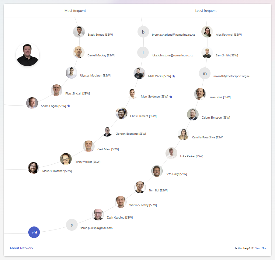
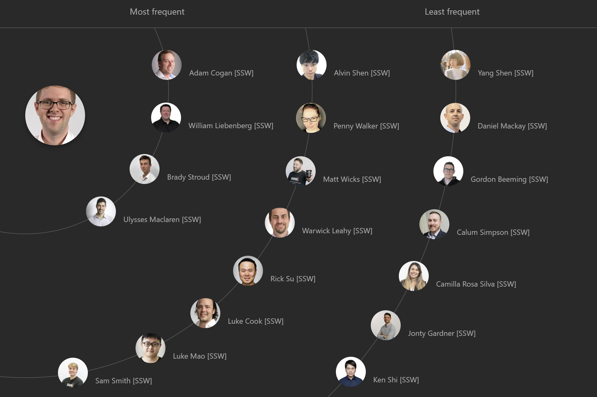
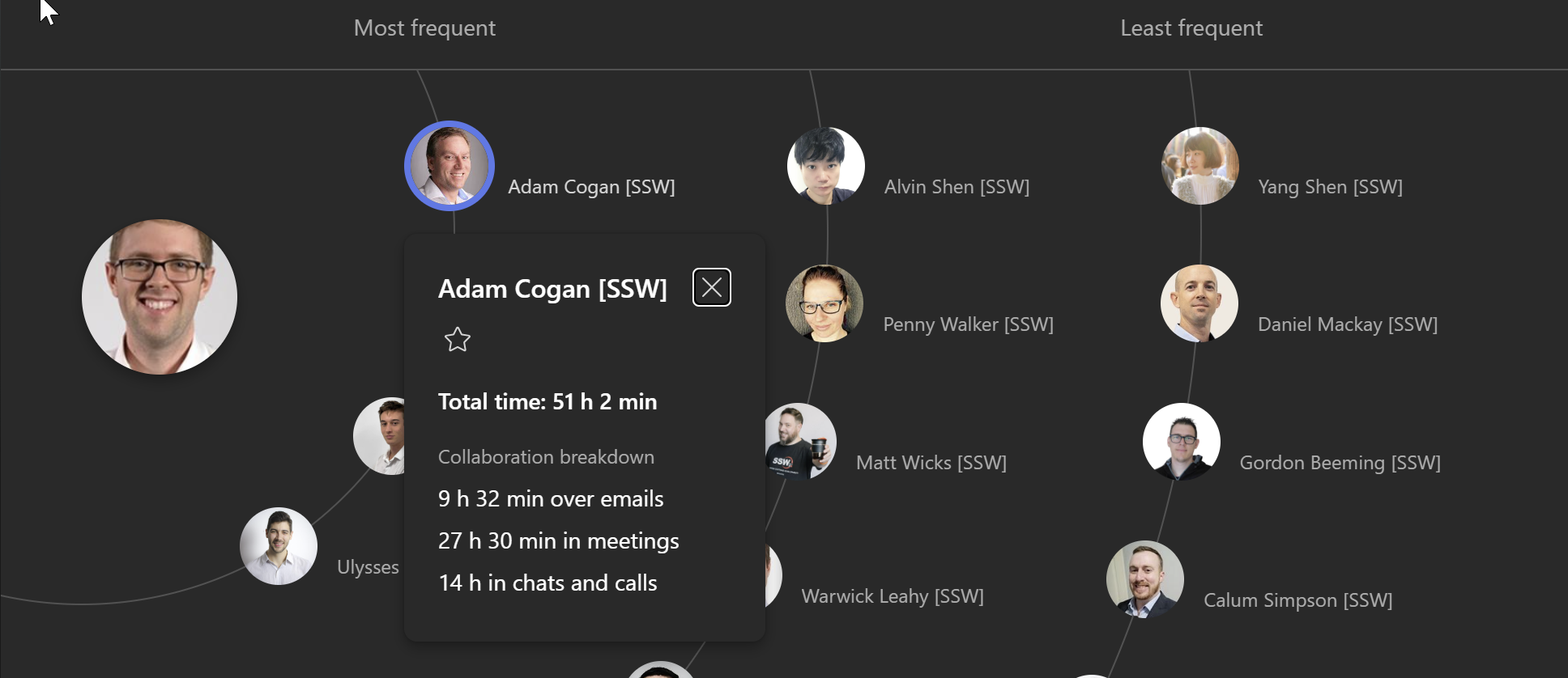
When I look at Microsoft Viva Insights, I can see the people I communicate most with, but not whether it’s going up or down over time.
I want to see the trend so I know who I should spend some more time with.
It should show how far up or down someone has moved, similar to a leaderboard.
Figure: The gain or loss arrow gives a nice indicator of change in positionFigure: I should be able to see who has done more or less communication this month
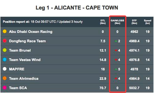
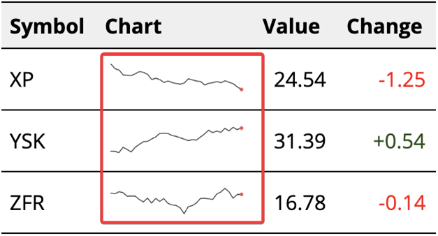
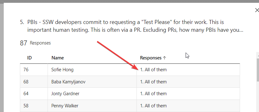
I think this would be affecting every Microsoft Forms customer who reads the results. When I look at results on the Microsoft Form, they can be ordered alphabetically, or by user, or by date filled. However, I cannot order them by the order I wrote the original questions in.
Therefore, I currently solve this by prefixing every question with a number, so it orders by the number.
Instead, there should be an option to sort by the order of the options (and it should be the default order).
Figure: As a workaround, we use numbers to order by option type, but it would be better if this was built-in
When it comes to software, user experience is paramount. One area that could benefit from improvement is the way we handle ‘My Access’ approvals.
Current Experience
When someone requests access, the recipient gets a detailed email with a neat table. This table clearly shows who requested what access and their reasons for doing so.
Figure: Access request shows reasons
Room for Improvement
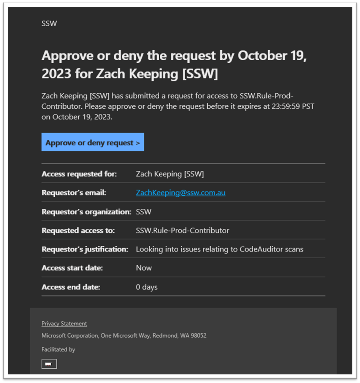
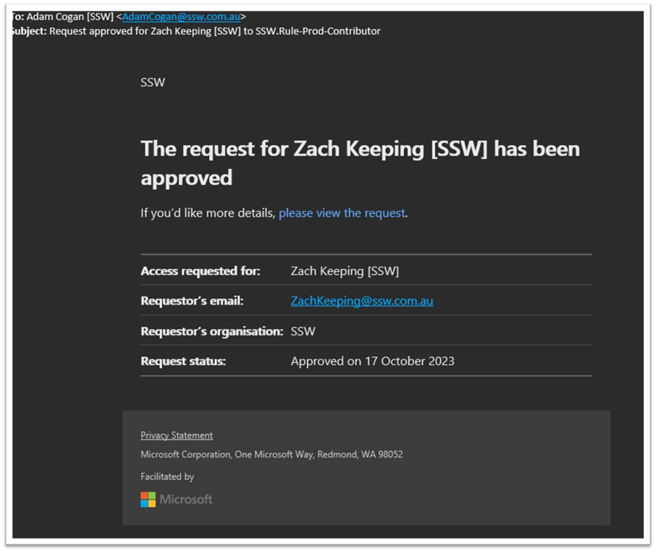
However, when it comes to approval notifications, the details are missing. The recipient only knows that the access was approved but doesn’t see who approved it or why. To find this information, they have to click a link and navigate through the history to locate the specific approval.
Figure: Approval email doesn’t show who approved it and why they approved the access
Suggestion
It would significantly enhance the user experience if the approval email could directly provide these details, similar to the access request email. This change would offer users a consistent experience, reduce the number of steps to find information, and increase overall efficiency.
TinaCMS is awesome and has the best editor. It can be used on a public site like www.ssw.com.au where the users are known and will be added to the database.
However for a public site like SSW Rules www.ssw.com.au/rules where users are _any_ github users, then the problem is each user needs to be added to the database _before_ they can make any changes.
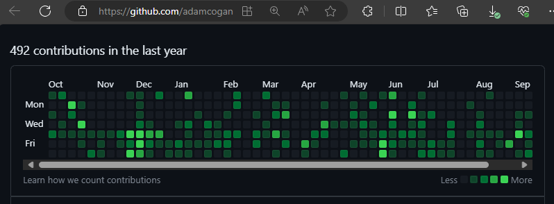
FYI – TinaCMS also has the issue of not allowing GitHub users to directly contribute to the content repo like what NetlifyCMS and Keystatic allow. This means no more GitHub green squares!!
Note: Similar products such as NetlifyCMS (aka DecapCMS now) do not have this limitation, nor does Keystatic.
Figure: See my green contributions to SSW.Rules.Content under Contribution activity https://github.com/adamcogan

 -
-