-
- I have a lot of editing options on Photos App for Windows 10, but I can’t resize. Had to open Paint to do so. Photos Apps should have this functionality or at least link me to Paint.
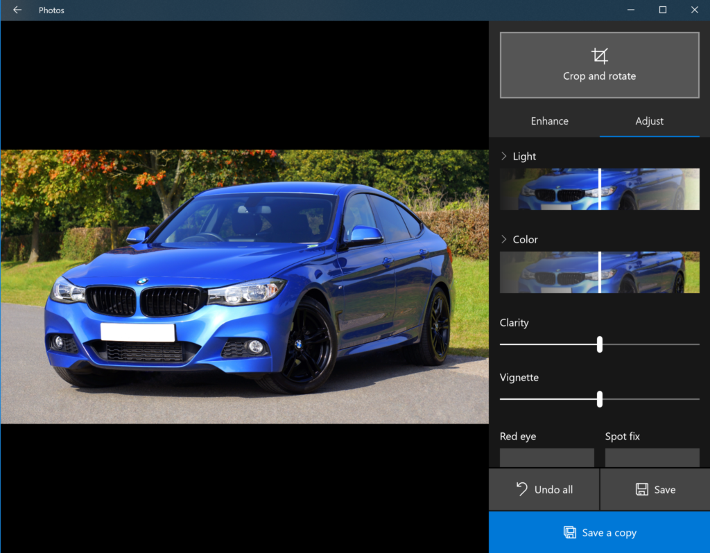
Figure: Windows 10 Photos built-in app doesn’t have a resize functionality