There is inconsistency in the Person menus…
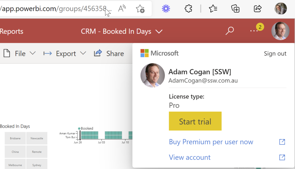
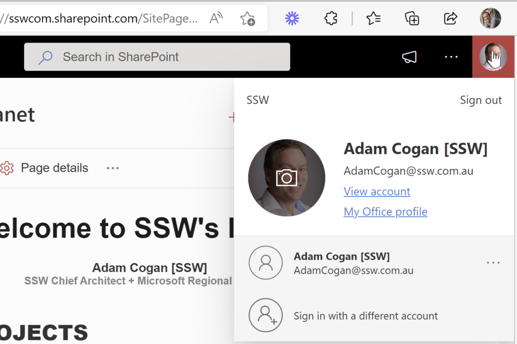
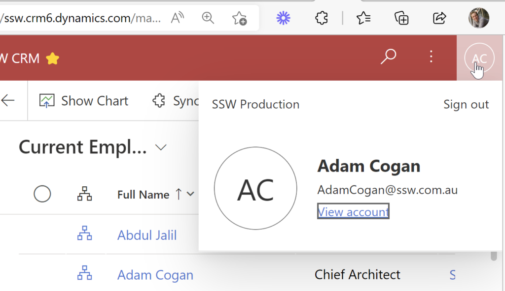
More Info:
In this case the Office | Person menu should show ”Microsoft 365 E3”
And link off to https://portal.office.com/account/?ref=MeControl
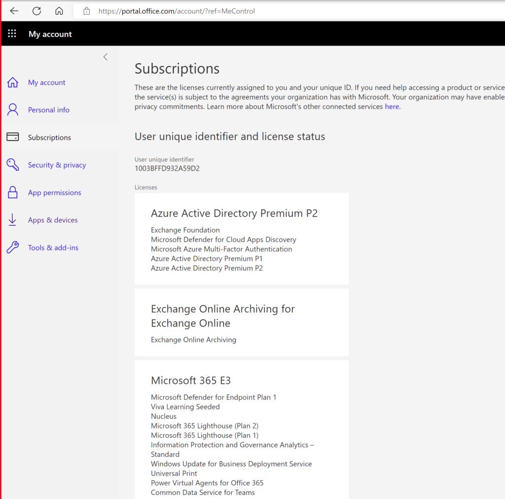
There is inconsistency in the Person menus…


In this case the Office | Person menu should show ”Microsoft 365 E3”
And link off to https://portal.office.com/account/?ref=MeControl

Teams search is super important, and I hope this one is on Microsoft’s backlog.
I expect Teams search and SharePoint search to have consistent results. Do others?
Not finding stuff you have permissions too is super frustrating. So this one has always confused me…. Do you consider it a bug?
Watch this one:
I think Jean did a great explanation of the permissions problem.
This is really weird behaviour – fire up Fiddler and you can see what Teams is doing in the background.
Turns out that when you search in Teams before it shows you what you have access to, it weirdly adds a refining query to only show documents from a list of every group you are a member of…
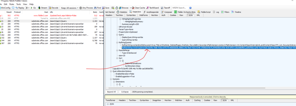
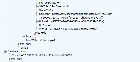
When I remove that refining query, it works as expected:
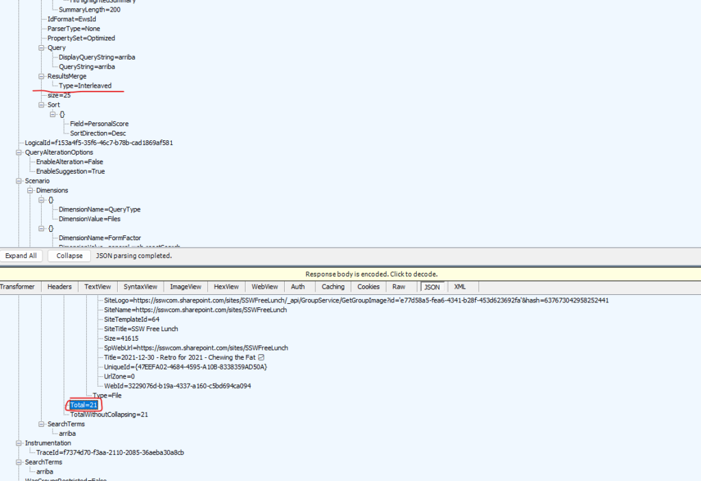
So I would say this appears to be a deliberate decision rather than a bug, though I think it is important to be able to turn it off if you want to find stuff using Team’s search 😂
In fact I would turn it off by default, so it is consistent with SharePoint Search
I’d love to know who uses LinkedIn Talent Hub?
At SSW we moved over to LinkedIn for our recruitment system (aka ATS being Applicant Tracking System) and it has been a good move, although it is much more $ expensive.
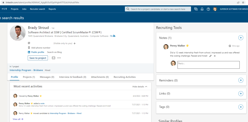
I find it annoying that there is no field to keep track of someone’s salary expectations. Currently I write it in a note:
How do you keep track of candidate’s salary expectations? What is the logic of not having this important field?
Dear Microsoft Forms Product Owner,
When looking at the feedback from my forms surveys, I prefer Bar Charts over Pies. Does anyone like Pies? – I find them less readable.
Suggestion: I would like to go to Tools | Options and set my preference
Question: I think I have noticed that Forms show Bars when there are 6 or more options. Right?
If so, I guess I should always make sure I have 6 options 😊 😊

VS
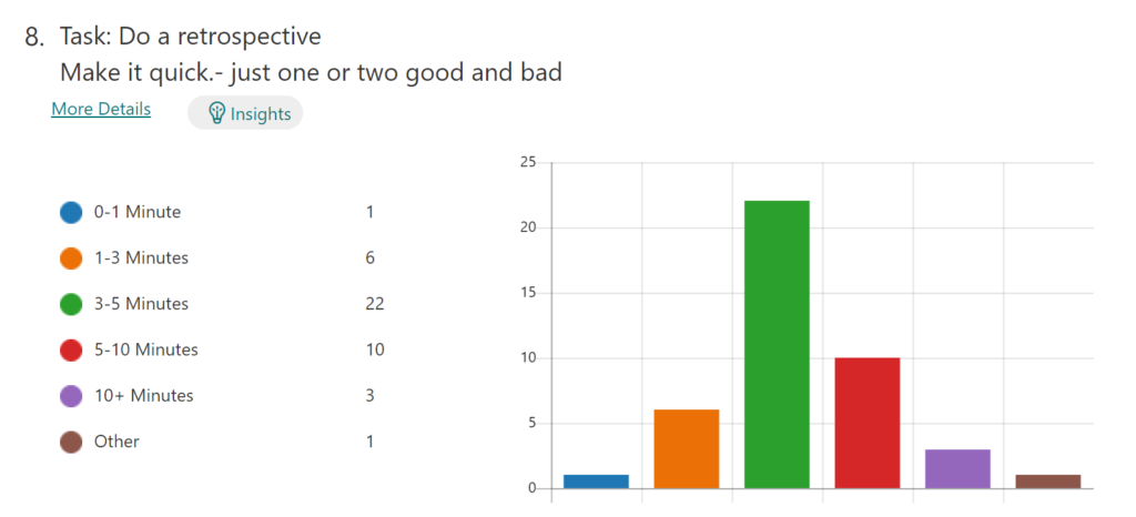
That is an odd decision. I was just talking to a person form New Zealand who said:
“we actually have a rule to never use a pie chart :) The only time they’re somewhat useful is if you are comparing 2 things. Anything more and it’s not really readable”
Please fix it or give us an option to allow us to fix it.
Basically what the Hyatt does – see LinkedIn post: KTLA 5 showcases our electronic locks using room key in Apple Wallet in partnership with Hyatt Hotels Corporation.