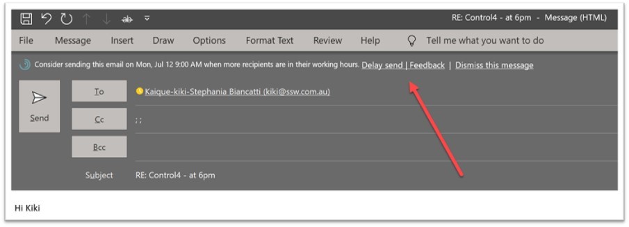
Help me understand how ‘Delay Send’ works

I often have problems giving specific feedback on Microsoft products and this example in Microsoft Outlook is an example.

Delay Send has been a feature I have used since I think the first version back in 1996.

Today I am sending emails to a co-worker at SSW on a Saturday and I see this cool new feature.

I think WOW! And I use it and think this Insight work Microsoft has done is super cool. ⭐

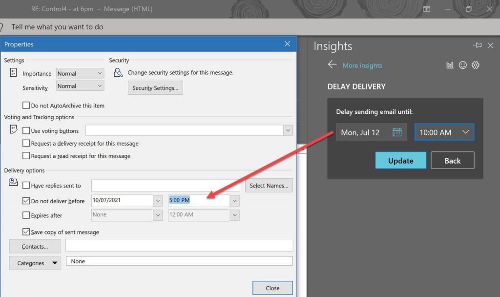
So I wonder how this works and look at “Delivery Options” and then I see this field is out of sync…

  • I think to myself that the old feature I use is client side.
  • I guess the new feature I am trying is server side.
Figure: BTW if I check off that check box “Do not delivery before” it sends the email immediately BAD BUG!!!

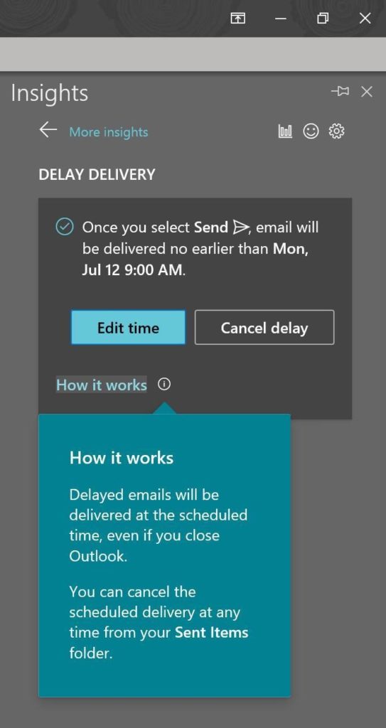
So I read the help and am not enlightened. ☹️

Figure: I’d love an “Advanced Help” link to the Microsoft Doc article. If a lot of people are clicking “Advanced Help” it might indicate that the help isn’t quite enough

So let’s tell Microsoft I didn’t like it.

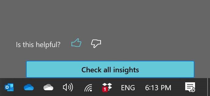
I click “Not useful” and nothing obvious happens (see below image) 

Suggestions:

  • I expect to see a red icon and a text field appear
  • I expect to be able to tell Microsoft why it is not useful.
  • I expect to get a URL that I can track the issue. This could be a nice integration point into Microsoft Rewards
Figure: If giving negative feedback, I would feel more heard if the down thumb went red. At least resize the icon to 3 times bigger so I know it was clicked

Help me prevent graph data loss

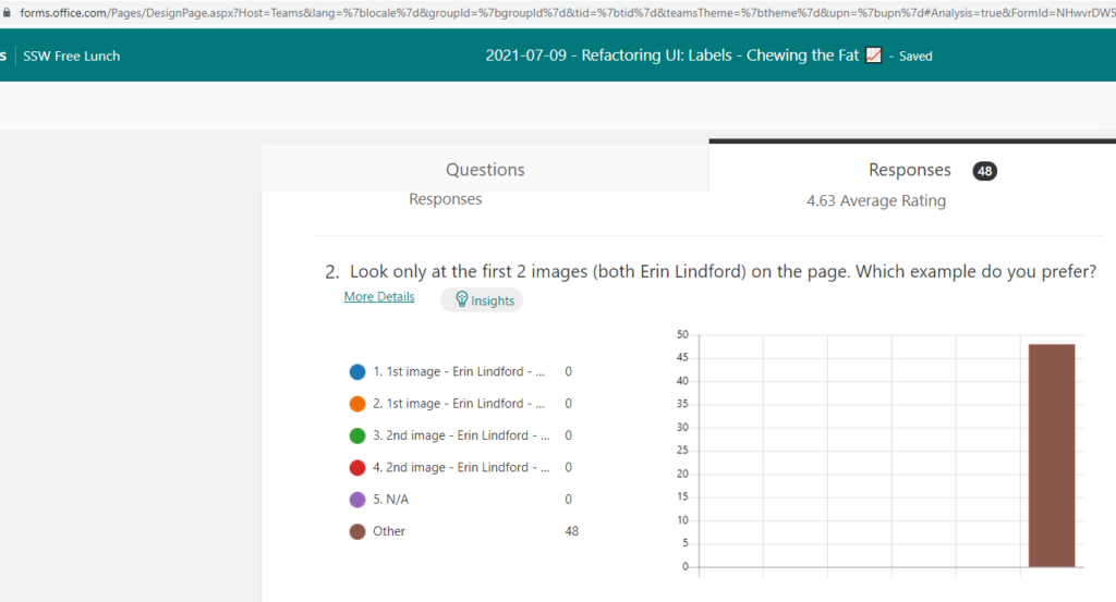
If you edit a response that has answers, you suddenly lose the nice bars on your graph and they move into the field “Other”. 

Please add a warning “you will lose your graph data as this option has xx responses”.

Figure: Editing response options will move all data into “Other”, without a warning! 🔥

Help me because the location of the attendees matter

Where your eyes are… matter.

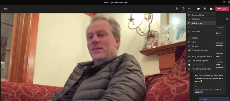
Do you know about“Gallery at Top” (see image) – if you are not using it, try it. I’d love to know if you also think it is awesome ⭐

  1. Suggested option: “Keep the person talking in the center” … what do you do if 2 people are talking? Move both of them to the center….
    Basically I’d like the people who don’t talk off to the sides.
  2. Suggested option: “Keep people who have cameras on, in the center”
    Basically I’d like the people who don’t turn their cameras on, off to the sides
Figure: Move the people to the top with the option “Gallery at top”

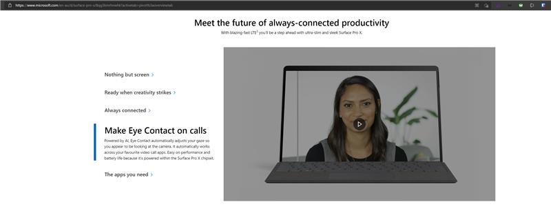
PS: Maybe we all need a Surface Pro X.  😊

Watch the video: Surface Pro X – Ultra-thin & Always Connected 2-in-1 Laptop – Microsoft Surface

It is pretty subtle.

Help me get more clarity from Workspace | Lineage View

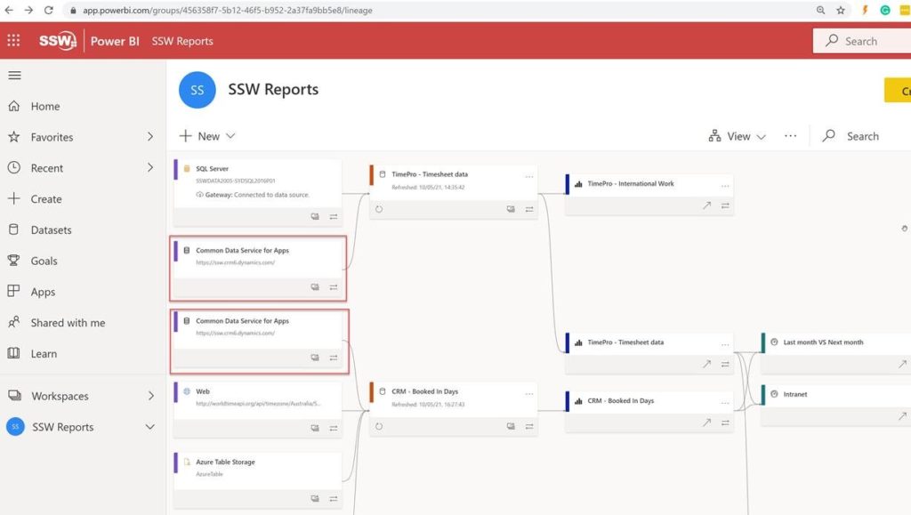
I love the new view in Power BI called Lineage. It allows visualising which data sources are used by which reports. 

One small thing I was confused by was the Data Source boxes.

1. As per my 2 red boxes, there is duplication…which I assume is there to make it simpler to read with less overlapping lines:

Am I right that there are 2 boxes instead of 1, to make it easier to read? 

I think that there should be an option to ‘show only 1 box with many arrows’.

Answer from Microsoft:

In your case, it looks like you are connecting the same data source to more than one dataset. We show it twice because although it is the same source, we allow you to setup different credentials against the source for each dataset, and potentially configure different parameters. In cases where you have the exact same data you want to use for both datasets, the recommended approach would be simply import the data once into a single dataflow and use the dataflow as the source for both datasets.

This is far more efficient as you bring the data in once, there’s no need to duplicate the data prep, and it reduces the load on source systems. Some source systems have constraints on the amount of data you can extract, or the throughput of the extraction. If you were to do that, the lineage view will show the same dataflow being used as input into both datasets. 2. Show a warning when you see duplicates
e.g. It looks like you have the exact same data in multiple datasets. The recommended approach is to simply import the data once into a single dataflow and use the dataflow as the source for both datasets.
You can learn more about dataflows here: Introduction to dataflows and self-service data prep – Power BI | Microsoft Docs

3. Alternatively if we stay with the current view, can we get an easy way to highlight all similar boxes
e.g. so I can see all reports using “Common Data Service for Apps”.

Right now I need to scroll through the whole list to identify all of them!

4. Curious… do you plan to enable this Lineage view on the iPad Power BI app?

Answer from Microsoft:

No

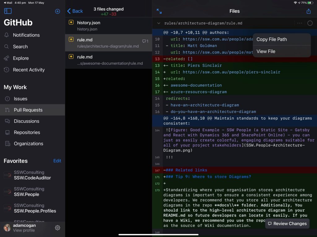
GitHub’s Mobile App – Support images rather than showing “binary file not shown”

For markdown users who use content + images and Pull Requests on content sites E.g. SSW Rules

> Mobile App – Support images rather than showing “binary file not shown” – Discussion #4056 – GitHub/feedback

If you agree, please:

  1. Login to GitHub
  2. Give it a heart, a like, and a rocket ship (I really don’t know the difference, nor why you can add more than one emoji )

SharePoint Intranets – Suggestion for Site Usage

I know that Microsoft have recently invested in giving us some stats to help us make our intranet’s better…

I’ve taken a look at https://<Tenant>.sharepoint.com/_layouts/15/siteanalytics.aspx?view=19 and I can see Site/Hub Usage stats on our Site Collection.

However, there are a few things that could be improved:

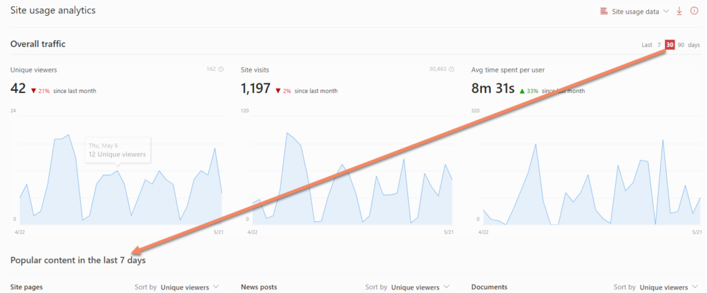
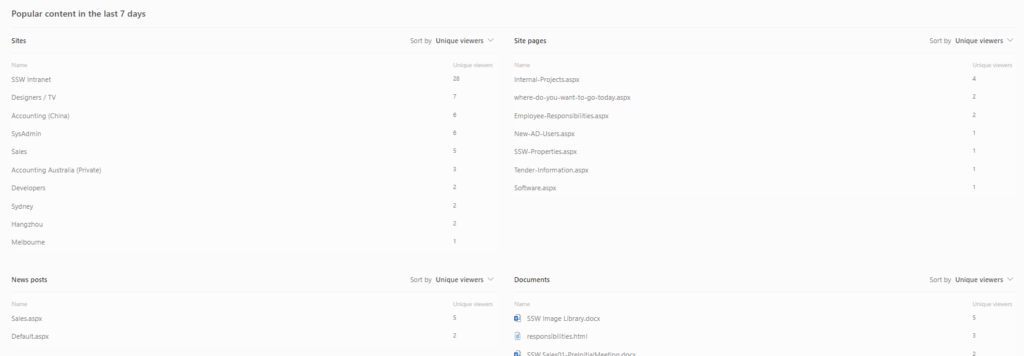
1. Sync top & bottom widgets – Popular content is locked to 7 days,  it should be in sync with the top selector

Figure: The filters should be in sync (I.e. when you change the top one, the bottom one should change

2. Hub Usage only allows 7 or 30 days – inconsistently the Site Usage allows 7, 30, or 90 days in the timespan selector

3. Missing the users – We should have a widget to see the most active users (we do have widgets to see sites, pages, news, documents… why not users?)

Figure: In Documents – I can see a file name but it would be good to know it’s location

4. Documents – (see bottom right widget) It would be useful to know where the documents are from (i.e. which Site Collection/Site/Library). This could be a card on hover or simply an extra column in the widget.

Help me see the status messages

Sometimes you see a message like this:

3 or more members are out of the office or have a status message

Unfortunately it is not immediately obvious where to read them. 

Currently you can open the top-right-hand pane, then from there hover over the people’s icons and see their status.

I have a suggestion that could remove this papercut by adding a button called “View” straight from the message we see.

Figure: “View” link opens panel