Do you agree that products always have room for improvement?
"Every day there are little things in software that we find annoying. Some write books about it, like Annoyances.org, but I thought this site would be more constructive.
BetterSoftwareSuggestions.com is proudly maintained by myself and the developers at SSW."
When I create a Microsoft Form from a template, I must follow an arduous process to get the Form into the right team so we can track the data.
First, it goes into my personal teams, then I must move it to a team, then I need to add it to a tab, then I must move the excel file to the folder I want!
Instead, there should be an option to choose which team and folder the form goes in.
See this video for the current steps, I’m proposing that most of these steps should be automated:
Figure: Save me from teaching people to do all these steps because they never remember!
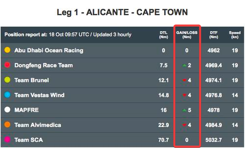
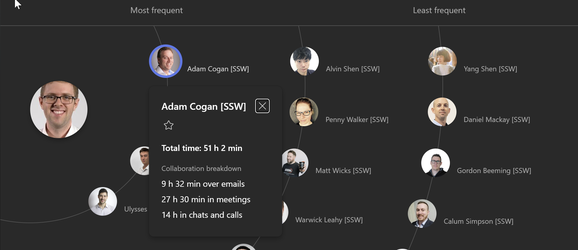
When I look at Microsoft Viva Insights, I can see the people I communicate most with, but not whether it’s going up or down over time.
I want to see the trend so I know who I should spend some more time with.
It should show how far up or down someone has moved, similar to a leaderboard.
Figure: The gain or loss arrow gives a nice indicator of change in positionFigure: I should be able to see who has done more or less communication this month
I think this would be affecting every Microsoft Forms customer who reads the results. When I look at results on the Microsoft Form, they can be ordered alphabetically, or by user, or by date filled. However, I cannot order them by the order I wrote the original questions in.
Therefore, I currently solve this by prefixing every question with a number, so it orders by the number.
Instead, there should be an option to sort by the order of the options (and it should be the default order).
Figure: As a workaround, we use numbers to order by option type, but it would be better if this was built-in
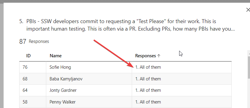
When it comes to software, user experience is paramount. One area that could benefit from improvement is the way we handle ‘My Access’ approvals.
Current Experience
When someone requests access, the recipient gets a detailed email with a neat table. This table clearly shows who requested what access and their reasons for doing so.
Figure: Access request shows reasons
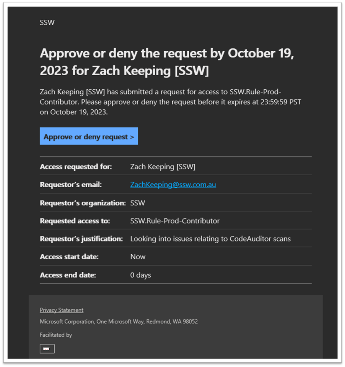
Room for Improvement
However, when it comes to approval notifications, the details are missing. The recipient only knows that the access was approved but doesn’t see who approved it or why. To find this information, they have to click a link and navigate through the history to locate the specific approval.
Figure: Approval email doesn’t show who approved it and why they approved the access
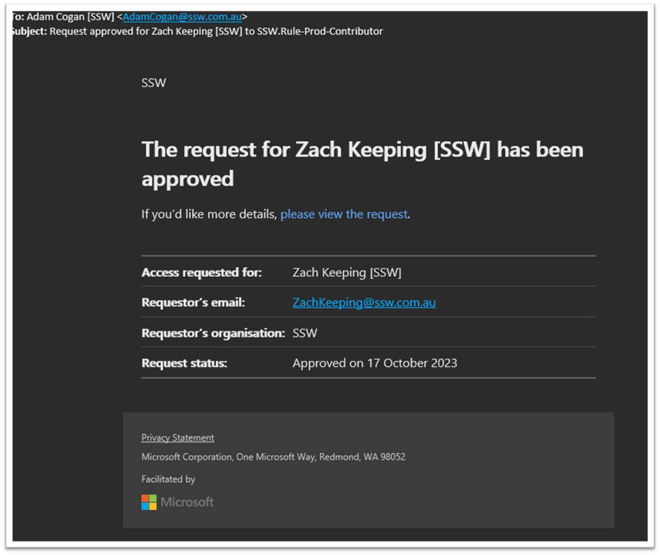
Suggestion
It would significantly enhance the user experience if the approval email could directly provide these details, similar to the access request email. This change would offer users a consistent experience, reduce the number of steps to find information, and increase overall efficiency.
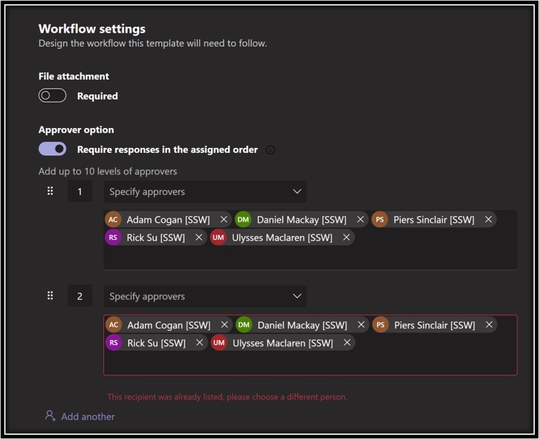
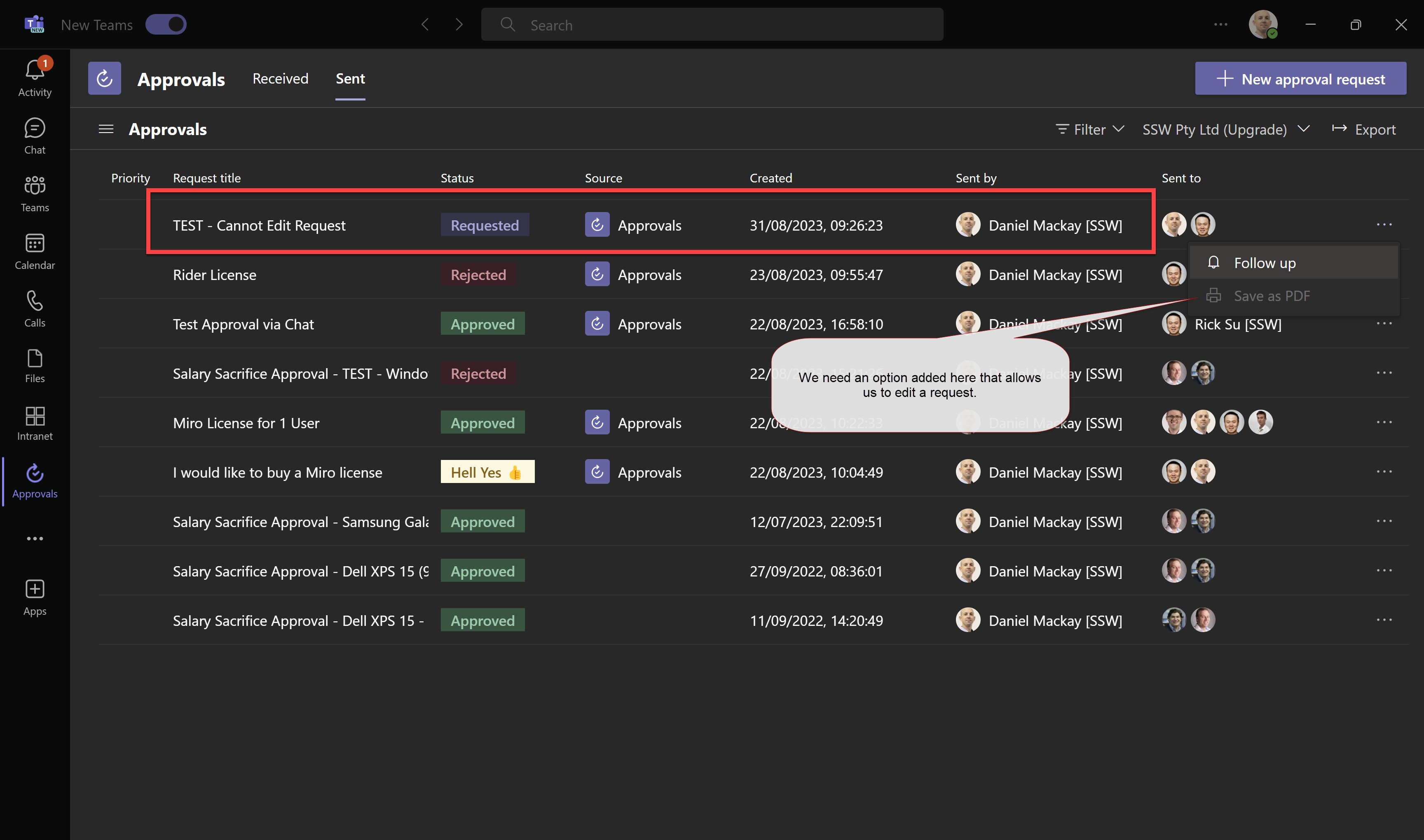
At SSW we are rolling out the use of the Approvals App with Teams to get requests approved through the organization. I love how easy it is to create templates and use them to submit requests. Previously we were using emails to manage these approvals, so another benefit is a reduction of noise across our collective inboxes.
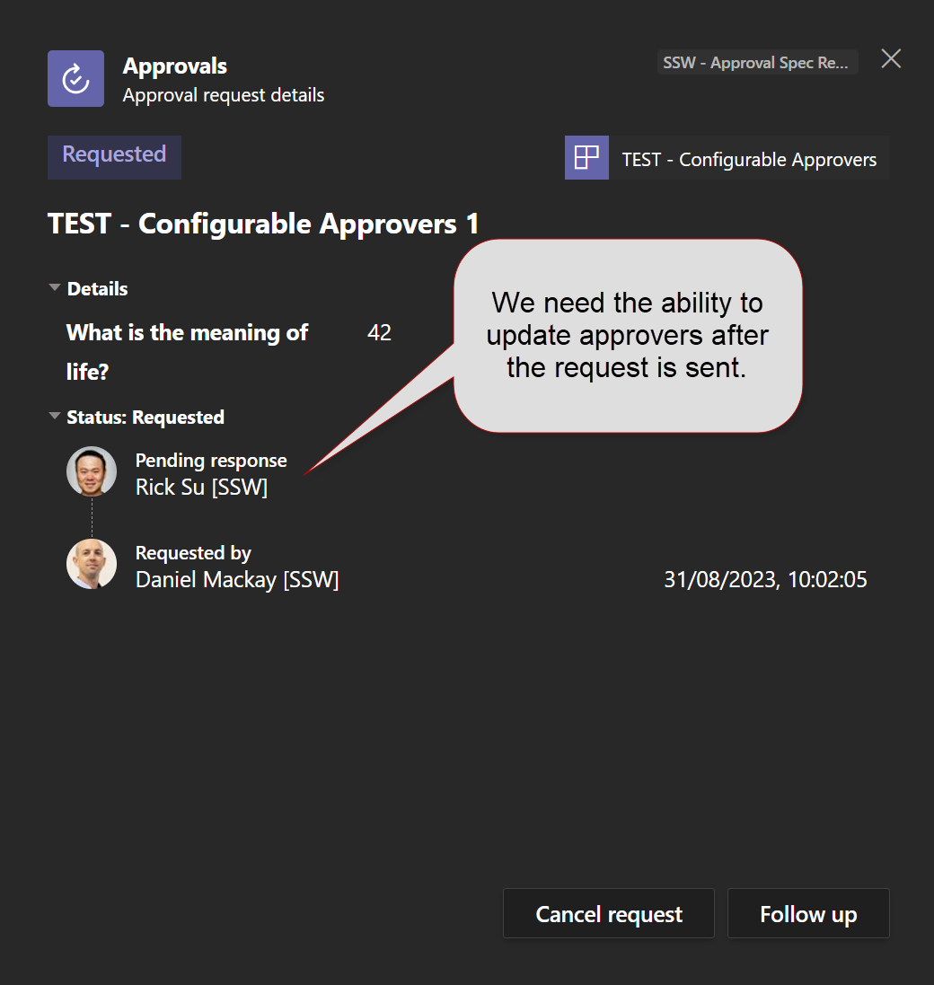
Once an approval is submitted there is no way to alter the data. While this makes sense for requests that have been approved, it would be great if we could edit requested approvals prior to being approved. Currently, the only way we can do this is submit another request which means manually entering all information again which takes time.
Send another request with the updated information.
❌ This can be time consuming if multiple edits need to be made
❌ Copying information to another request can be error prone
❌ Approval system gets polluted with duplicate requests
Suggestion:
Add the ability to edit an approval request prior to it being approved.
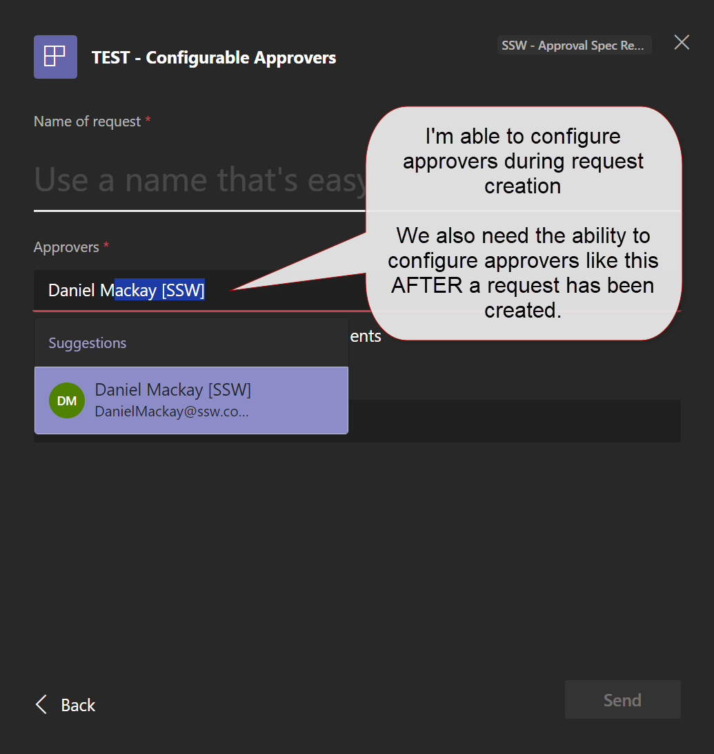
This would include changing the approver (if the template allowed the user to select approvers)
Figure: Lack of an option to edit an approval requestFigure: Only able to edit approvers during request creationFigure: Viewing details of an approval request after it’s sent
Every company has the need for requests to be approved. We’ve found that the Microsoft Teams Approval App works well, but only in simple cases. It is easy to create templates and use them to submit requests.
When companies switch from emails to a centralized structured approval, processes improve, and emails are reduced.
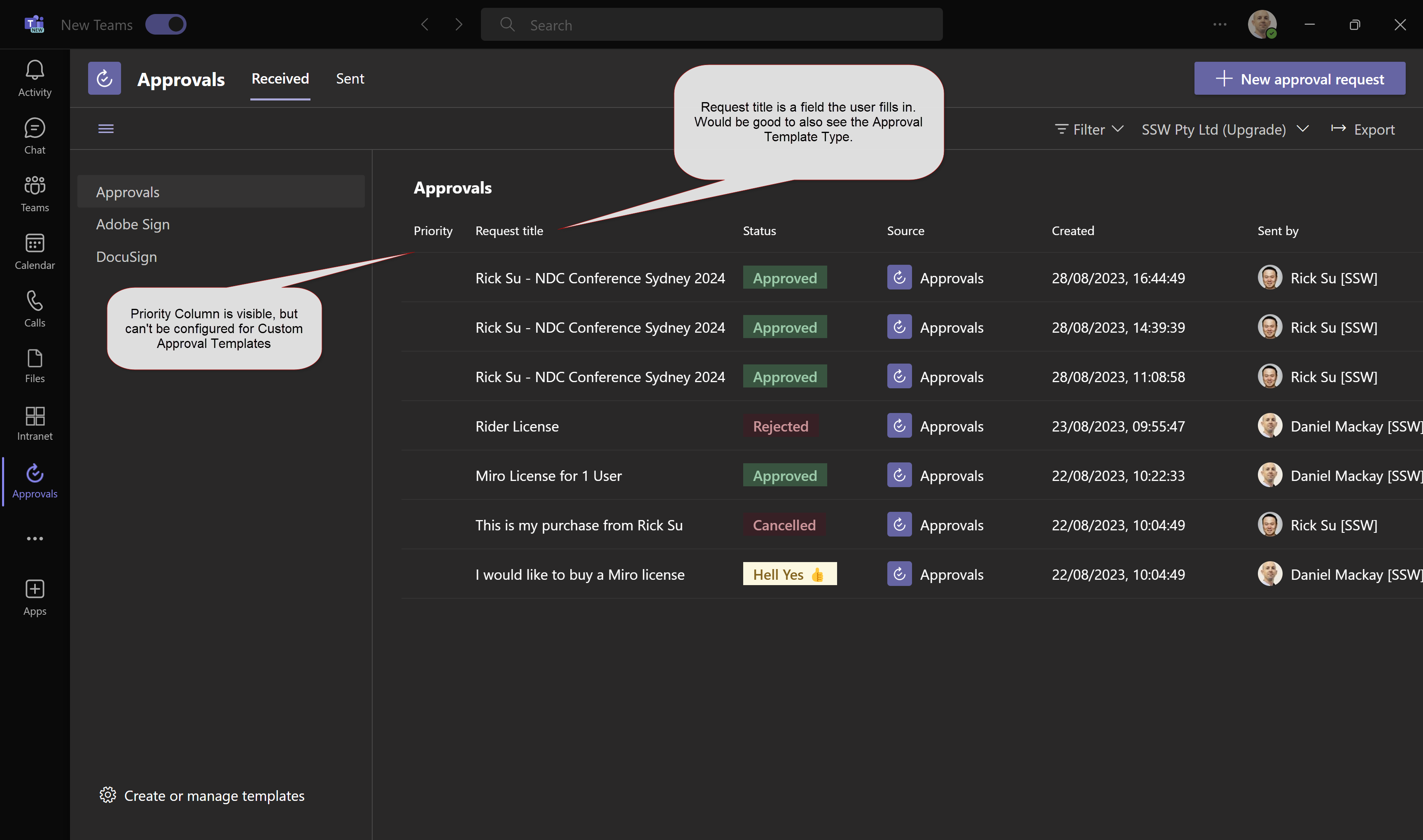
Senior Management are often responsible for approving most requests and as such can have a large backlog of requests to approve. In order to help approvers action the most important requests I would like to see the following enhancements:
Allow Priority to be set in Custom Approval Templates – ideally the priority level would be set in the Custom Approval Template, and not able to be changed by the user making the request.
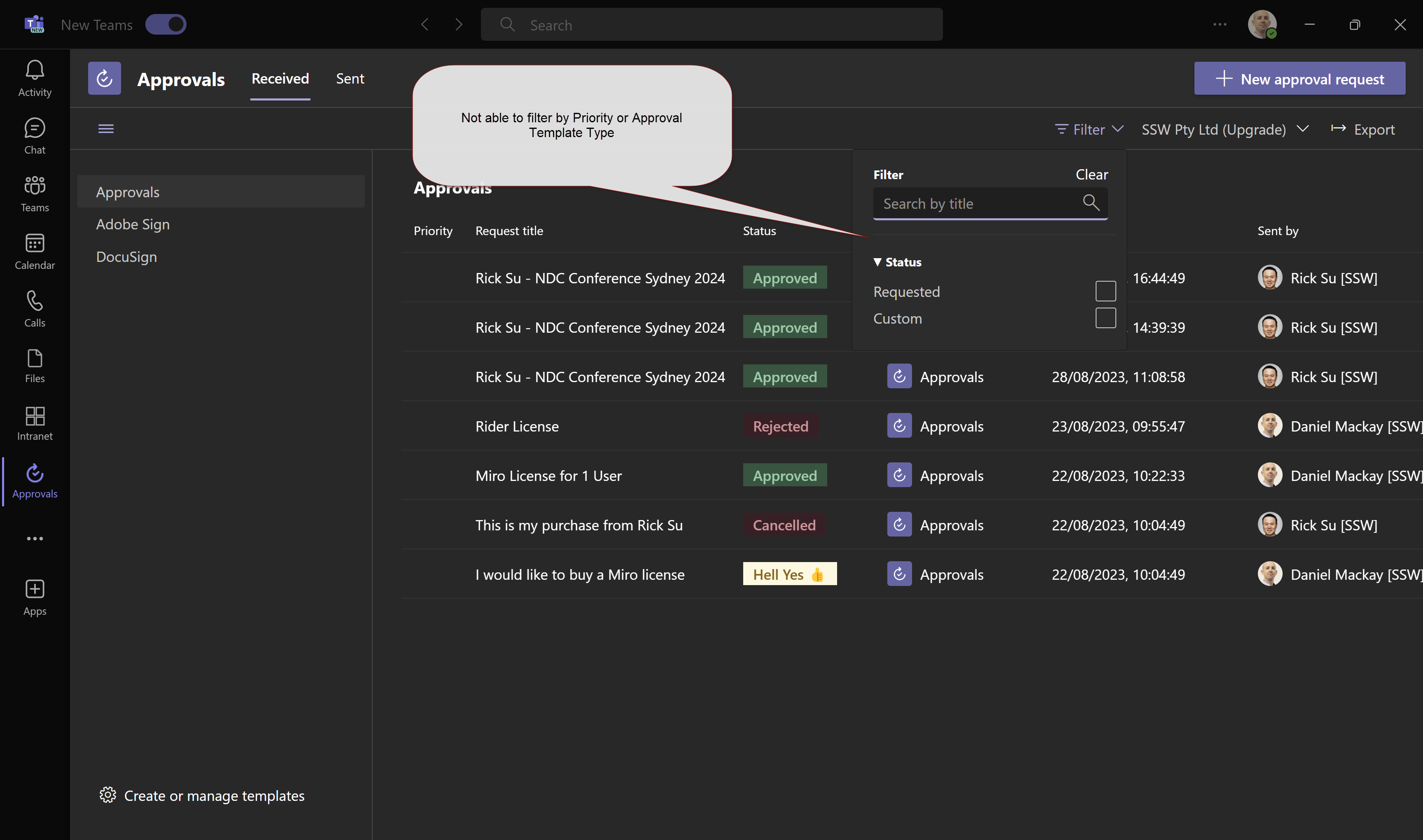
The ‘Request title’ field is not enough. We need another column called ‘Approval Template Type’.
We can sort on the column titles, but we need the ability to filter by Priority and Approval Template Name
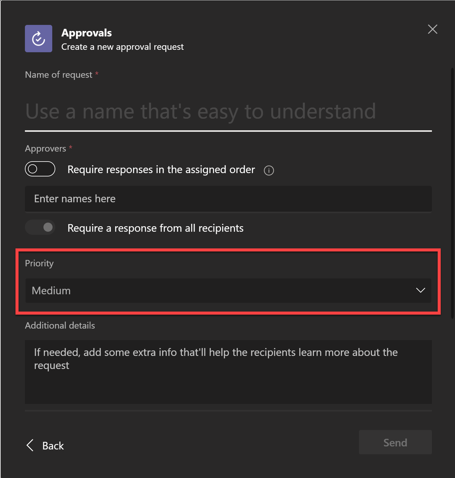
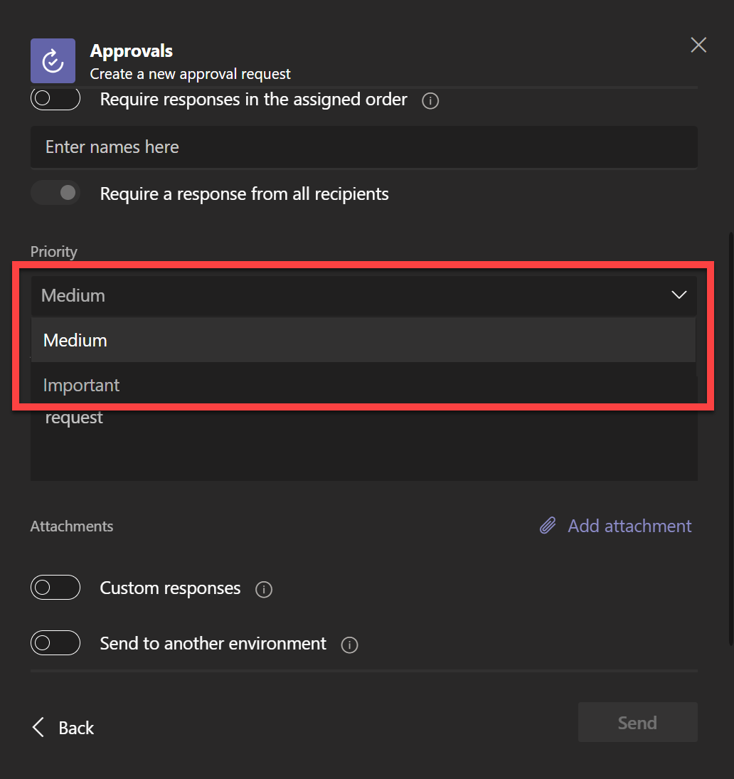
Figure 1: Approval Hub – Can see Priority and Title, but not Request TypeFigure 2: Not able to filter by Priority and/or Request TypeFigure 3: We are able to configure priority for basic requests, but NOT able to do this for Custom Request Templates. We need access to this field in Custom Request Templates.Figure 4: Why are there only two priorities? We would like to have 3 levels (for example, similar to how Outlook works (see below))Figure 5: In Outlook we have 3 priorities. For consistency, we would like 3 priorities in the Teams Approval App also.
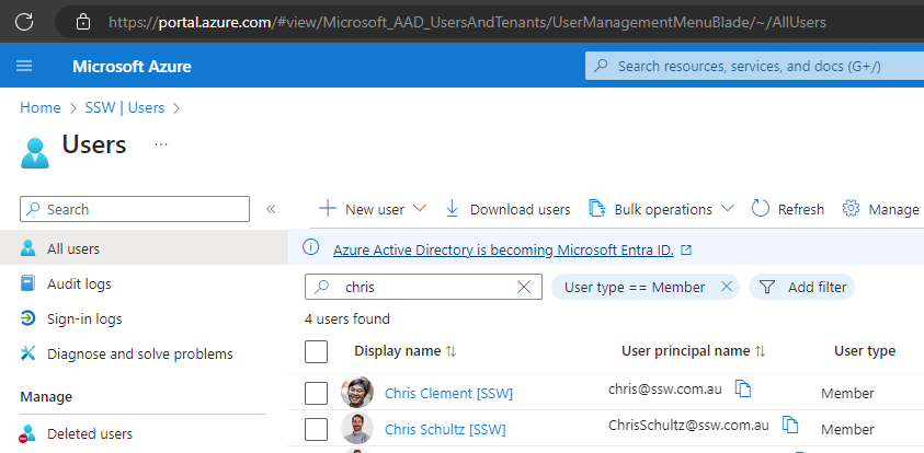
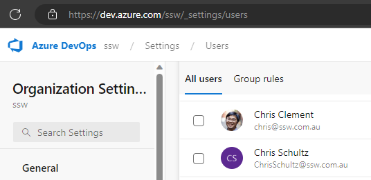
We have Azure DevOps connected to Azure AD so that our users can log in with their Azure AD credentials. Currently, DevOps does not show our users’ Display Name that is set in Azure AD.
Users can change their own name here, but this is not a fix. For the sake of consistency, display names should match the display names used in Azure AD.
Figure: Display Name in Azure AD (with [SSW])Figure: Display Name in Azure Devops (missing [SSW])
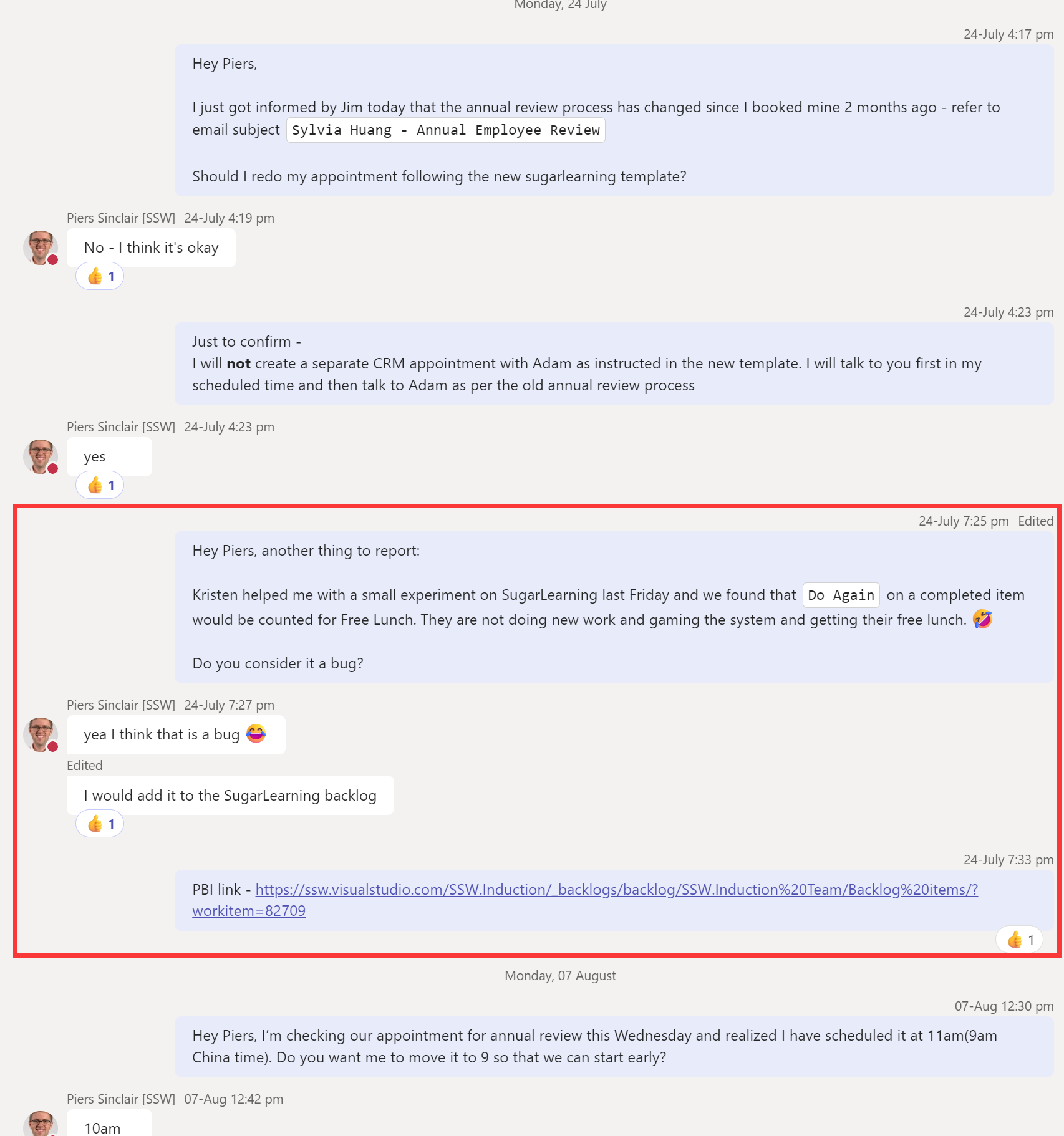
I work in the China office, and we keep reverting to WeChat because it offers this feature which is super useful. It is missing from Teams.
I want to be able to forward a group of messages in my private chat with someone else not in the chat. This often happens when a problem comes up in the discussion and I realized I have already discussed a similar issue. Therefore, I want to share a section of my chat history to them quickly.
❌ My current workarounds: Option 1: Copy + paste the messages one by one to the other chat. Option 2: Take a long screenshot of the chat history and share the image.
✅ Suggestion: Allow people to cherry-pick messages in their chat and forward them in a bundle.
❌ Figure: I want to forward just the section in the red box to someone else (but I don’t want to share irrelevant information about my annual review)✅ Figure: WeChat lets me combine and forward selected messages

 -
-