Do you agree that products always have room for improvement?
"Every day there are little things in software that we find annoying. Some write books about it, like Annoyances.org, but I thought this site would be more constructive.
BetterSoftwareSuggestions.com is proudly maintained by myself and the developers at SSW."
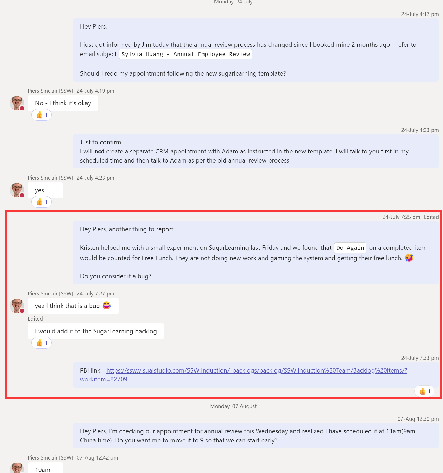
I work in the China office, and we keep reverting to WeChat because it offers this feature which is super useful. It is missing from Teams.
I want to be able to forward a group of messages in my private chat with someone else not in the chat. This often happens when a problem comes up in the discussion and I realized I have already discussed a similar issue. Therefore, I want to share a section of my chat history to them quickly.
❌ My current workarounds: Option 1: Copy + paste the messages one by one to the other chat. Option 2: Take a long screenshot of the chat history and share the image.
✅ Suggestion: Allow people to cherry-pick messages in their chat and forward them in a bundle.
❌ Figure: I want to forward just the section in the red box to someone else (but I don’t want to share irrelevant information about my annual review)✅ Figure: WeChat lets me combine and forward selected messages
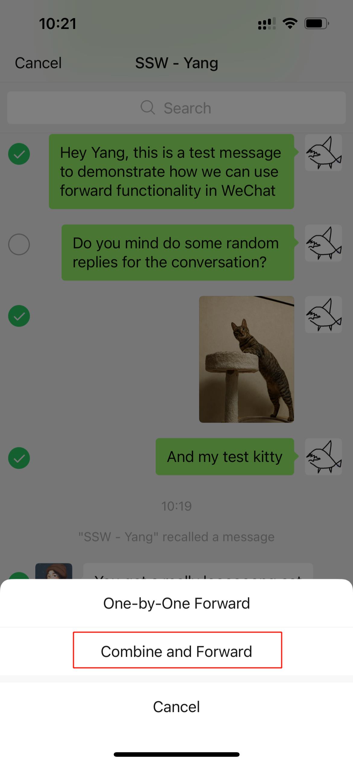
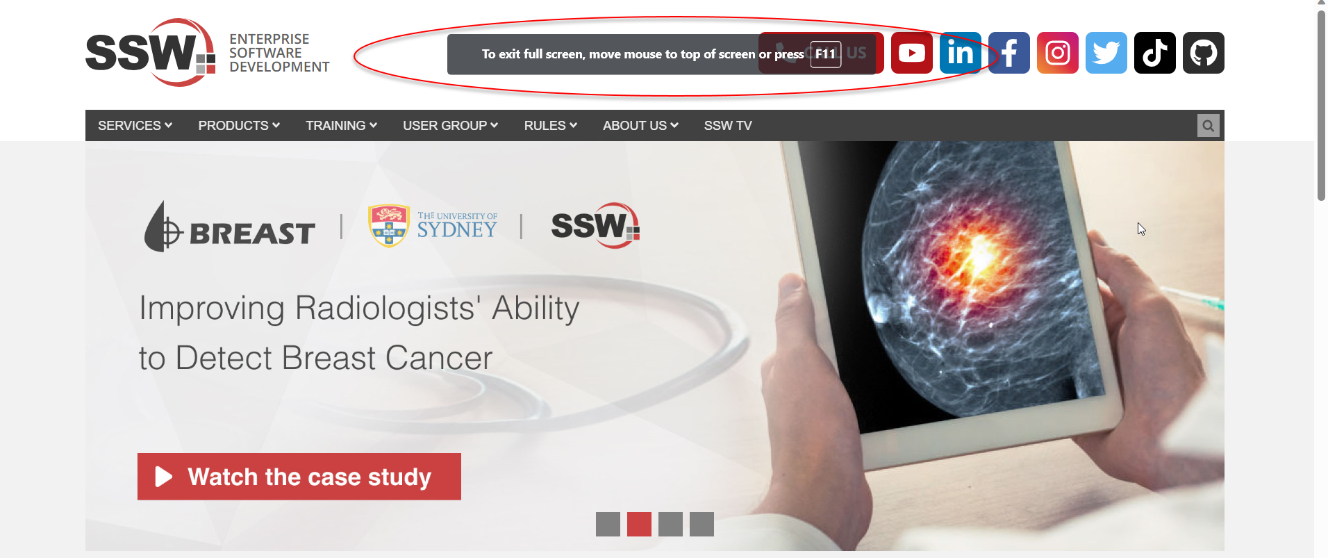
When screen sharing in Teams or other applications, you want to be able to reduce noise as much as possible. One way to do this is by using full screen mode.
✅ Chrome – F11 works
✅ Edge – F11 works
❌ Outlook new email – F11 doesn’t work (does nothing)
❌ Word – F11 doesn’t work (does nothing)
❌ Excel – F11 doesn’t work (goes to Charts)
❌ Figure: F11 key goes to Charts in Excel✅ Figure: Full screen in Edge with F11
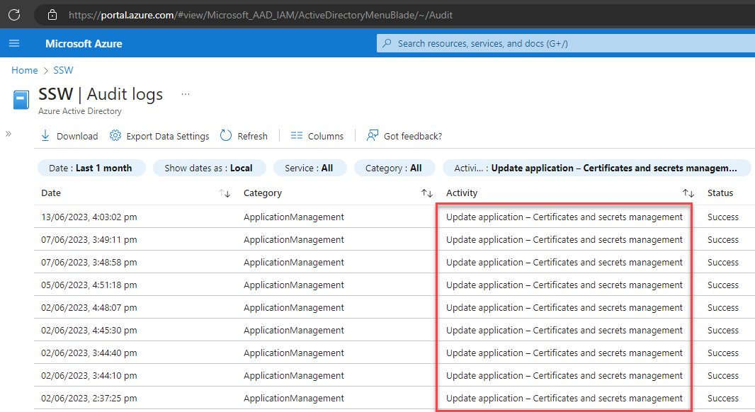
Azure AD Audit Logs are very helpful when diagnosing issues. Similarly, sending these logs to Azure Monitor is very useful for storing logs, and for setting up alerts on certain events.
In Audit Logs, we can see when an app registration secret or certificate is created or deleted.
Figure: Azure AD | Audit Logs app registration secret/certificate logs
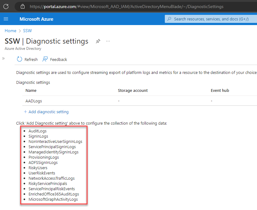
However, there is no way to send these logs through to Azure Monitor so that we can set up alerts on these events.
Figure: no option for app registration secret/certificate logs
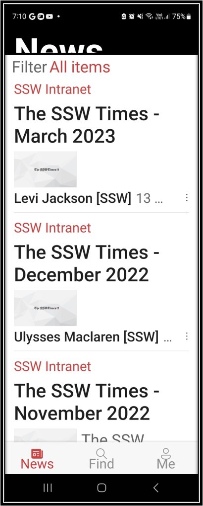
There are accessibility problems. E.g. I am having some of the 50 year olds in SSW reporting that they cannot even use the SharePoint app. Reason – they can’t read anything! Suggestion #1: below Suggestion #2: below
Note: it is not only the SharePoint app
❌ Same issue on the Dynamics app
✅ The Teams app has fixed this issue
✅ The Outlook app has fixed this issue
Figure: Android default is too hard to read for some.
Suggestion #1: Fix this accessibility problem by adding pinch to zoom (users expect the same as the web page)
Figure: Android Settings
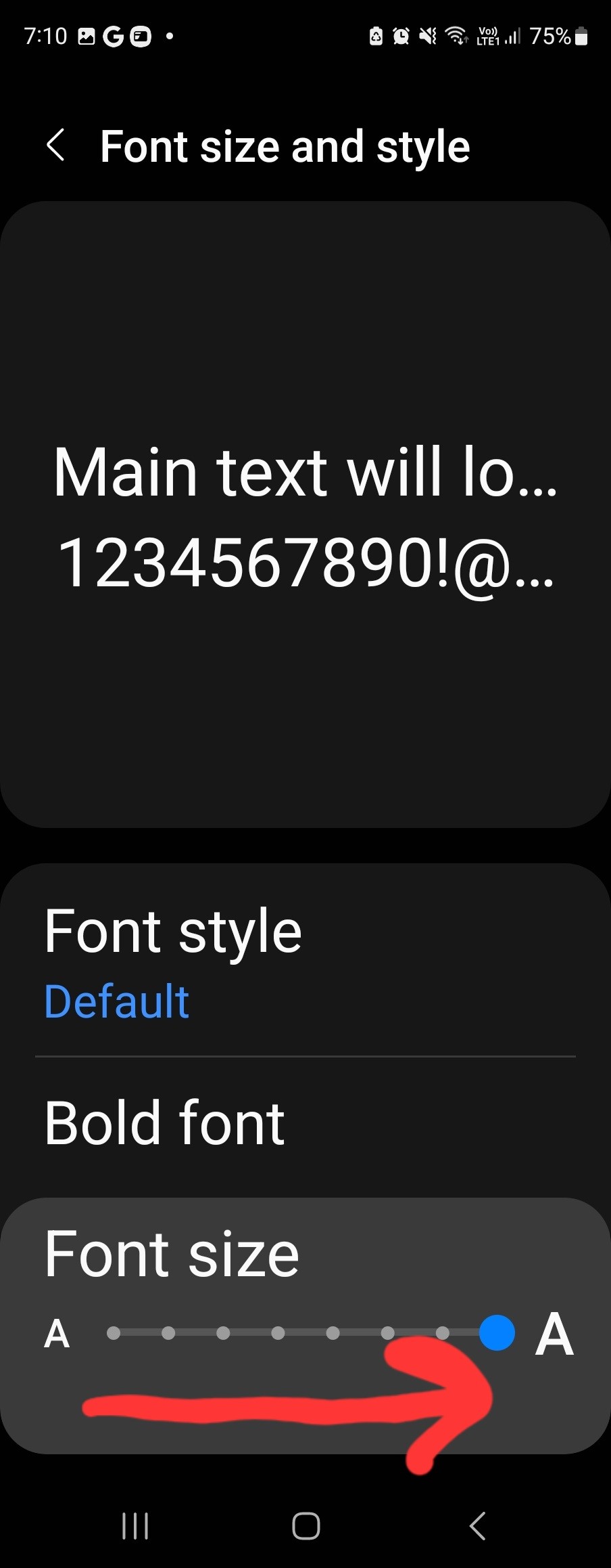
Suggestion #2 – add a Cogs button that would take the user to Settings | Font Sizeand Style where they can increase the system font size! People don’t want to use this setting because it changes everything on your phone.
Figure: Android after increasing the size on Settings
Suggestion #2 is magic UX – see it is broadly fixed (❌ the top “News” is weird)
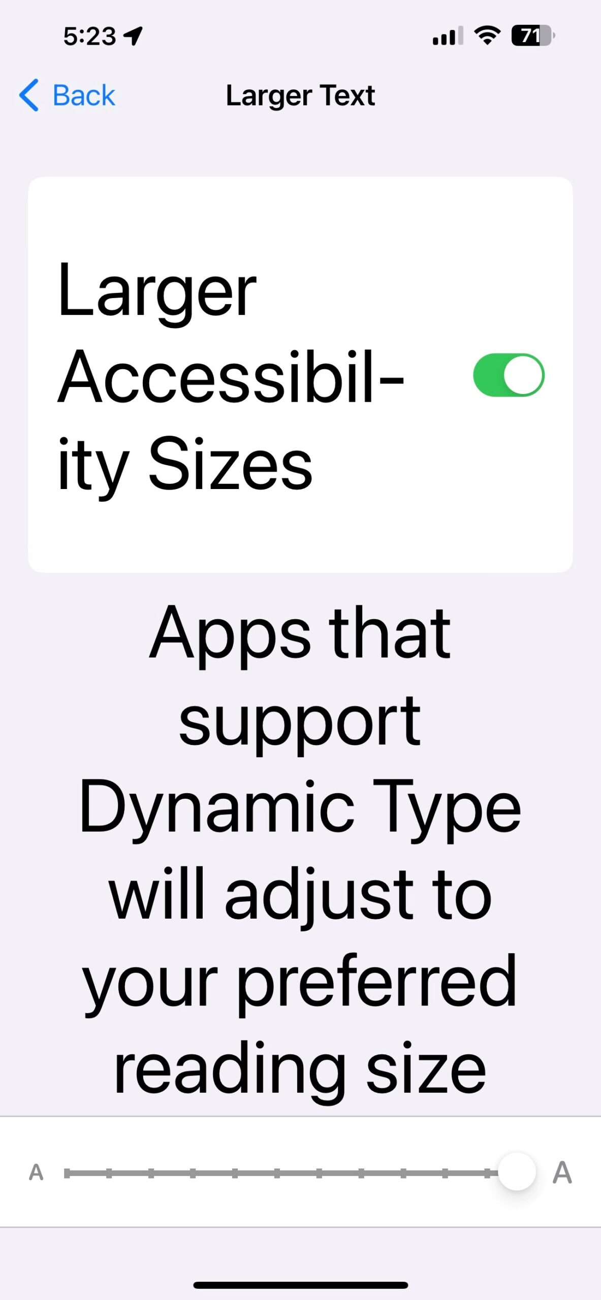
iOS seems to have a different problem
Figure: iOS normal view
Figure: iOS accessibility settings
Figure: ❌ Broken – Nothing increased except for the Search box (which is overlapping)
There are a couple things that frustrate me about SharePoint News. I believe that Microsoft Forms results should be shown in SharePoint news. By fixing this, SharePoint news will be more useful.
I see 2 problems: ❌ SharePoint News is not used a lot in most companies I work with ❌ Not many people in a company know when is the right time to read a Forms survey results…. Or even that you can.
Suggestion: ✅ When you are looking through the results of a Microsoft form, it would be great if there was an easy option to show the results in SharePoint News.
✅✅ Even better would be a way that the Form owner who reviews the comments, could add their own commentary to give context, before the others get to read them.
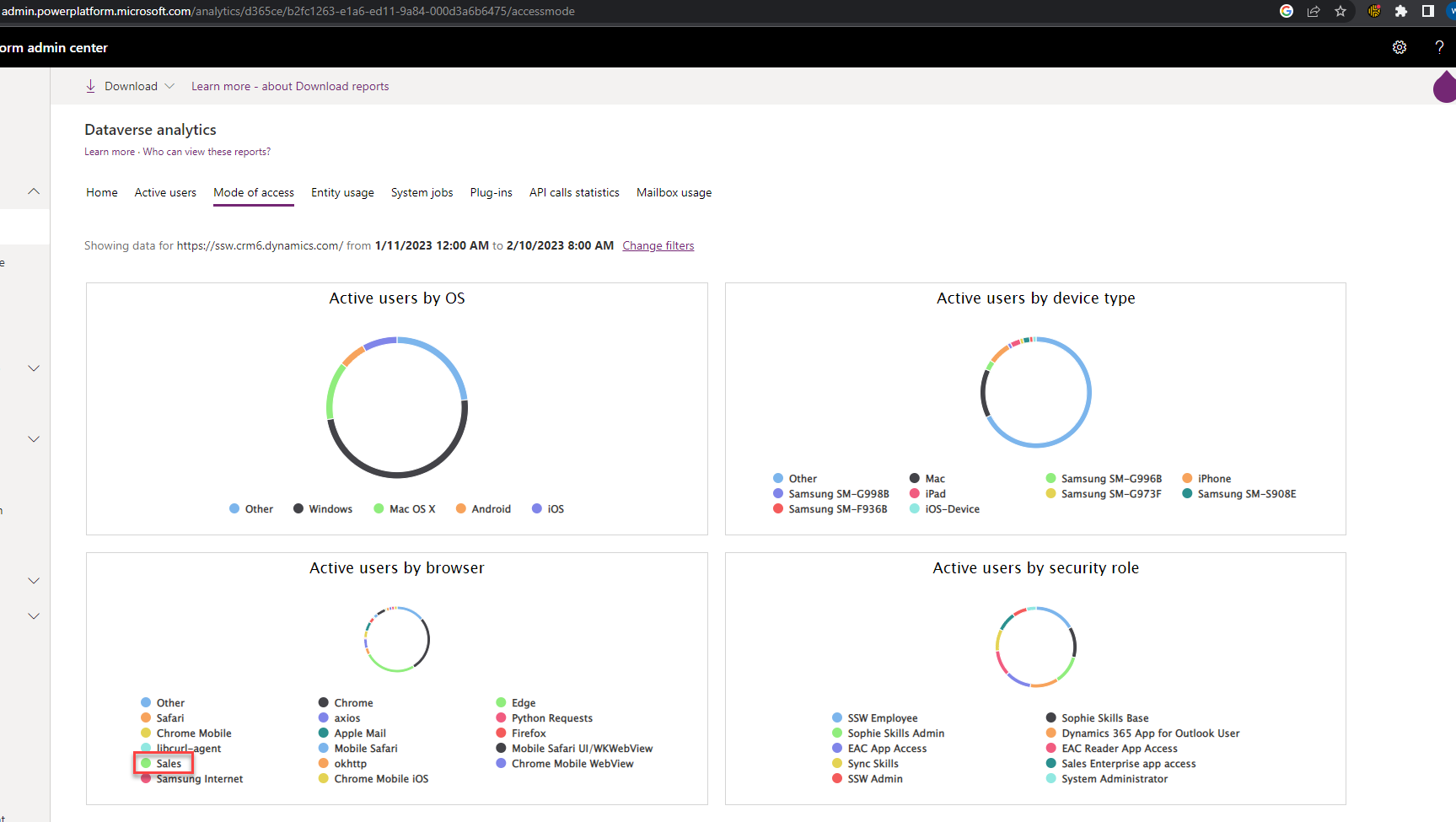
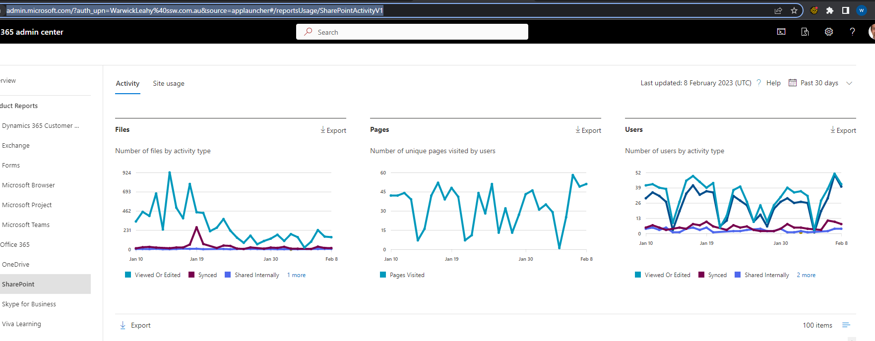
I am very interested in how people are accessing our services. I especially like how I can see that our users are accessing Dynamics 365 on their mobile app.
SharePoint should display similar results. I would like to see how many of our SharePoint users are accessing our intranet via the ‘SharePoint app’ and also SharePoint Lists via the ‘Lists’ app.
Figure: Dynamics usage report shows that a number of people are using the Sales app to access DynamicsFigure: SharePoint usage report should show the same thingsFigure: Office365 Power BI app shows Outlook Mobile and Teams but doesn’t have SharePoint stats
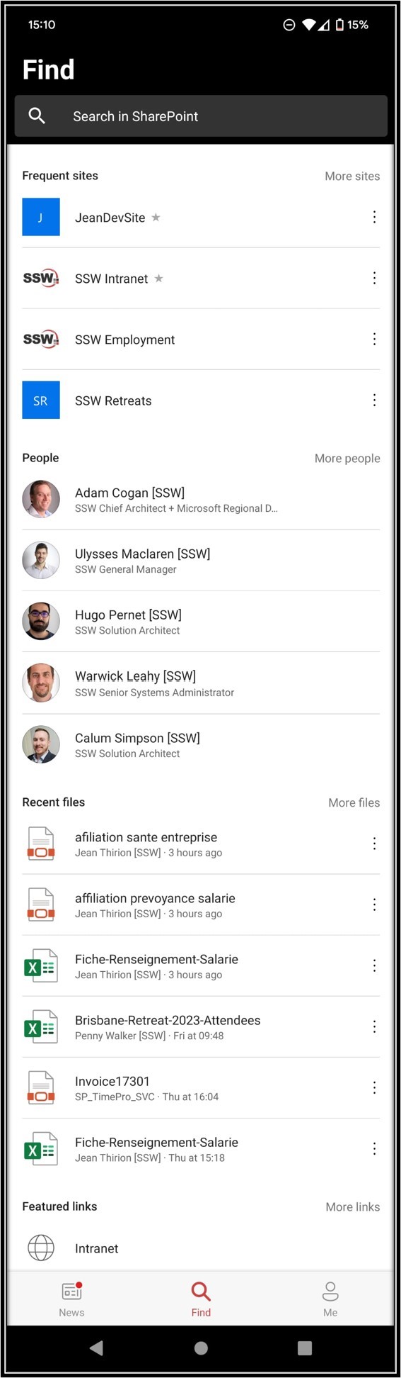
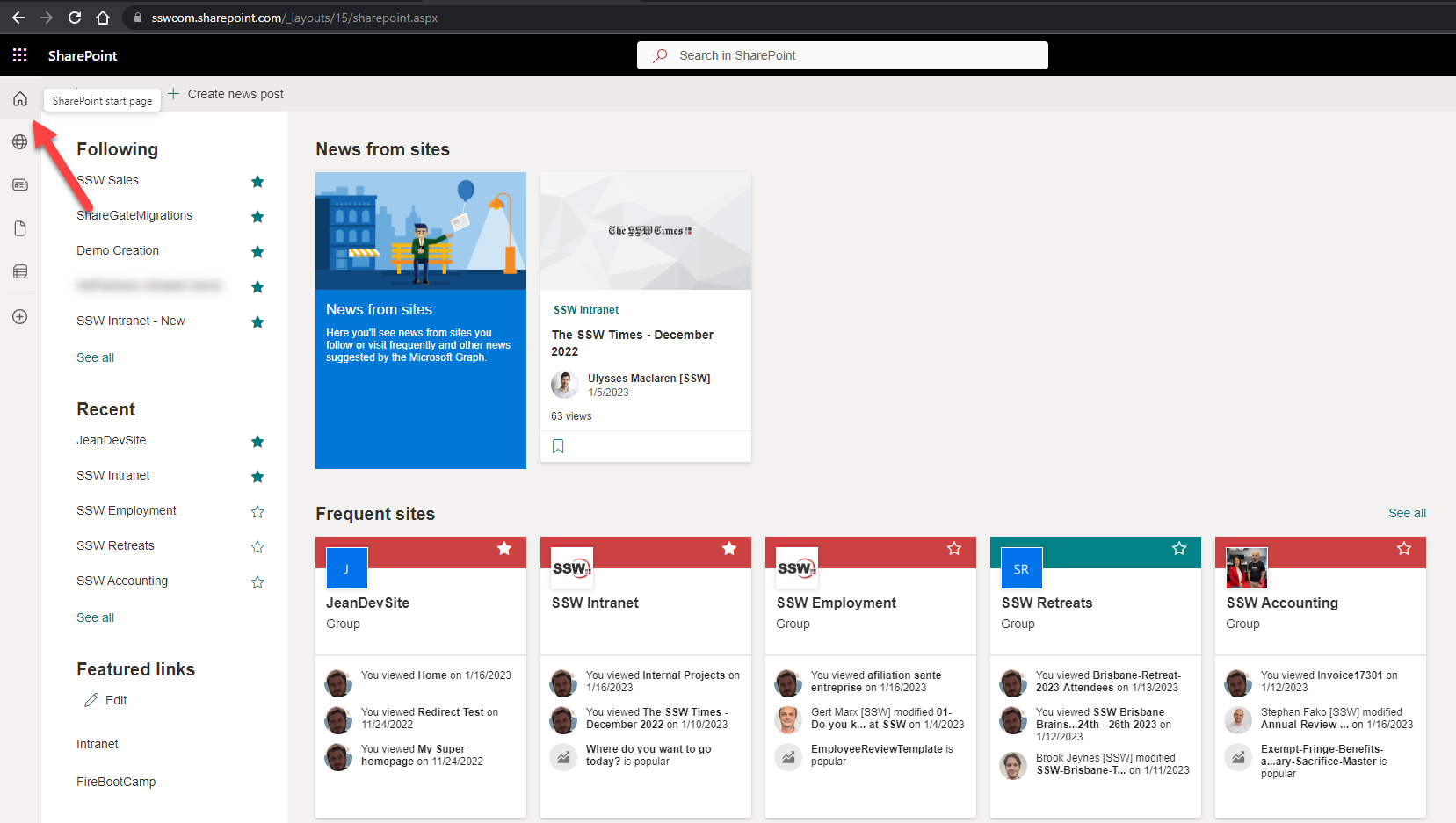
More importantly the page’s content is pretty bad, i.e. it shows different sections and even different content compared to the mobile app.
Figure: This is the SharePoint “Home page” and it needs improving – make it consistent with the mobile app
I would love to see the same categories described above in Suggestion #1 (i.e. Sites, People, then Files).
In short, the content should be the same – whether I use the browser or mobile app (e.g. today even just the Frequent Sites I see on the browser and on the mobile app are different – how??).
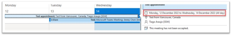
If I view an all-day event in my Outlook calendar that:
Was created in a different time zone
Goes for multiple days
Has all-day event ticked
The event will show as one day shorter than the actual event. The hover preview shows the same (incorrect) number of days. If I open the event, it displays correctly.
Please fix this inconsistency.
Figure: Test event, created in a different time zone for Monday to Thursday – shows as Monday to WednesdayFigure: The same event (correctly) shows as Monday to Thursday when opened

 -
-