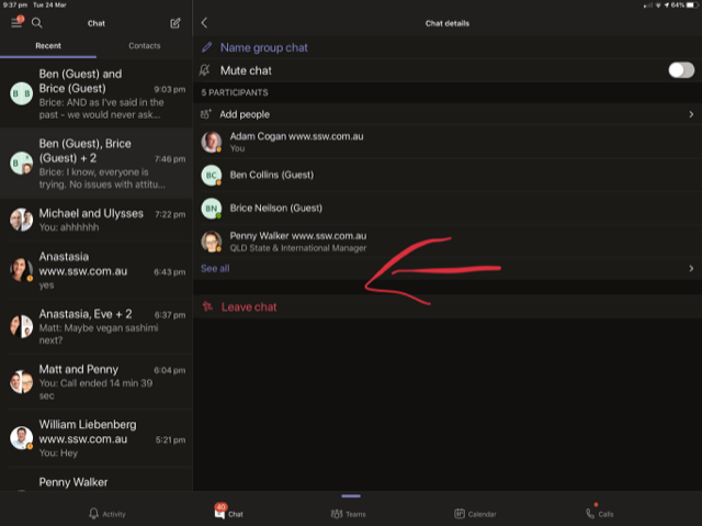
If there is enough space to show all, the ‘See all’ button becomes unnecessary.
Help Microsoft Teams look better when you move it to ½ screen
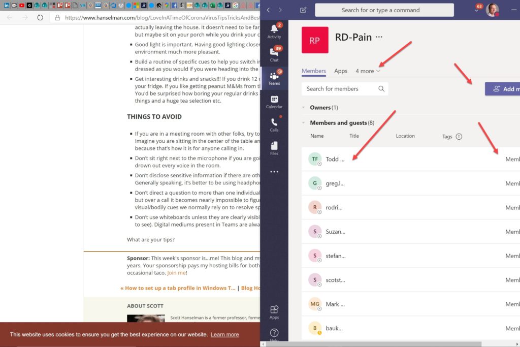
I often have Teams on the right side of my screen and there are a few little things that could be fixed.
Some examples as per the red arrows
- Expand “4 more”
- Expand columns
- Move buttons
- Add column last access eg. “5 hr”
Help me know what resources a client has access to
Inside SSW, we have added a lot of clients into the Teams team. On the downside, you start seeing a lot of names you don’t know.
Suggestion:
John is a client and a person I don’t really know. It took me a long time to know what he has access to here at SSW.
On this popup window it would be nice if you show something like this:
John has access to:
- 1 team
- 1 DevOps project
- 2 invoices (via an extensibility point)
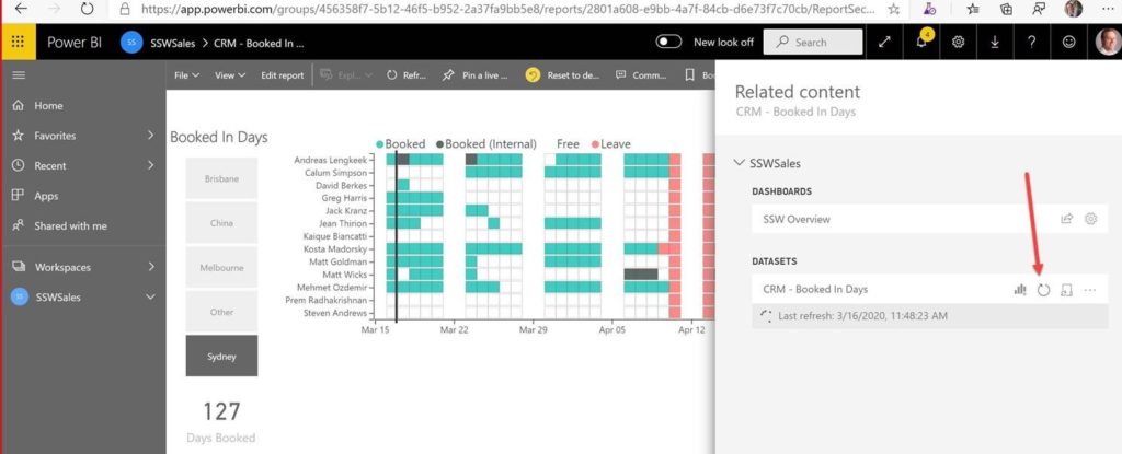
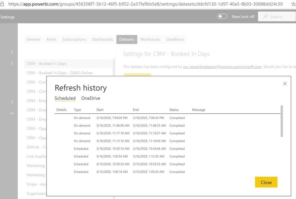
Help me know who refreshed the Data Sets
On this Related Content view, I would like to see stats on who is clicking this and the length of time it took…
… say “Show the last 10 runs”
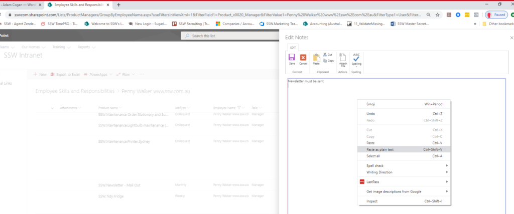
SharePoint Lists – Help me paste from an email, from Notepad or from anywhere!
You cannot copy and paste into a note text box to update a list item:
For example, the right-click menu “Paste” does not work on https://sswcom.sharepoint.com/Lists/ProductManagers/DispForm.aspx?ID=69&e=IC1JaK
Advise when the contacted person is busy
When I message someone and don’t pay attention to their status (Busy, In a call, Presenting, etc.) I want the Teams Bot/App to reply with something like:
Adam Cogan is currently in a call and may not be notified of your message. If it is urgent, please click here to send the notification now.
This will be a useful feature so that we are made aware of the recipient’s status before we start pinging them continuously.
Slack has this already implemented with its DND (Do Not Disturb) feature. Link to example: Knock, knock: Introducing Do Not Disturb
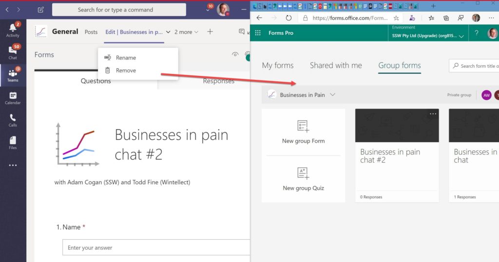
Help me easily see the form I work on each week
You know I love Microsoft Teams – I use it every week.
1. Are you going to be doing many changes to this view (I don’t enjoy using it a lot)
2. I am baffled when I see all these groups (when I have never used them)…. can you give the user the ability to remove them? (Even better dont show them if they are 0)
3. The group I use every week never shows up… I expect it to be #1 based on usage… so it kind of seems like a bug to me.
Navigation – Help me know where I am
I click a link (sadly an unreadable link):
And I go here.
Suggestions:
- Where am I? Can you please add a breadcrumb that takes me to the team that this file belongs to (see red arrow)
- The ‘Close’ button should be renamed to ‘Cancel’ because it takes you back to where you were eg. the last chat
Include the account URL in “Refresh failed” emails
The yellow should be added:
Help a new Product Owner looking at the Backlog
When a new Product Owner is looking at an unfamiliar backlog, it would be handy to know the *active* developers.
I am thinking of a new tab “People”
Eg. Backlog | Analytics | People
If you like this idea, I’d love to know how to show the *active* developers. Maybe columns for:
- Work Item updates
- Code commits
- Etc
And some Product Owners are active testers and maintain the backlog.
Maybe it would also be useful to give stats on the Product Owner too.
…and then you could compare with Product Owners on other projects.