Do you agree that products always have room for improvement?
"Every day there are little things in software that we find annoying. Some write books about it, like Annoyances.org, but I thought this site would be more constructive.
BetterSoftwareSuggestions.com is proudly maintained by myself and the developers at SSW."
There are a couple things that frustrate me about SharePoint News. I believe that Microsoft Forms results should be shown in SharePoint news. By fixing this, SharePoint news will be more useful.
I see 2 problems: ❌ SharePoint News is not used a lot in most companies I work with ❌ Not many people in a company know when is the right time to read a Forms survey results…. Or even that you can.
Suggestion: ✅ When you are looking through the results of a Microsoft form, it would be great if there was an easy option to show the results in SharePoint News.
✅✅ Even better would be a way that the Form owner who reviews the comments, could add their own commentary to give context, before the others get to read them.
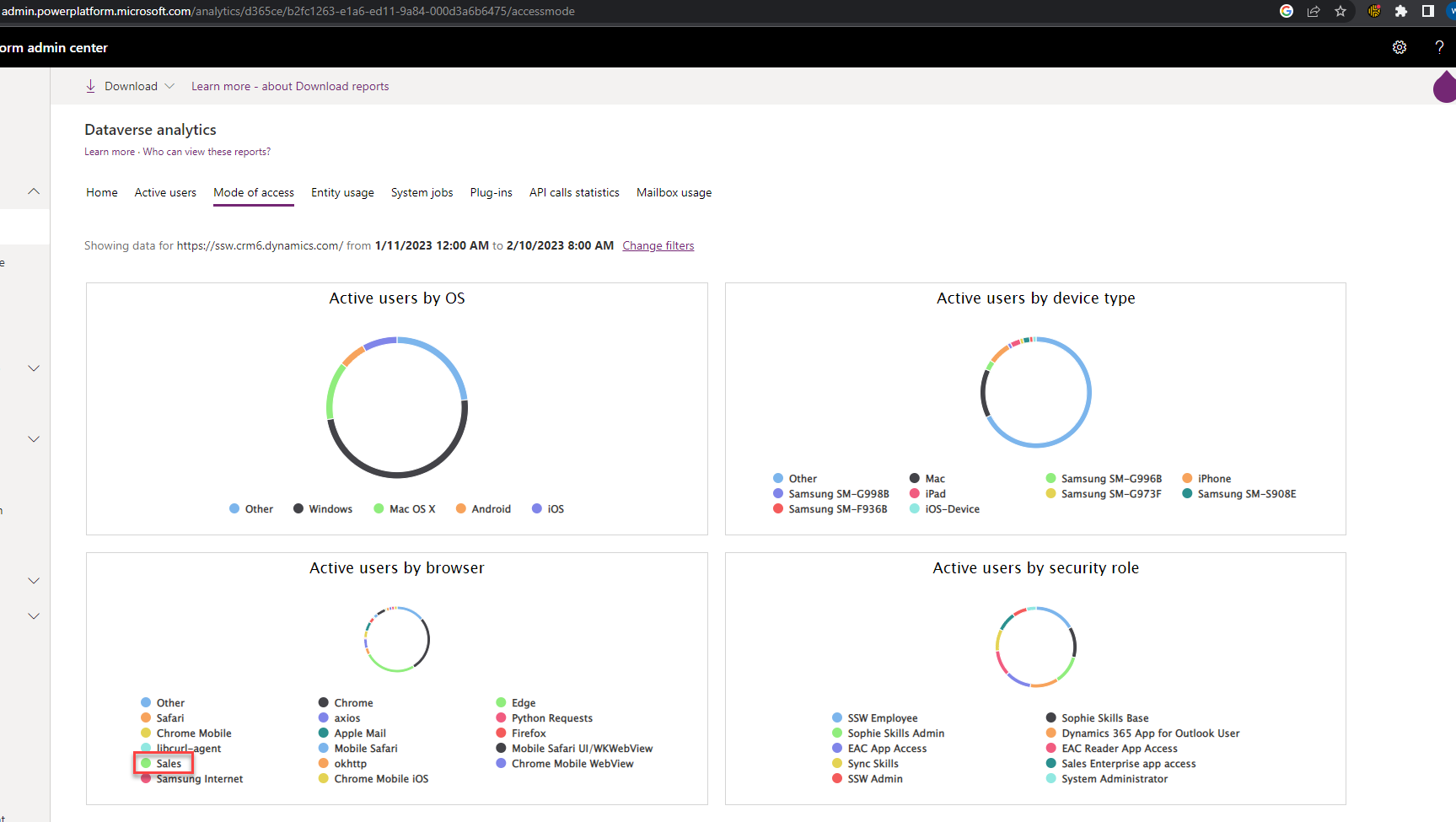
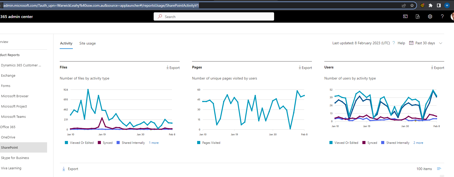
I am very interested in how people are accessing our services. I especially like how I can see that our users are accessing Dynamics 365 on their mobile app.
SharePoint should display similar results. I would like to see how many of our SharePoint users are accessing our intranet via the ‘SharePoint app’ and also SharePoint Lists via the ‘Lists’ app.
Figure: Dynamics usage report shows that a number of people are using the Sales app to access DynamicsFigure: SharePoint usage report should show the same thingsFigure: Office365 Power BI app shows Outlook Mobile and Teams but doesn’t have SharePoint stats
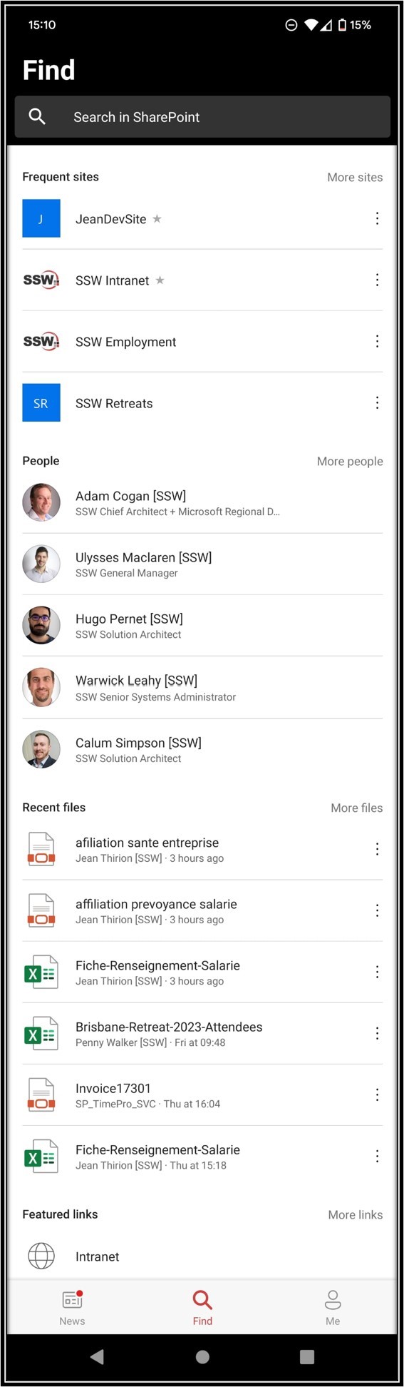
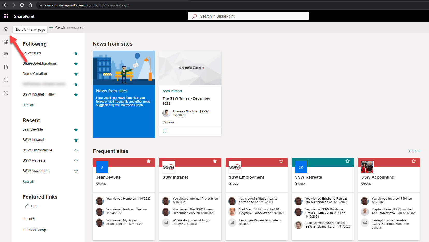
More importantly the page’s content is pretty bad, i.e. it shows different sections and even different content compared to the mobile app.
Figure: This is the SharePoint “Home page” and it needs improving – make it consistent with the mobile app
I would love to see the same categories described above in Suggestion #1 (i.e. Sites, People, then Files).
In short, the content should be the same – whether I use the browser or mobile app (e.g. today even just the Frequent Sites I see on the browser and on the mobile app are different – how??).
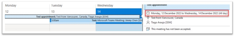
If I view an all-day event in my Outlook calendar that:
Was created in a different time zone
Goes for multiple days
Has all-day event ticked
The event will show as one day shorter than the actual event. The hover preview shows the same (incorrect) number of days. If I open the event, it displays correctly.
Please fix this inconsistency.
Figure: Test event, created in a different time zone for Monday to Thursday – shows as Monday to WednesdayFigure: The same event (correctly) shows as Monday to Thursday when opened
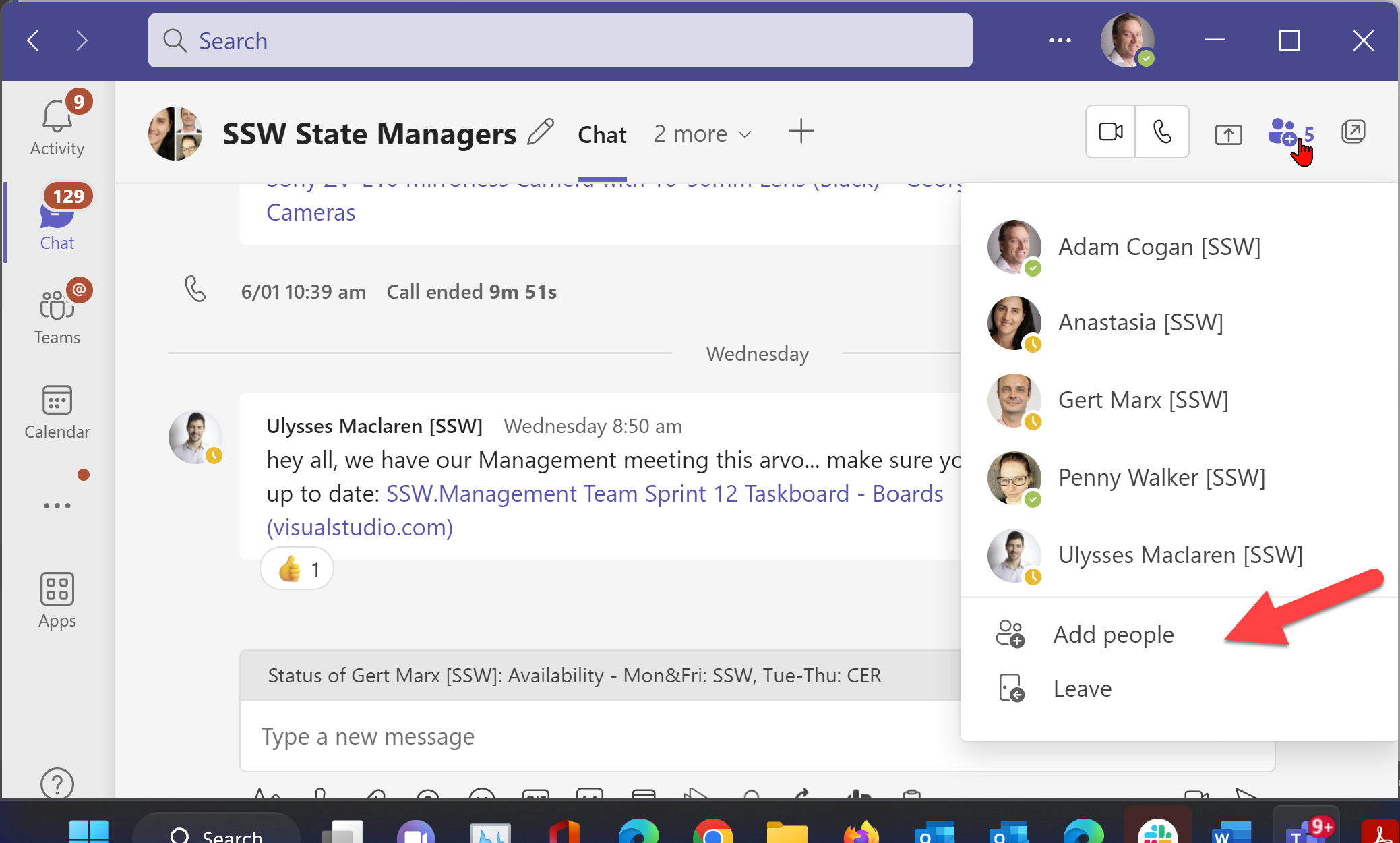
I am not sure if this is an edge case…. I’d love to know how others work.
On some calls – for example a managers meeting – you want to temporarily add in someone just for a quick question. You don’t want them to remain after the call. It is kind of a security or privacy issue if you don’t remove them.
So I find it really annoying when I forgot to remove them after the call and they probably find it annoying when they get our messages after the call. So I would prefer not to have to remove the person manually.
Suggestion – next to “Add people”, I think it would be really cool to add a person via an option “Add people (temporarily)”.
We have a new feature “Delete” a chat. I’d love to know if people will use it.
I’m not sure I will use it as I like history in chats, but I regularly use ‘Hide” to remove a chat conversation (I am always aiming for a 0 inbox and a 0 chat list).
On the right click menu, notice the last 2 are about getting rid of a chat…. And so is “Hide” chat. Therefore it is in the wrong place.
Please can you move “Hide” with the bottom 2 menu items. Those 3 are related.
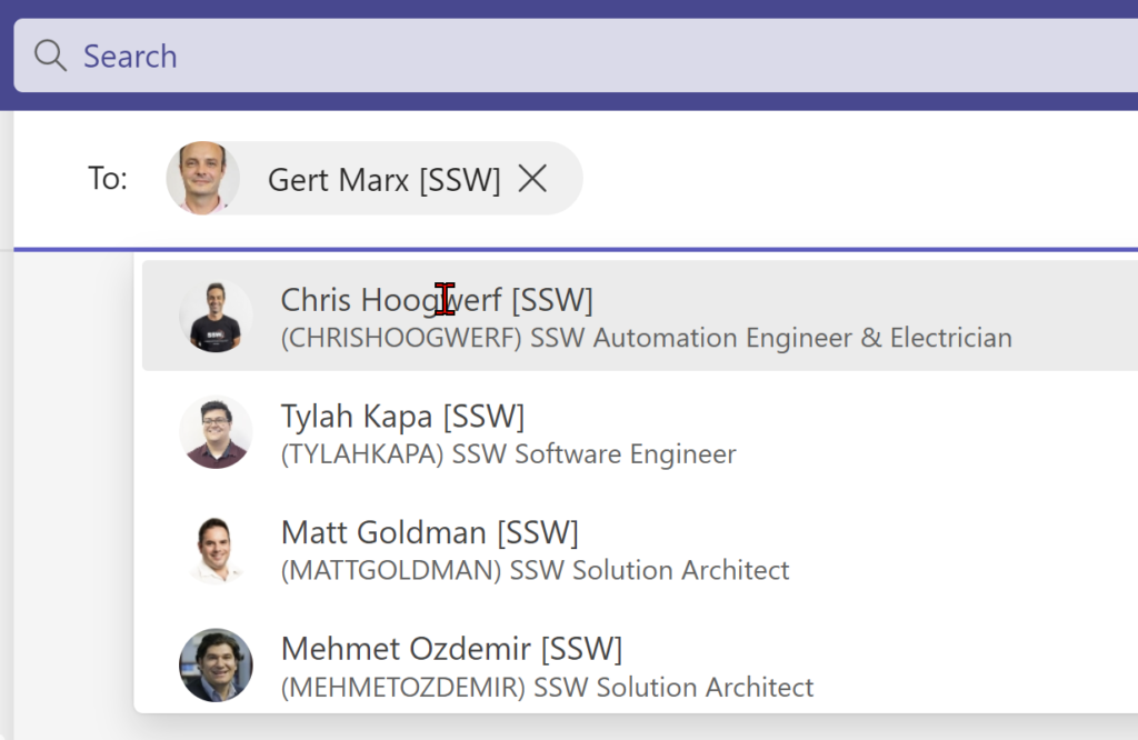
We all love Microsoft Teams and I think this UI looks like it is about to be clever, but it is not.
When starting a new chat… If I pick 1 person… please attempt to guess the 2nd person I will add to the chat. People are often related and I know it would be a nice for all Microsoft Teams users if the people picker showed the like people that I will chat with together.
Today, it doesn’t matter who I pick first in the chat, the search always shows the same people.
Figure: I type ‘Gert’ it pops open people, if I pick ‘Bob’ it pops open the *same* people!
Suggestion
Please pick who I will probably pick next … it should change the people based on who I am adding.
More info: Delve tells me who I talk to a bit, that would be ok. But when you talk to a manager, you probably are going to pick another manager. When I talk to an Azure DevOps engineer, I am probably going to pick another Azure engineer (not a React developer).

 -
-