Do you agree that products always have room for improvement?
"Every day there are little things in software that we find annoying. Some write books about it, like Annoyances.org, but I thought this site would be more constructive.
BetterSoftwareSuggestions.com is proudly maintained by myself and the developers at SSW."
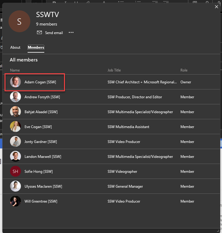
Say you add user to a group… you should be able to see this change in the Azure AD Audit logs.
Figure: New user added to a distribution group
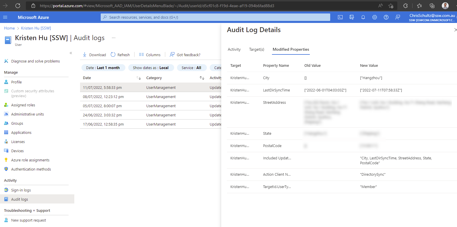
The Audit log details work great for users. For example, when you make a change to a user in AD and sync with Azure AD (using AAD Connect), you get great visibility of what was changed.
✅ Figure: Good example: Azure AD | [user] | Audit logs | Audit Log Details with Old Value & New Value
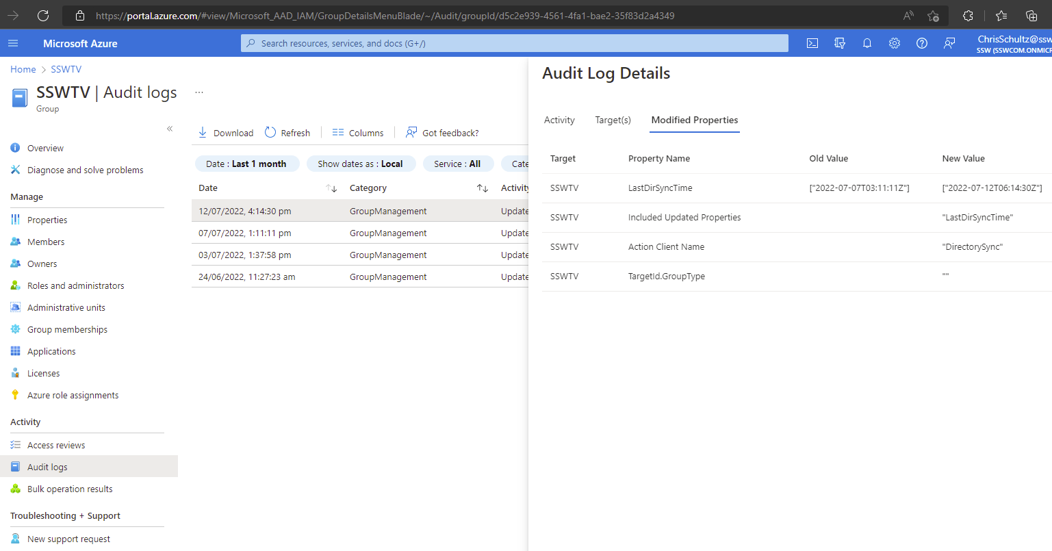
Sadly you can’t see who changed it.
When you make a change to a distribution group in AD (e.g. add a new member) and sync, there are no details at all
❌ Figure: Bad example – Azure AD | [group] | Audit logs | Audit Log Details shows no details (you can’t see that a new user was added to the distribution group)
Suggestion: Please add the details of who changed what for both users and distribution groups in the Audit logs.
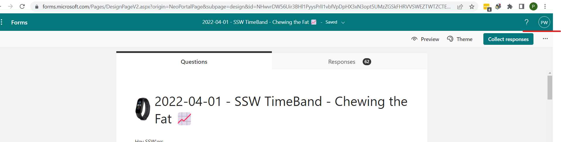
When filling in a form the user icon (aka Account Name) on the top right is missing.
It would be awesome if the Forms questionnaire showed who was signed in. They could copy the Forms responses which is really clear. So it would be awesome if they had the same green bar below:
✅ Figure: Good example – In the green bar I can see who is signed in being “PW”❌ Figure: Bad example – How the forms currently look – there is no indication who is signed in
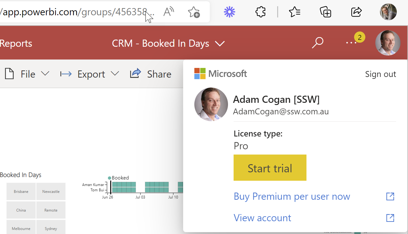
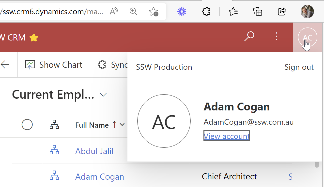
✅ Figure: Good example – Power BI shows my “License type:” is Pro❌ Figure: Bad example – Office 365 does not tell me what license I have❌ Figure: Bad example – Dynamics 365 does not tell me what license I have
More Info:
In this case the Office | Person menu should show ”Microsoft 365 E3”
I think Jean did a great explanation of the permissions problem.
More info
This is really weird behaviour – fire up Fiddler and you can see what Teams is doing in the background.
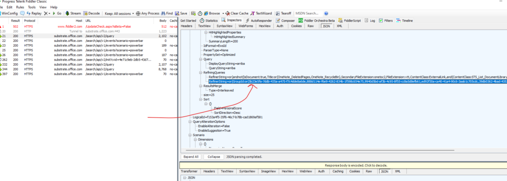
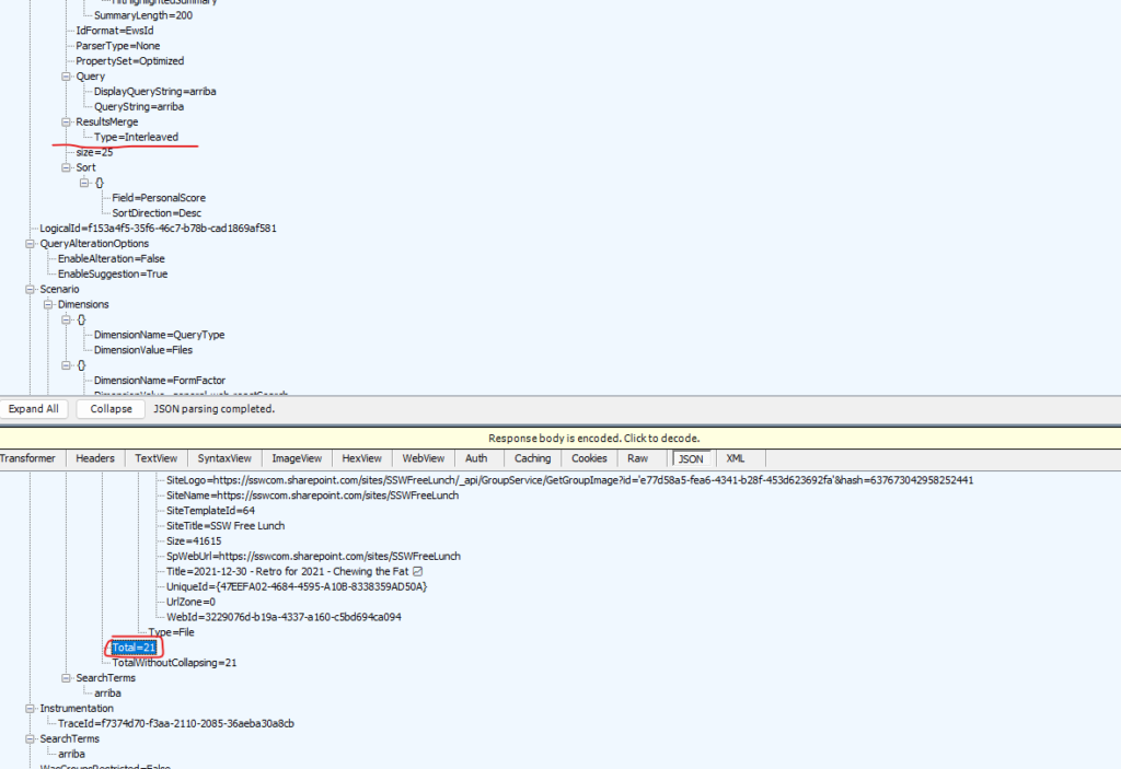
Turns out that when you search in Teams before it shows you what you have access to, it weirdly adds a refining query to only show documents from a list of every group you are a member of…
Figure: This string of group id’s is about 75 items long, and I believe it is made up of every Team I am a member of… I’d like to turn this offFigure: Query yields 1 result
When I remove that refining query, it works as expected:
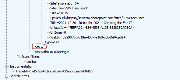
Figure: In Fiddler when you edit the request and remove the group id refining query …it yielded 21 results
So I would say this appears to be a deliberate decision rather than a bug, though I think it is important to be able to turn it off if you want to find stuff using Team’s search 😂
In fact I would turn it off by default, so it is consistent with SharePoint Search
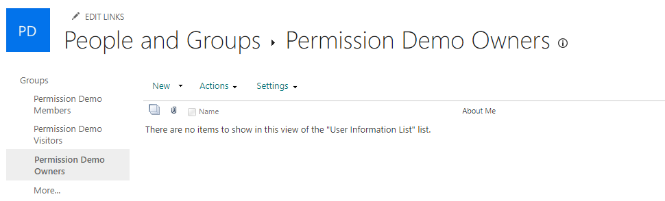
See the below text from our document on how to set up the security ourselves
Context
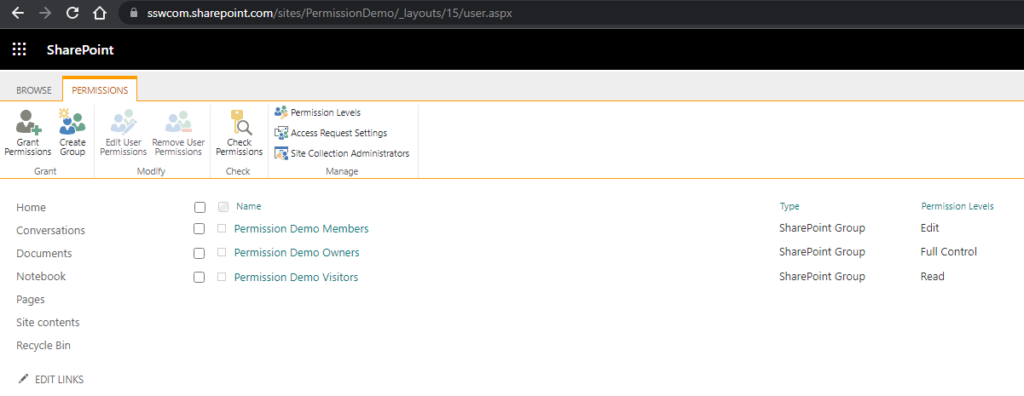
Whenever you create a Site Collection, two O365 groups get created (xxx-Owners and xxx-Members). For retro-compatibility, these O365 groups are automatically added to the SharePoint groups at creation time.
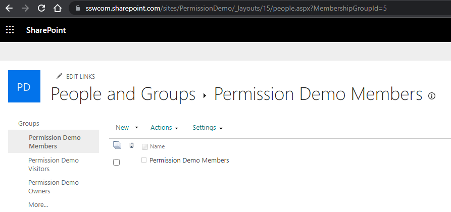
Figure: SharePoint Advanced Permission setup – 3 traditional SharePoint Groups Figure: “Members” SharePoint group has exactly one member – the Office 365 Group Figure: “Owners” SharePoint group is Empty!
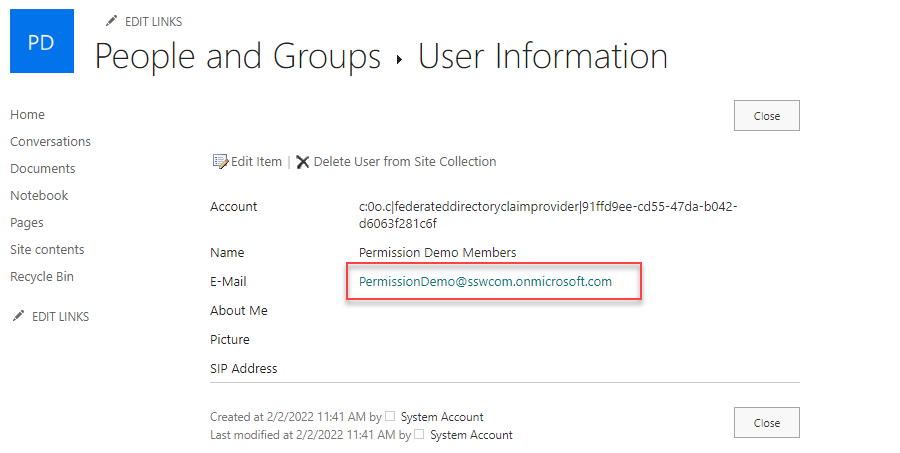
(Note for SharePoint gurus: O365-xxx-Members is mapped to SharePoint-xxx-members, but O365-xxx-Owners is mapped to… Site Collection Administrators! Crazy.)
Figure: “Site Collection Administrators” are mapped to The Site Owners Office 365 Group
SharePoint membership grants access to SharePoint resources, while access to Teams features (Channels, tabs, apps) is controlled directly via O365 groups.
Problem
The problem with this model is we cannot add AD (Active Directory) groups (or even O365 groups) within O365 groups (no nesting allowed). So, if we want to give access to two different sites to the same people (say SSWDevelopers), we must add ALL MEMBERS manually on EACH generated O365 group. That is ridiculous, and hard to maintain long term.
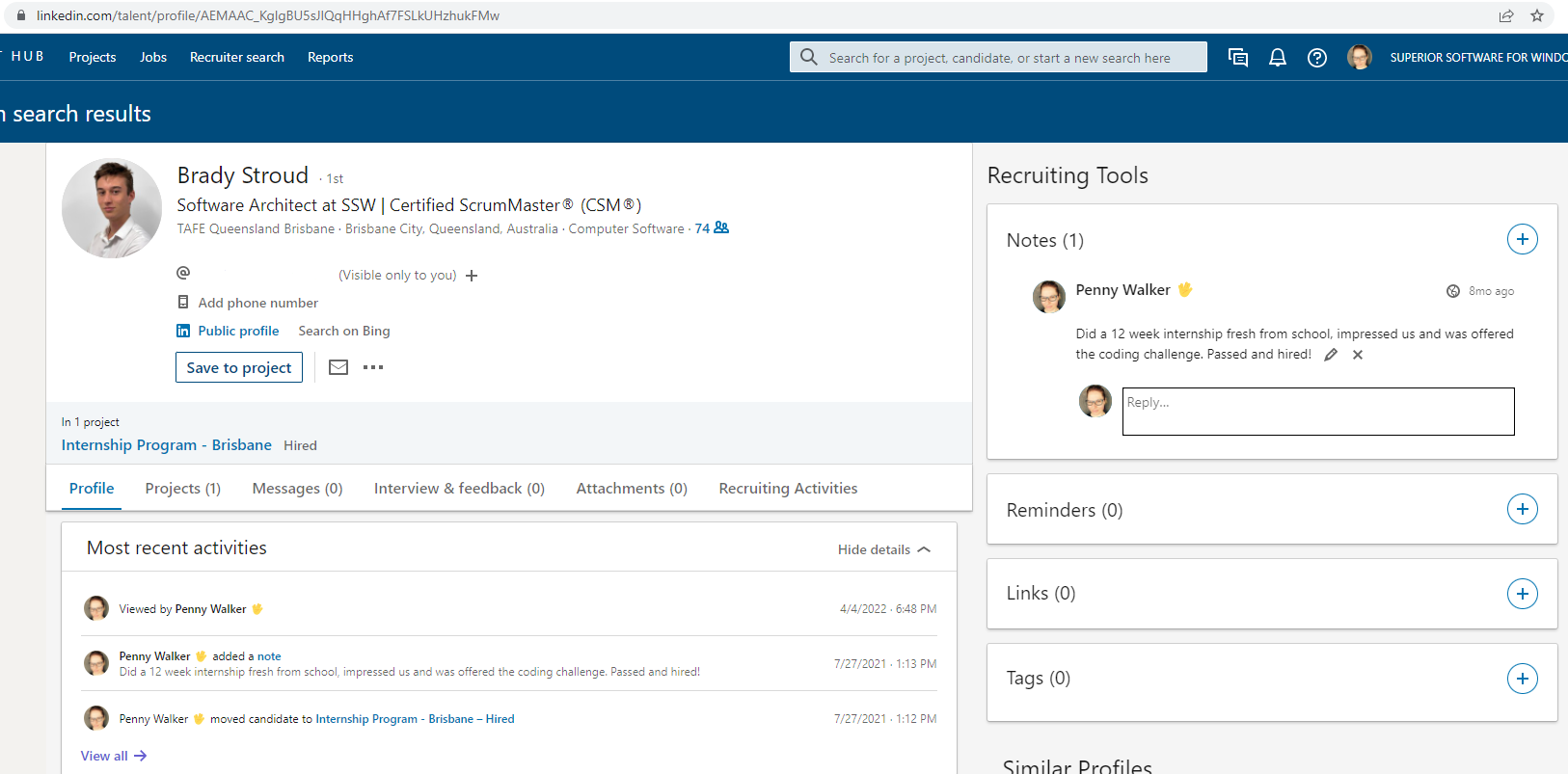
At SSW we moved over to LinkedIn for our recruitment system (aka ATS being Applicant Tracking System) and it has been a good move, although it is much more $ expensive.
I find it annoying that there is no field to keep track of someone’s salary expectations. Currently I write it in a note:
How do you keep track of candidate’s salary expectations? What is the logic of not having this important field?
Figure: Weird – There is no field to track Salary $
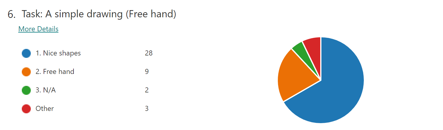
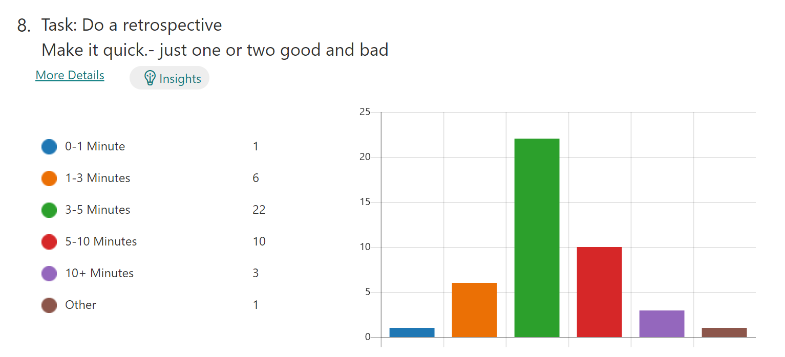
When looking at the feedback from my forms surveys, I prefer Bar Charts over Pies. Does anyone like Pies? – I find them less readable.
Suggestion: I would like to go to Tools | Options and set my preference
Question: I think I have noticed that Forms show Bars when there are 6 or more options. Right? If so, I guess I should always make sure I have 6 options 😊 😊
Figure: Pie chart
VS
Figure: Bar chart
That is an odd decision. I was just talking to a person form New Zealand who said:
“we actually have a rule to never use a pie chart :) The only time they’re somewhat useful is if you are comparing 2 things. Anything more and it’s not really readable”
Please fix it or give us an option to allow us to fix it.
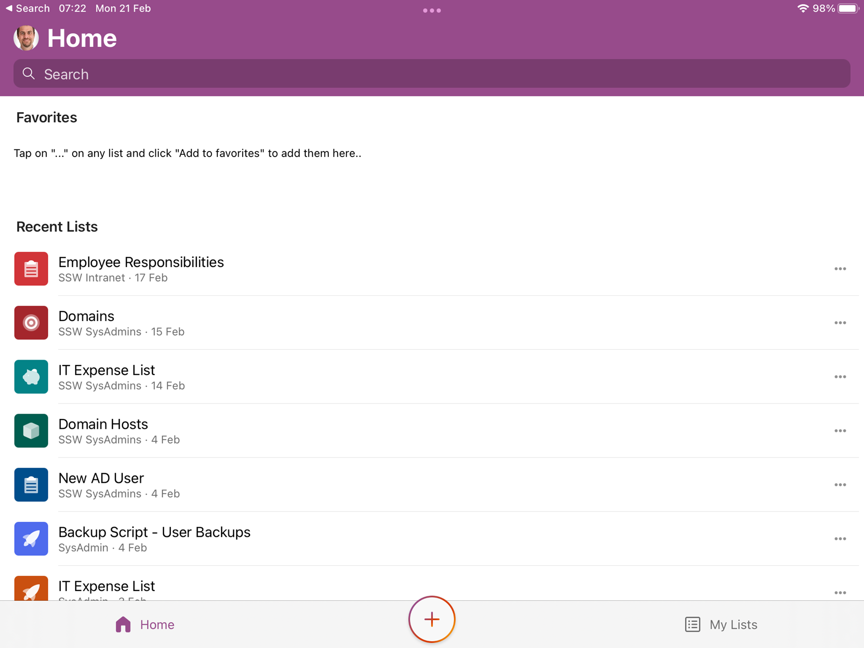
See the below screenshot – this is the default on the lists app. It shows all lists that I have permissions for and have added as a favourite list. Although it says ‘Home’ it shows not only lists in the ‘Home’ site but also any other lists that I have access to. These lists are not in the ‘Home’ site but are in other sites.
If I don’t know what the name of the list is that I am looking for how do I find it?
Figure: All lists shown that I have access to
It would be better if I could see the hub-site navigation from the normal SharePoint site. That way I could just navigate to the SysAdmins site and see the lists in that site, or the Designers and see those lists. That would give more context.
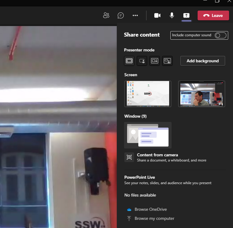
In Teams when in video chat with only 1 other person and click Share Content | (there is no Whiteboard app)
❌ Figure: Bad Example – With only 1 other person in the chat there is no whiteboard
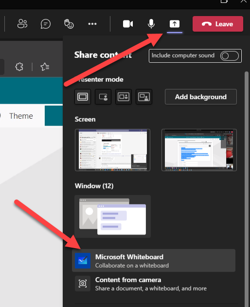
When I add someone else to the call I can see the whiteboard app.
✅ Figure: Good Example – With 2 or more people in a video chat Whiteboard is there
This is weird and wastes a lot of time debugging why this feature comes and goes. The button should always be there and if Microsoft don’t want to enable it for 2 people for some reason pop a message that says “Whiteboard is for 3 or more users”.

 -
-